The new update of the Dynamox App for Android is now available!
Check out what’s new and make the most of the updates! ______________
Management indicators in the app
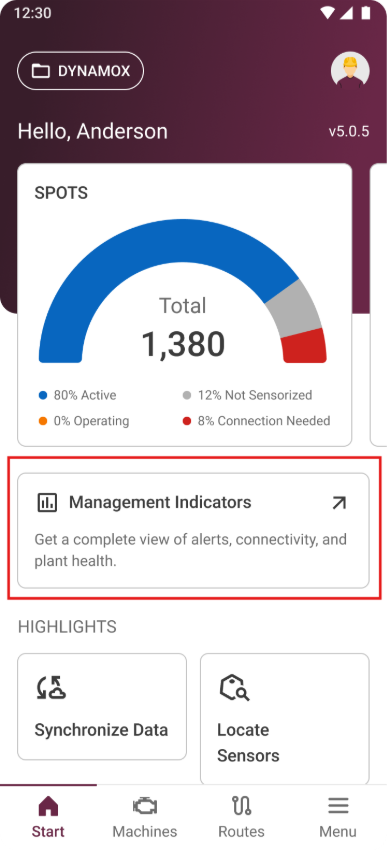
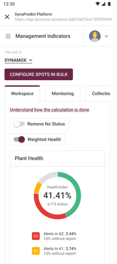
The Management Indicators module is now also available in the Dynamox app, making the key information from your area even more accessible in your daily routine. When you open the app, right below the spots chart, you’ll find the new card for the Management Indicators module. With a single tap, you can access the dedicated indicators area, where you can easily keep track of the main management data from your plant.
To access the indicators through the app, an internet connection is required for loading and updating the information, ensuring that the displayed indicators are always aligned with the most recent data on the Dynamox Platform. The feature is available for both Android and iOS devices.
The new update of the Dynamox App for Android is now available!
Check out what’s new and make the most of the updates! __________________
Management indicators in the app
The Management Indicators module is now also available in the Dynamox app, making the key information from your area even more accessible in your daily routine. When you open the app, right below the spots chart, you’ll find the new card for the Management Indicators module. With a single tap, you can access the dedicated indicators area, where you can easily keep track of the main management data from your plant.
To access the indicators through the app, an internet connection is required for loading and updating the information, ensuring that the displayed indicators are always aligned with the most recent data on the Dynamox Platform.
The feature is available for both Android and iOS devices.
Stay up to date with the latest features and enhancements we’ve just launched on the Dynamox Platform.
Check out what’s new and leverage these updates to their fullest! _________________________________________________
Global telemetry from 3 to 13,000 Hz
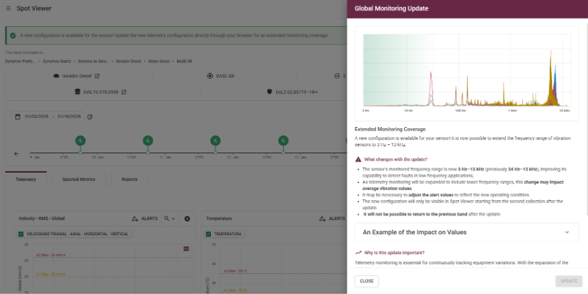
A new configuration is now available for the HF+/HF+s sensor! You can now expand the frequency range of these sensors to 3 Hz – 13 kHz, updating telemetry settings for more comprehensive monitoring.
What changes with this new monitoring?
Telemetry monitoring is essential for continuously tracking equipment variations. With this expanded frequency range, you ensure greater accuracy, safety, and predictability in monitoring your assets.
Spot creation
By default, Spots created with HF+/HF+s will have telemetry set to 3–13,000 Hz.
Spot editing
In the Spot Viewer, a notification will appear prompting you to update to the new configuration. When you click “Learn more” you’ll see a summary of the update, along with the main points to pay attention to.
These enhancements were designed to make your monitoring more intuitive and efficient, contributing to a smoother and cleaner operation in your daily routine.
Stay up to date with the latest features and enhancements we’ve just launched on the Dynamox Platform.
Check out what’s new and leverage these updates to their fullest!
____________________________________
Rescheduling spectral acquisition on an idle machine
Ensure that only relevant data is collected, analyzed, and stored by aligning spectral capture with the asset’s operating status.
This feature allows the system to automatically reschedule spectral collections when it detects — based on the operating thresholds configured on the Spot — that the machine is stopped.
With rescheduling:
Without rescheduling:
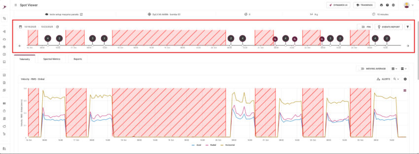
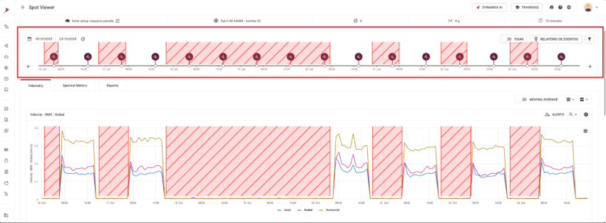
In SpotViewer, you can clearly observe the effects of rescheduling by comparing the event timeline with the telemetry graphs:
With rescheduling enabled:
During periods when the global RMS velocity approaches 0 mm/s (indicating the machine is stopped), no spectral collection records are generated. These collections are rescheduled and performed only when the asset resumes operation.
Without rescheduling enabled:
The collection follows the gateway’s fixed schedule, generating spectral events even during downtime; cluttering the timeline with irrelevant events.
In SpectralViewer, the impact is seen in the quality and relevance of the available spectral graphs: With rescheduling enabled:
The spectral graphs reflect moments when the asset was actually operating, making the analysis more accurate and useful for diagnostics and decision‑making.
Without rescheduling enabled: A large volume of graphs is generated during inactive periods, which are not useful for analysis since they do not represent the asset’s real behavior.
CONFIGURATION Rescheduling is configured through the collection schedule of the DynaGateway LTE or IoT, running firmware version 2.1.1. This option is not available in earlier versions.
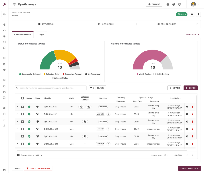
ATTENTION: When the configuration is set to triaxial, for operational‑level thresholds, any axis that exceeds the defined limit will be considered as the machine operating. In other words, the logical operator used is “OR”. If X, Y, or Z are above the threshold, the function will not be enabled, and a collection will be performed. In the DynaGateway Viewer screen, when you click the COLLECTION SCHEDULE button, the option appears disabled by defaultand must be selected to enable it.
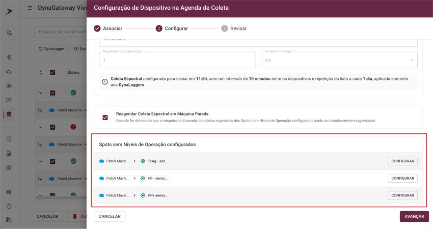
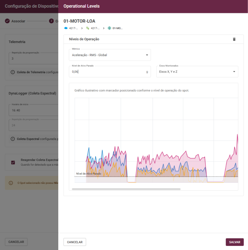
If the Spot does not have operational levels configured, attempting to enable rescheduling will trigger a message informing you that this configuration is required, along with a button that takes you directly to the operational levels screen.
After configuring and saving the levels, the schedule can be adjusted normally. Then, you must:
Save the schedule.
Save the DynaGateway.
Confirm the update.
After that, the icon for spectral‑collection rescheduling on idle machines will appear in the collection settings column.
The collections will be rescheduled according to the following sequence:
Schedule 1 = 15 minutes, new attempt.
Schedule 2 = 30 minutes, new attempt.
Schedule 3 = 45 minutes, new attempt.
Schedule 4 = 1 hour 15 minutes, new attempt.
In other words: A(N–1) + A(N–2) = AN.
The collections that do not take place will be displayed in the panel on the right side of the screen, after clicking the “EVENTS” button.
These improvements were designed to make your monitoring experience more intuitive and efficient, contributing to a smoother and clearer operation in your daily routine.
Stay up to date with the latest features and enhancements we’ve just launched on the Dynamox Platform.
Check out what’s new and leverage these updates to their fullest!
_____________
ANALYSIS PLAN
Organization, standardization, and control for analysis routines.
The new Analysis Plan feature enables the creation of well‑structured plans designed to meet predictive maintenance requirements and maintenance strategy guidelines.
This brings operational discipline, clarity, and agility, resulting in safer decisions and more consistent outcomes.
Standardized, traceable routines focused on the assets and critical points that truly matter.
Higher technical quality, with complete and mandatory reports that prevent unsupported conclusions.
Greater operational efficiency with clear prioritization of analyses and centralized process management.
Strategic oversight, allowing leadership to monitor compliance and quickly correct deviations.
Efficiency in analyses
With greater traceability, prioritization, and predictive process management, analysts can structure condition analysis routines based on:
the asset tree;
relevant subsets;
and the points that genuinely require periodic monitoring.
Meanwhile, Operations Leadership monitors plan compliance, evaluates deviations, and ensures consistent execution of the maintenance strategy.
Importance of reports
Here, the report is always mandatory for each machine/subassembly/spot.
Only after completing or updating all monitoring points within the report will the machine’s CHECK be available. Reinforcing analysis quality and preventing conclusions without proper technical justification.
Hands-on!
Creating an Analysis Plan
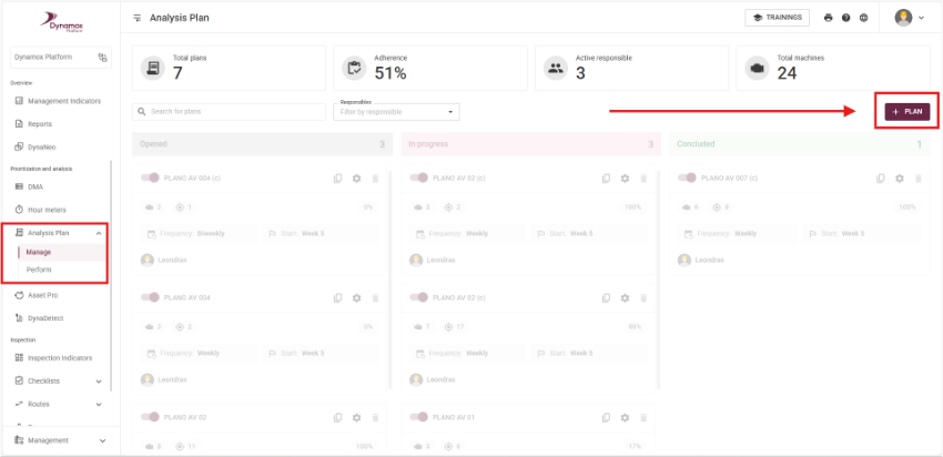
In the Prioritization and Analysis section of the side menu, you’ll find the new Analysis Plan option.
In Manage, click + PLAN, as shown below:
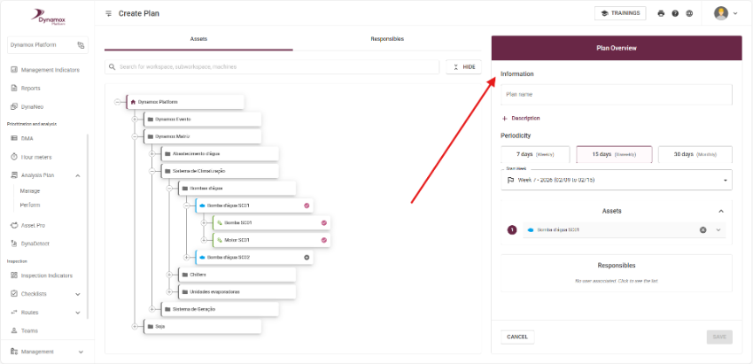
Then proceed with the configuration:
Select the machine to be monitored.
Choose the relevant sub-items and points for analysis.
Set the periodicity.
Assign responsibles.
Save the plan.
The analysis plan is now ready for execution.
The plan will automatically be generated according to the configured periodicity.
Executing the plan
When executing an analysis plan, the analyst:
Accesses the machine’s monitoring point for analysis within the same navigation page.
Records the analysis and observations.
Completes the mandatory report.
Once the report is compliant for all points of the machine, the machine’s CHECK becomes available.
Managing analysis plans
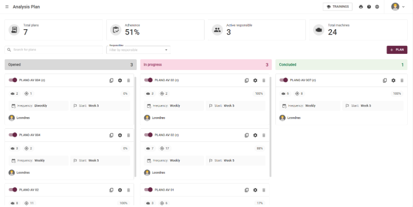
To optimize management, the plan overview provides indicators and a kanban-style display showing the total number of plans, average compliance, responsible analyst, total assets, list of configured plans, and the execution status of each plan.
This product was designed to make your monitoring experience more intuitive and efficient, helping you streamline daily operations with greater clarity and agility.
Be an active part of these improvements — the Analysis Plan is currently in the beta stage and open to receive your feedback and suggestions.
Responding to requests from our clients, we’ve introduced three updates to DynaDetect, Machine Viewer, and Spot Viewer that make defect monitoring even more efficient and intuitive.
DynaDetect Asset indicators are back on the DynaDetect home screen. When accessing DynaDetect, you’ll now see a clear and quick overview of monitored assets, assets with critical defects, assets with manageable defects, and assets without diagnostics. You can also use the “Show Indicators” and “Hide Indicators” options to customize the display of information as you prefer.
Machine Viewer The second update is that Machine Viewer now displays subassembly and component information directly on the screen. Clicking on these elements reveals details in the new layout, along with a quick-access button to DynaDetect for monitoring other equipment. This brings more efficiency to your asset management.
Spot Viewer In Spot Viewer, defects are now shown by severity directly on the screen. When selecting a defect, the new quick analysis tab displays detailed information about the diagnosis at that specific point, providing more context for your decision-making. We’ve also added a quick-access button to DynaDetect for faster monitoring of other assets.
These improvements were designed to make your monitoring experience more intuitive and efficient, contributing to a faster and clearer operation in your daily routine.
Dynamox Lens
Information at your fingertips The new “Learn More” button in the upper-right corner provides all the details about Dynamox Lens settings. Quickly and easily learn everything about installing and configuring Dynamox Lens.
Thermographic scale adjustment The thermographic scale is now even better, offering more control in your thermal analyses. The temperature scale automatically follows the maximum and minimum values of the thermogram. With this update, you can manually adjust these limits using the cursor or set custom values, ensuring much more accurate and personalized analyses.
Spot settings
FTF Calculation by bearing race Now, you can choose whether the bearing’s rotating race is internal or external. Based on this setting, the system calculates the cage fault frequency, updating markers and metrics for even more accurate and reliable analyses.
Spot Viewer
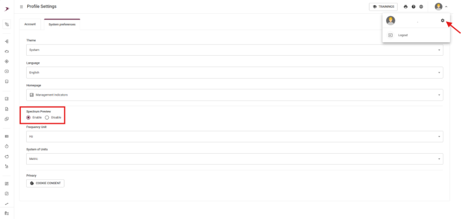
Choose to enable or disable spectrum preview Responding to customer requests, you can now choose whether to display the spectrum preview on the Spot Viewer screen. In user settings, select Enable (to view) or Disable (to hide).
Additionally, when configuring this preference, you can access the Spectral Viewer page by double-clicking on spectral metric collections.
Axis unification With axis unification, you now have unified control, highlighting the selected axis in the following contexts:
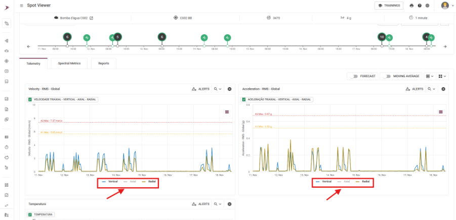
-Telemetry Charts: Clicking on the axis legend (Velocity / Acceleration) will make the charts respond to your selection, ensuring a unified visual experience.
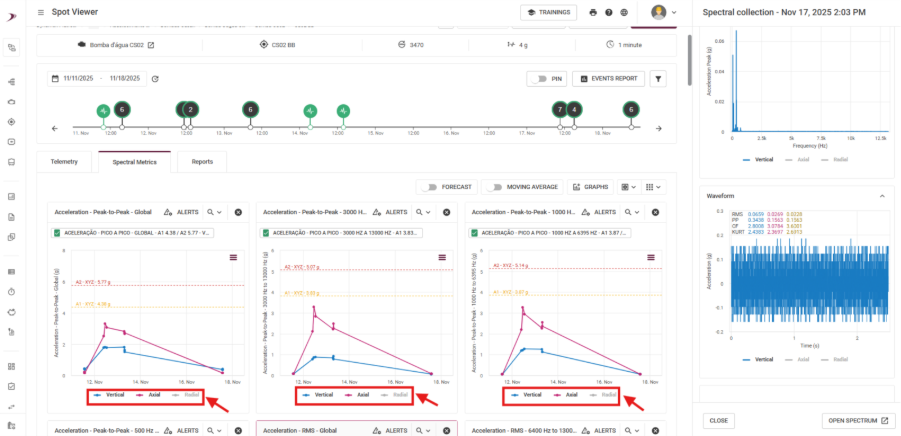
-Spectral Metrics: When selecting a spectral collection, the corresponding axis will be highlighted, while others will appear with reduced opacity. This approach makes it easier to identify the axis under analysis and will be applied consistently across other metrics.
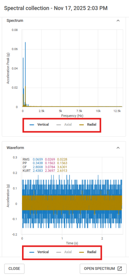
-Spectral Preview: When returning to the spectral preview, selecting an axis will make both charts respond to the selected point. The spectral collection updates to the chosen axis, keeping everything uniform.
Asset Pro
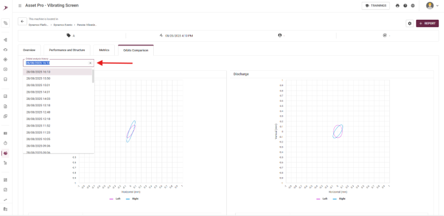
View previous orbits of the vibrating screen You can now visualize previously calculated orbits. This feature allows you to quickly select past readings and makes it easier to compare them with the current indicator.
Trigger for DynaGateway
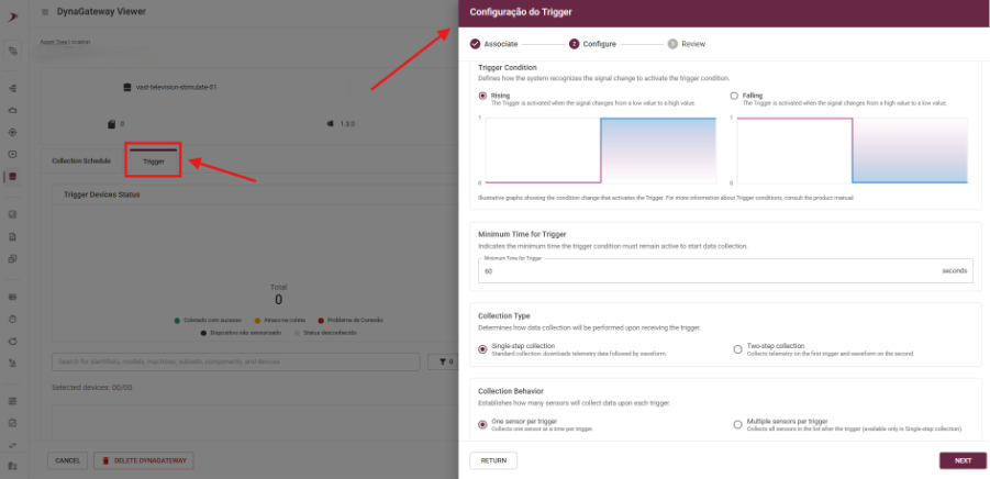
New: Configure Trigger for DynaGateway via Dynamox Platform You can now configure Trigger for DynaGateway directly on the platform. Easily adjust conditional data collection according to your analysis needs. ⚠️ Important: This configuration is only available for the LTE and IoT versions of DynaGateway!
These improvements were designed to make your monitoring more intuitive and efficient, contributing to a faster and clearer operation in your daily routine.
Do you have questions or want more details about any of these updates? Contact our team!