Android: January/2024
The new Android version of the DynaPredict app is now available. Below, check out the main new features you can explore.
- Optimization of the DynaLoggers Association
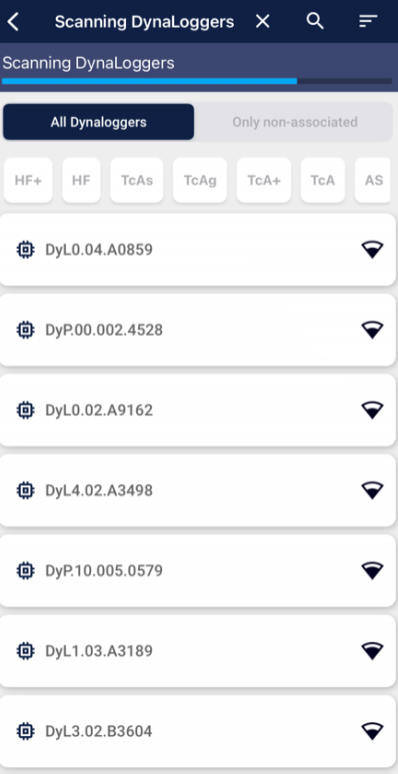
Two new filters have been added to the App to simplify and speed up the process of associating sensors to a new spot.
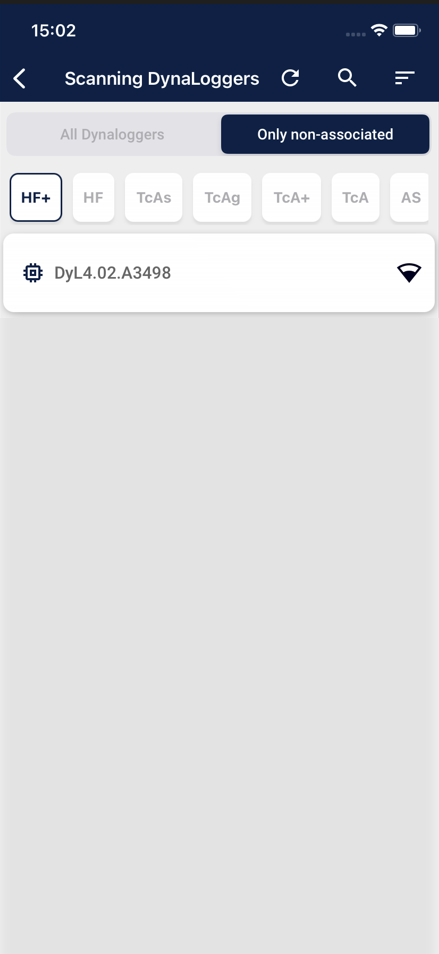
Filter “Only non-associated”: When searching for sensors, users have the option of applying the filter “Only non-associated”. This feature makes it easier to quickly identify the DynaLoggers that are available for association.
Filter by sensor model: to make the search even more accurate, users can now filter sensors by a specific model, making the search easier, especially when there are multiple DynaLoggers of different models near the user.
Take a look at the sensor search without the filters applied:
Check out how much easier it is to find your sensor by applying the filters “Only non-associated” and the specific DynaLogger model you’re looking for:

WEB: February/2024
A new version of the DynaPredict Web Platform is now available. Below, you can find
the main features that you can explore:
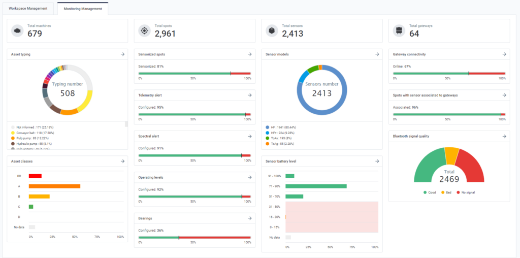
1) Monitoring Management
In order to facilitate system administration, we have introduced a new management
screen in the plant health area. The “Monitoring Management” tab provides an objective
view of the system, summarizing information on Machines, Sensors, Settings, and
Gateways, bringing a macro view directly focused on administration and management.
Among the various information you can find on the new screen are: sensor configuration
status, battery level, number of offline gateways, typing, machine risk, and much more.
iOS: January/2024
The new iOS version of the DynaPredict app is now available. Below, check out the main new features you can explore.
- Optimization of the DynaLoggers Association
Two new filters have been added to the App to simplify and speed up the process of associating sensors to a new spot.
Filter “Only non-associated”: When searching for sensors, users have the option of applying the filter “Only non-associated”. This feature makes it easier to quickly identify the DynaLoggers that are available for association.
Filter by sensor model: to make the search even more accurate, users can now filter sensors by a specific model, making the search easier, especially when there are multiple DynaLoggers of different models near the user.
Take a look at the sensor search without the filters applied:
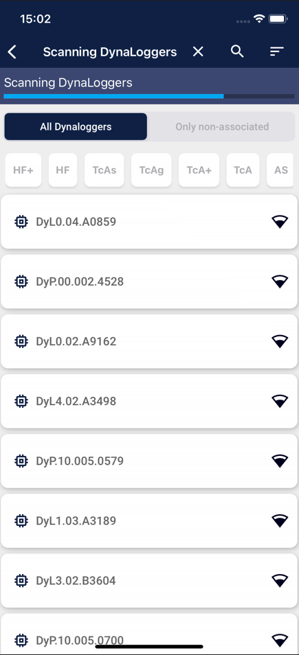
Check out how much easier it is to find your sensor by applying the filters “Only non-associated” and the specific DynaLogger model you’re looking for:
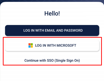
2) Logging with Single Sign-on (SSO)
Our App now offers the option of logging in via Single Sign-On (SSO). This tool will not only simplify user authentication but will also significantly strengthen data security. SSO provides centralized authentication management, introducing an additional protection layer to our solution’s user data.
With this update, then, 3 ways of logging in to DynaPredict are now available:
- Sign in with Login/Password: The user must provide their login/password registered for exclusive use of the DynaPredict application.
- Sign in with your Microsoft account: The user must enter their credentials registered with their Microsoft account (Outlook). The first time the user accesses the application from their Microsoft account, they will receive a confirmation email. In this case, they will have to access their Outlook account (via browser or Outlook application) and then click on the link generated. The following times they access DynaPredict, this process will take place more quickly and they will only need to provide their Outlook e-mail address (the password will already be saved).
- Sign in with “Continue with SSO (Single Sign On)”: The user must provide an e-mail account that they already have registered (e.g. Google, Yahoo etc.). An access link will be sent by e-mail to allow the user to access the application.
To enable this functionality, please contact the Dynamox team.
WEB: September/2023
Software: DynaPredict Web Platform
New Version: 3.22.0
Here are the release notes for version 3.22.0 of the DynaPredict Web Platform, with the new features listed:
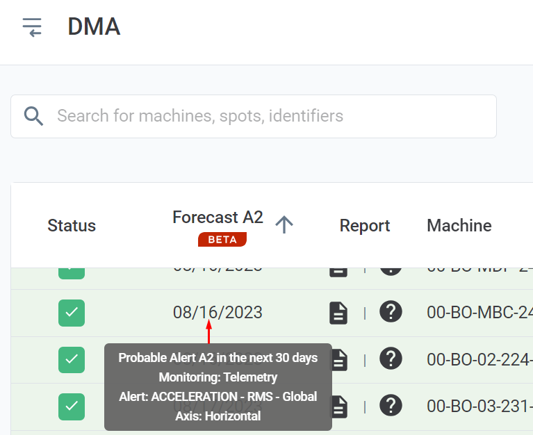
1) A2 forecast now appears as an event in your timeline
With this update, if the asset is expected to trigger an A2 alert within the next 30 days, the information will appear as an event on your timeline, making it easier to visualize and identify the forecast.
By the way…
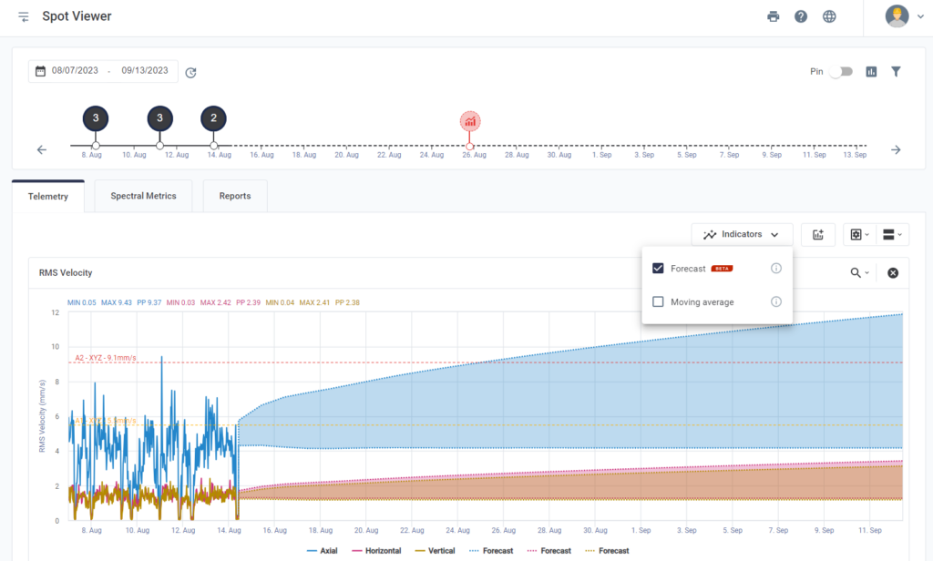
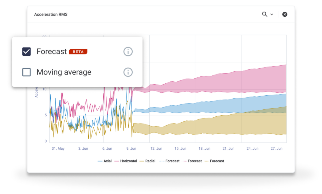
Are you already using the DynaPredict Web Platform forecasting tool?
It is a tool that allows users to manage maintenance actions for their assets in advance. With the forecast, you can view projections of telemetry graphs and spectral metrics and check the DMA to see if any future A2 alerts are expected, as in the image below. This ensures greater assertiveness and reduces the time the analyst needs to spend looking for points with a critical trend for analysis.
2) Spectral logarithmic scale
Logarithmic representation is an alternative way of visualizing spectra. It is mainly applicable in cases where very different magnitude values are expected to be displayed on the same graph. This tool will help you detect failures in two ways:
– Log X scale will help in spectra analysis, allowing low and high frequencies to be visualized together.
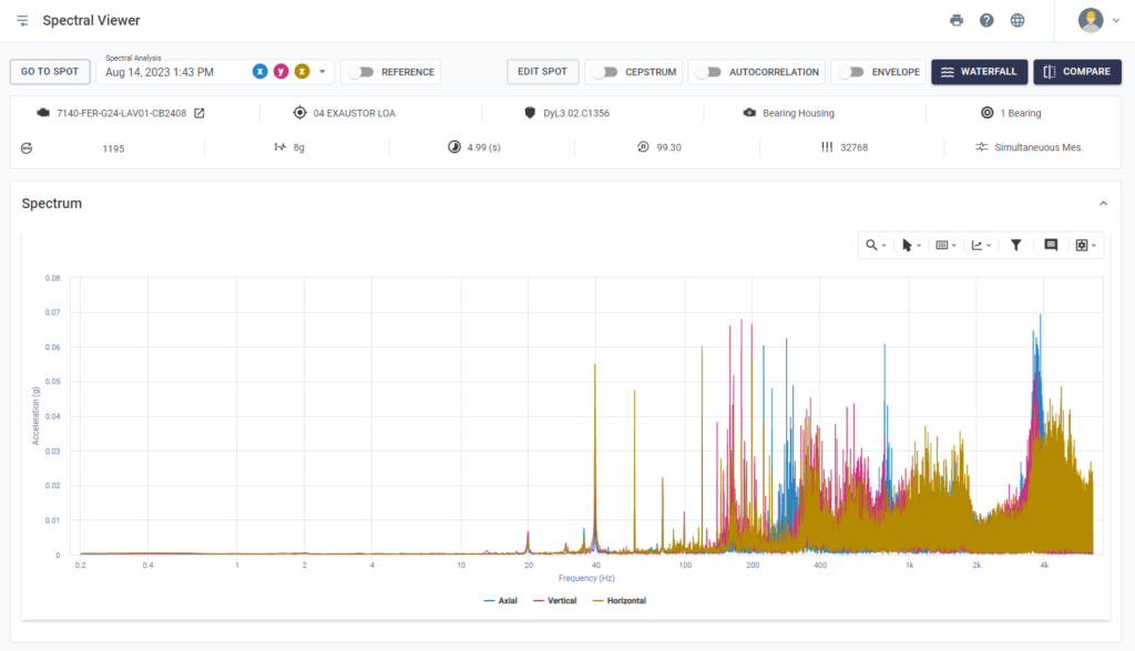
– Log Y scale will mainly help in the analysis of spectra that have peaks of great magnitude and elevations of the spectral carpet, which often remain unnoticed because of these peaks, but which can be analyzed together with the log Y visualization.
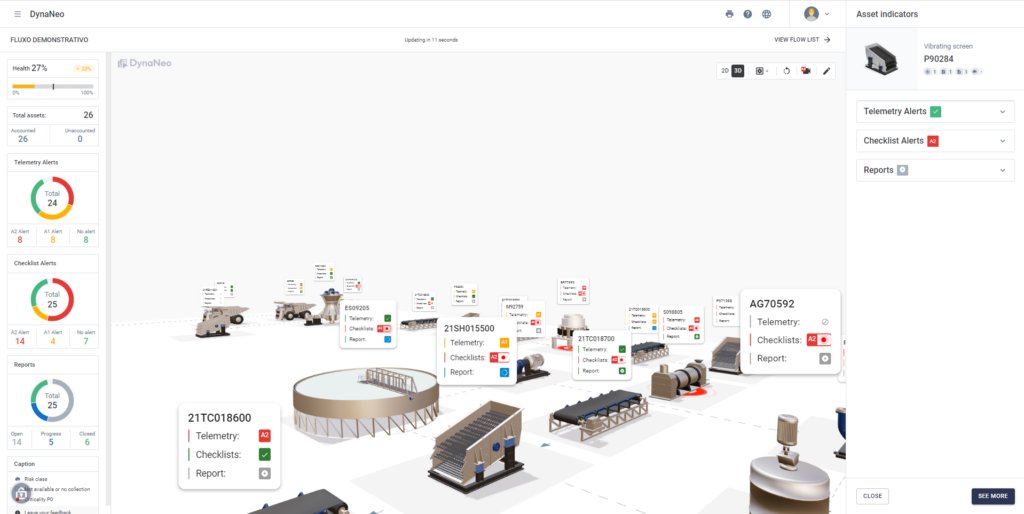
- 3D DynaNeo
Now, the DynaPredict Web Platform offers a 3D version of the DynaNeo tool. In other words, you can create much more intuitive dashboards, obtaining an immersive experience when viewing the assets installed in your plant. This makes it easier to identify alerts and speeds up the mapping and decision-making process.
WEB: May/2023
Always seeking to update its analysis tools and facilitate the use of the Web Platform, Dynamox has just released another series of new features.
Check out the main updates in the latest version below:
INTEGRATED MODULE
DynaNeo
PREDICTIVE MODULE
Forecast
New spectral metrics screen
SENSITIVE MODULE
Checklists
Dynaneo
Customize your company’s asset management process and have a more interactive analysis
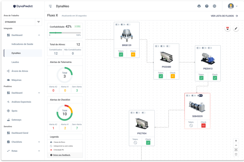
DynaNeo is a visual management dashboard, which combines information from the DynaPredict environment into an integrated visualization. The functionality allows the calculation of the reliability of a process based on the indicators of interest to the user. The DynaNeo is customizable, interactive, visual, and conclusive.
With DynaNeo, you can easily explain the maintenance process through visual management. With this solution, you can quickly find the alarmed assets and visualize the consequences of breakage or maintenance. In addition, it is possible to configure the relevant indicators for the application and set the desired reliability percentage.
Forecast
Project future spectral and telemetry alarms to schedule maintenance actions.
Spot Viewer and DMA now feature the Prediction tool, which will help you analyze your data more efficiently.
This tool allows you to project telemetry data and spectral metrics based on a recent history, allowing you to identify monitoring points that are evolving and schedule maintenance actions.
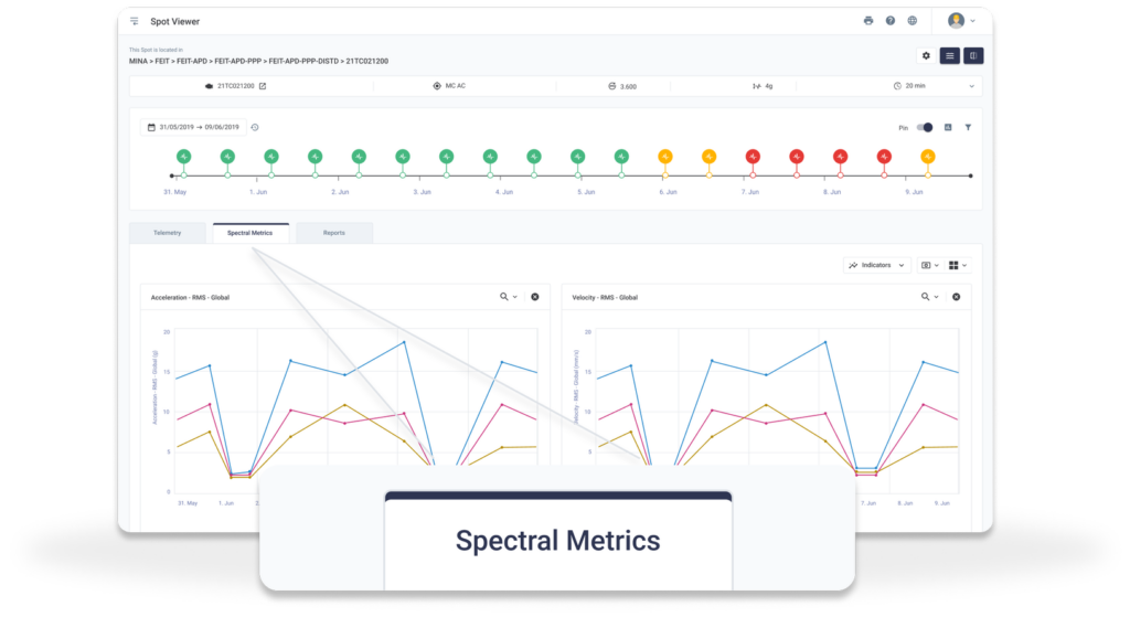
Spectral Metrics
Ensure a more complete analysis of the information.
The Spectral Trend screen has been renamed; it is now called Spectral Metrics. The data on the screen is still the same, it has just changed its access location and has improved data visualization.
The page is now integrated as a new tab in the Spot Viewer, offering the same telemetry-compatible features and tools.
It also allows visual customization of the graphs. This upgrade makes it easier to view the spectral data and provides a more complete analysis of the information, with all three tabs available in one place.
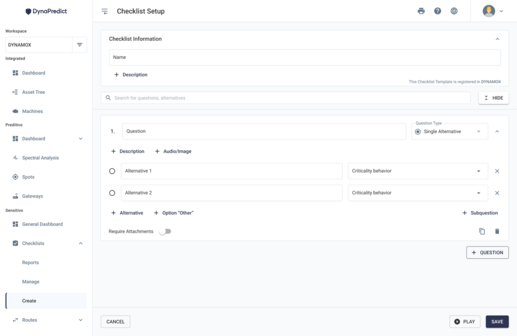
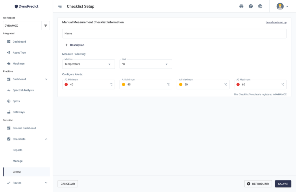
Checklists
Interface change for better usability
The checklists have been updated with a more visual interface, resulting in better usability. Checklist creation is centralized, bringing together the name and type screens with question settings on one screen.
Before creating a checklist, it is possible to get detailed information about the options available for each checklist type. The user can review the configuration steps and see how the checklist will look in the application.
The old Standard Checklist is now called Free Checklist, keeping all the previous functionalities. The user can create a checklist, assign a name, and configure the questions.
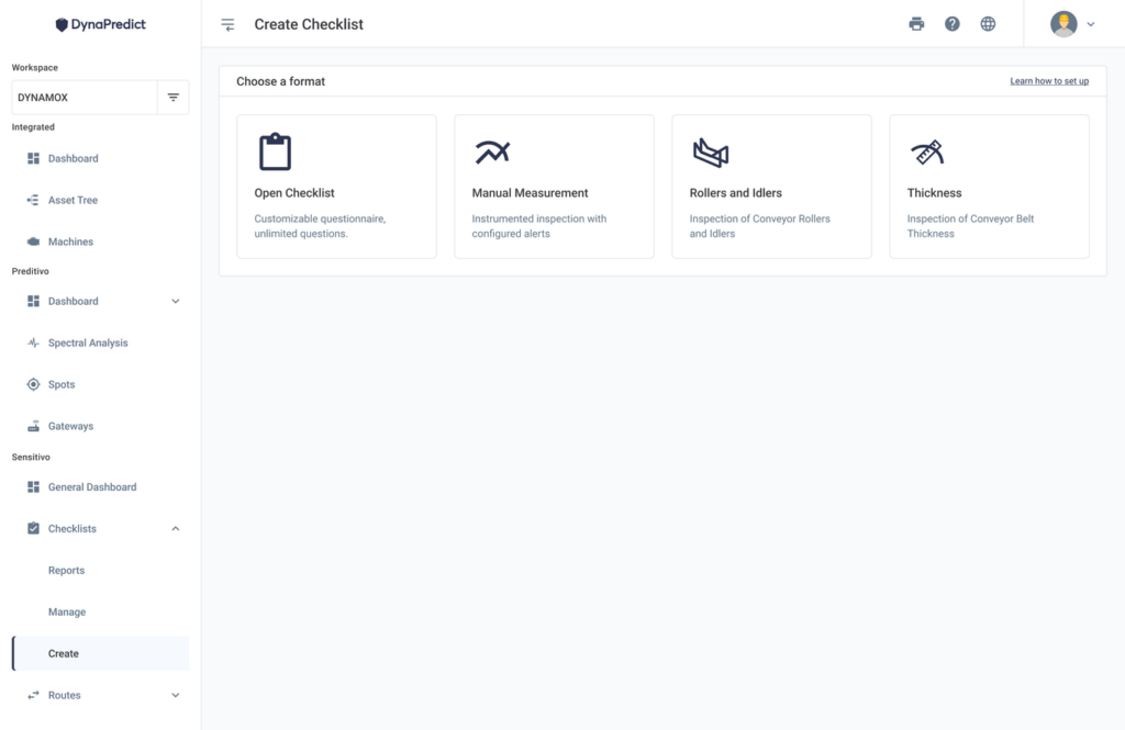
During the setup process, there is a new playback option. The play button is available in all stages, allowing the user to test the checklist execution and preview what it will look like before saving.
When adding a Free Checklist, the user can select whether the question will be single choice, multiple choice, or manual measurement. In addition, you can change the order of the question alternatives by clicking and dragging to the desired position (Drag&Drop).