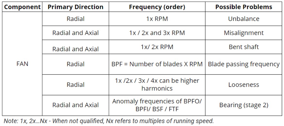
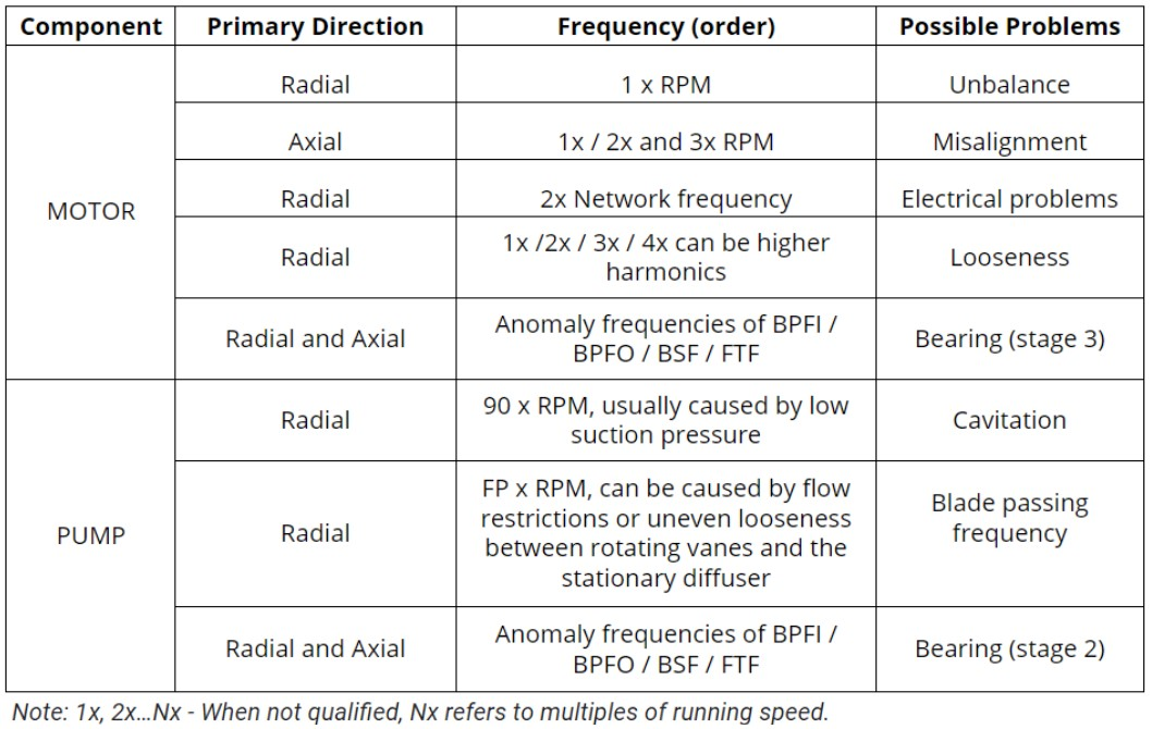
Vibrating Screens
Vibrating screens are used to separate materials according to their size and are especially important in mining processes. This machine basically consists of a motor, exciter mechanisms, bearings, screen mesh and vibration attenuators. It works by means of a precise vibratory movement with a suitable inclination angle, which provides benefits such as saving energy and reducing costs in the screening process.
Various components of a vibrating screen can fail, leading to repairs, downtime and various costs. The implementation of a continuous monitoring system for failure detection and other predictive maintenance strategies are fundamental for increasing the safety and reliability of this type of machinery.
Although the entire system has several vibration loads, which are inherent to the process or its components, it is still possible to relate these loads to specific parts of the equipment or the process that the equipment goes through. For example, harmonic loads are related to the vibrational isolation present in vibrating screens, or even transient vibrations can arise due to a loading impact/impulse on the screen.
In order to assertively monitor vibrational behavior, the installation of vibration sensors can become an important ally. However, when wired systems are installed in this type of machinery, they often result in high maintenance costs for cables and infrastructure. Thus, there are huge advantages to using wireless sensors, such as little or no maintenance costs, easy installation, automated and continuous monitoring (with the help of a gateway), among others.
To obtain good results with wireless vibration sensors, certain precautions must be taken, such as choosing a suitable sensor, mounting it correctly on the components to be monitored and setting an appropriate operating configuration.
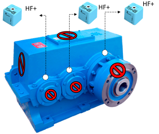
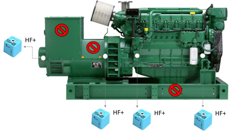
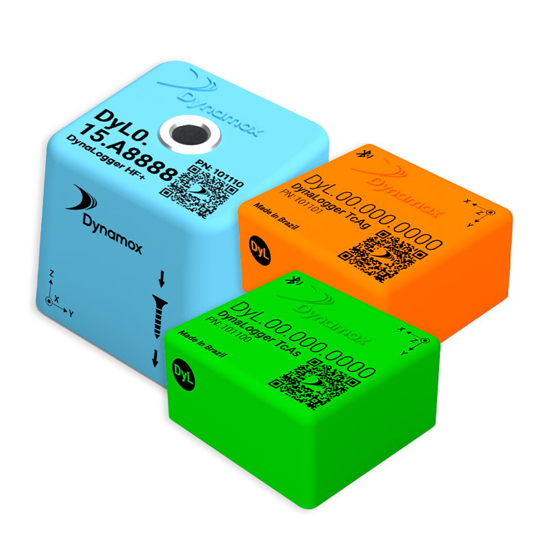
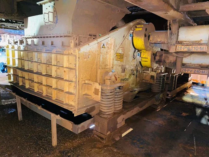
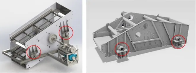
As a practical example, for a screen like the one in the figure below, driven by exciter boxes, we recommend installing HF+ sensors, measuring up to 13kHz (blue DynaLogger), for motors, bearing housings and exciters. For the spring bases, it is recommended to install TcAs sensors of up to 2.5kHz (green sensor).
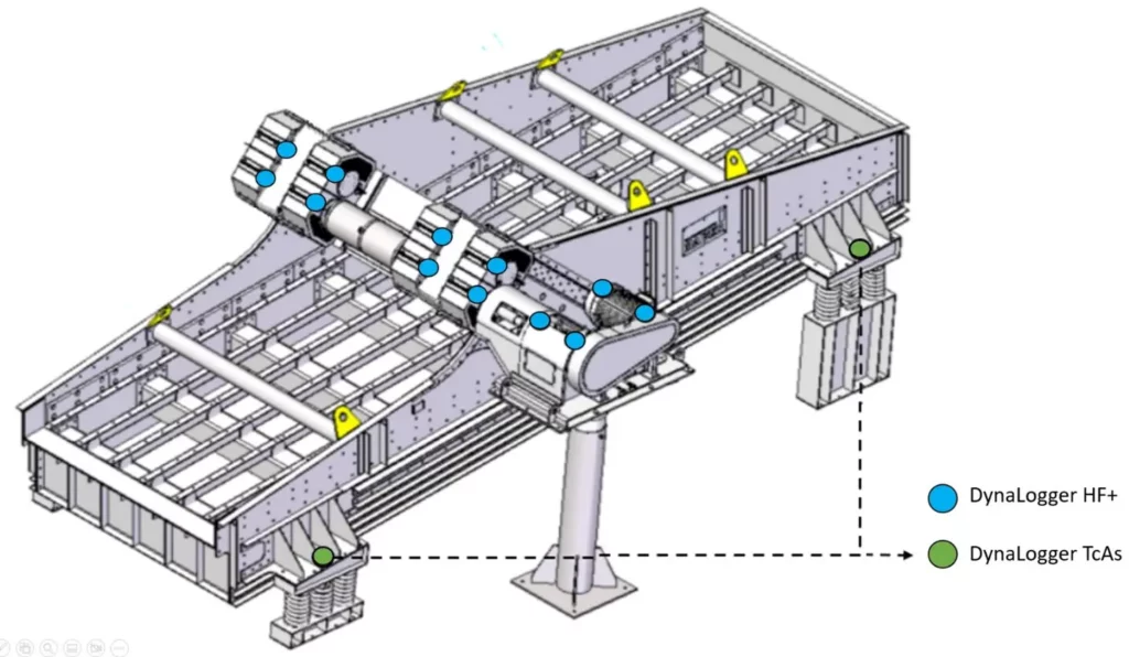
Figure: Indication of sensor mounting on vibrating screens
| Location on the screen | Number of DynaLoggers | DynaLogger |
| Motor | 2 | HF+ |
| Bearing housings | 2 | HF+ |
| Exciter 1 | 2 | HF+ |
| Exciter 2 | 2 | HF+ |
| Spring basis | 4 | HF+ or TcAs |
| TOTAL | 12 |
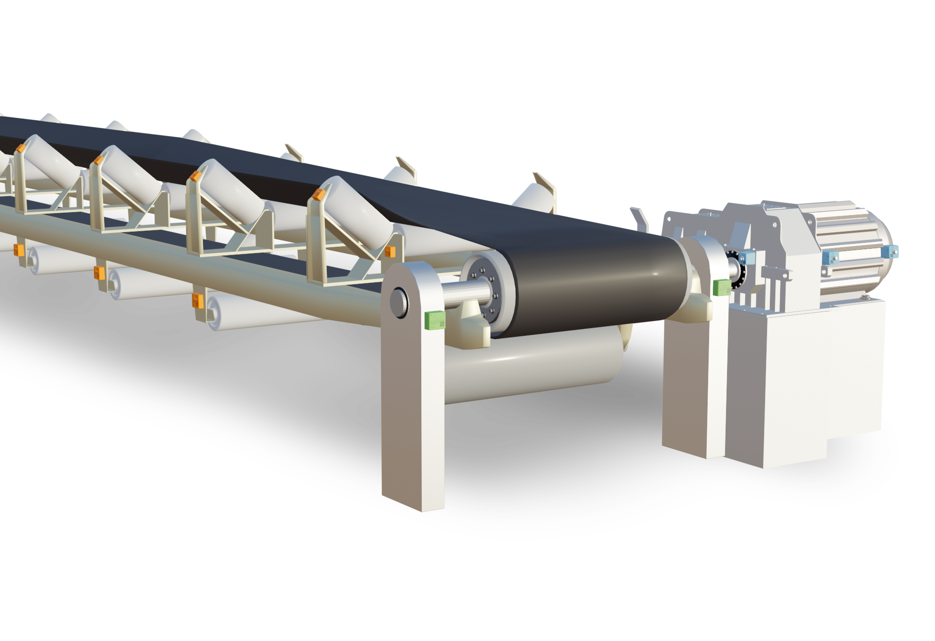
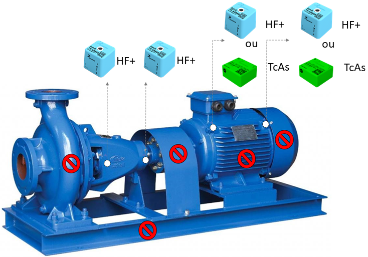
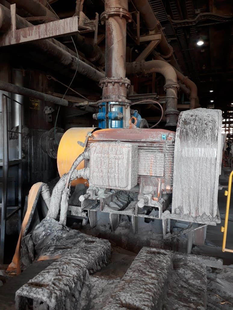
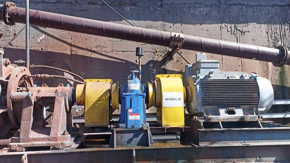
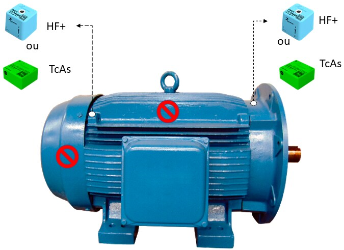
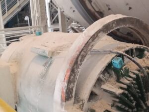
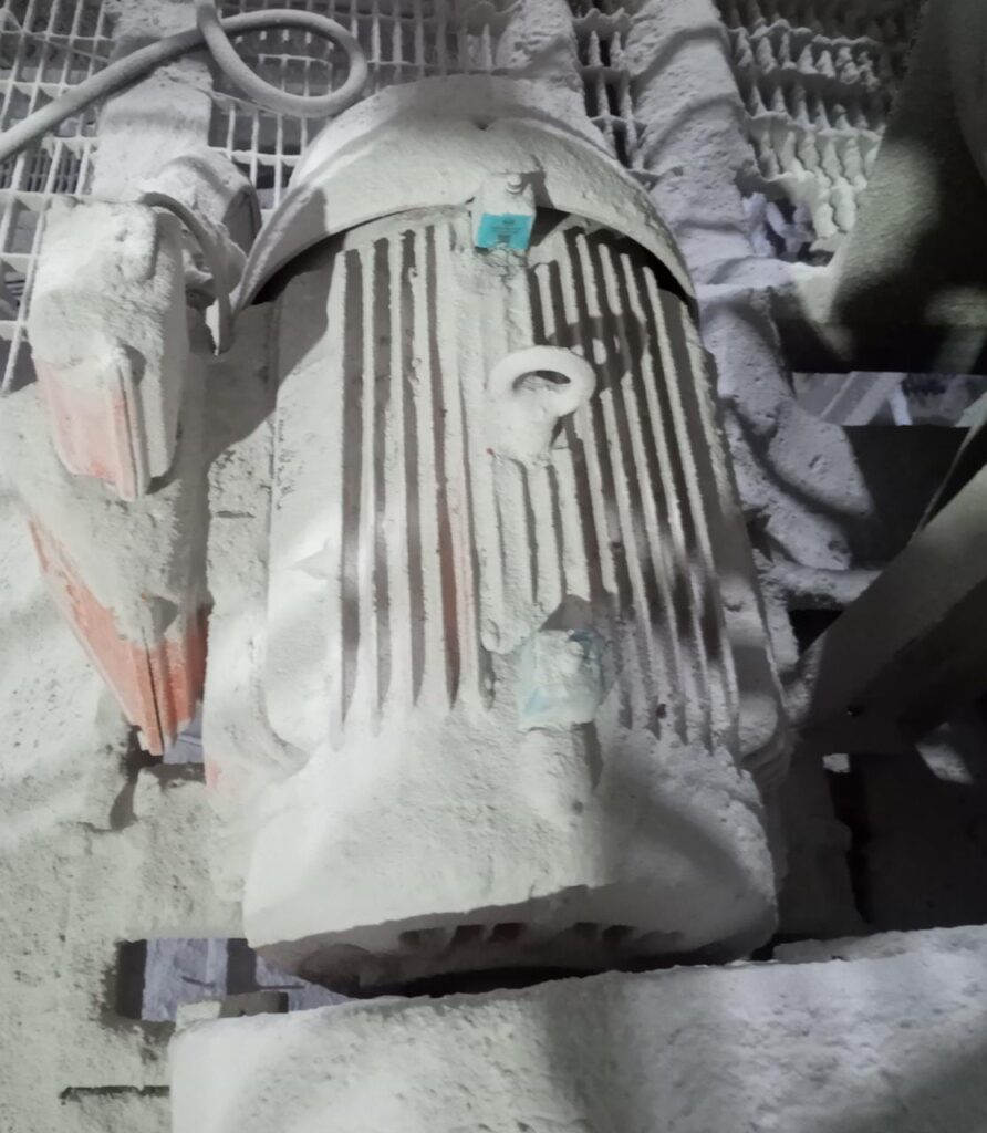
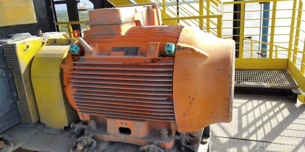
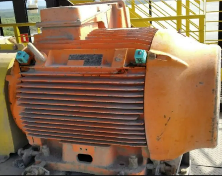
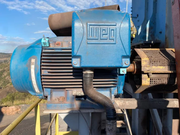
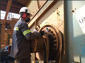
In general, when monitoring motors, we recommend using two sensors, one for the drive end (DE) and one for the non-drive end (NDE). For the exciter mechanisms, we recommend using a sensor for each bearing housing. A DynaLogger HF+ is recommended per exciter cell. In the case of external bearings, HF+ sensors are also used for each bearing housing. Below are some photos of the installation on these components.
Motors
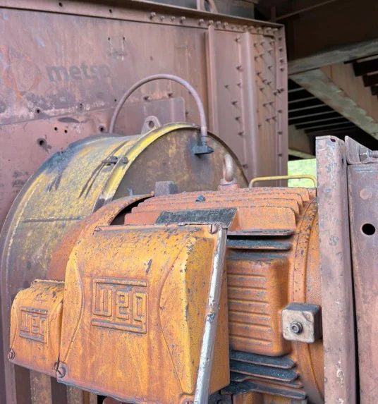
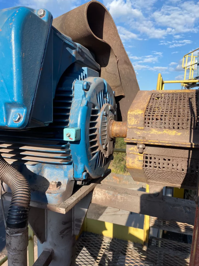
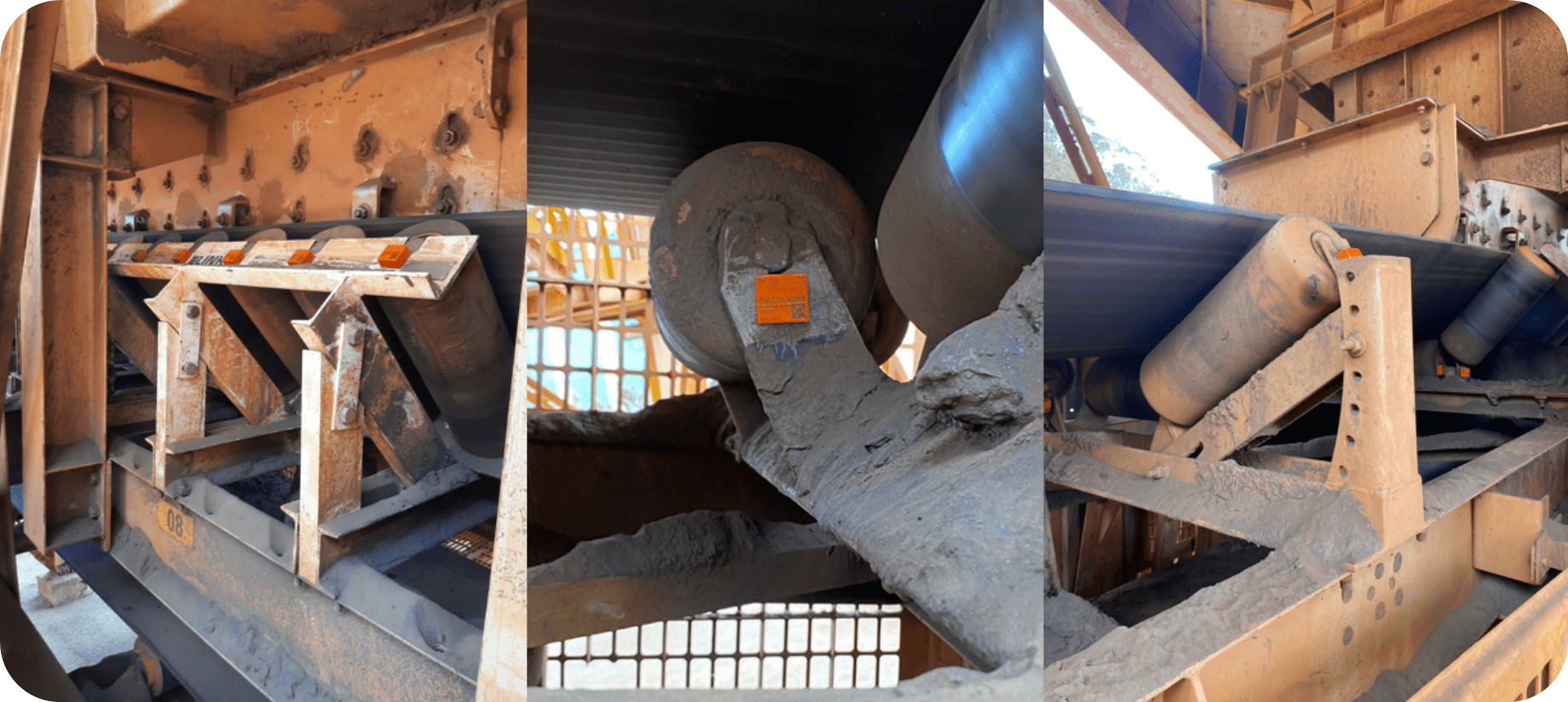
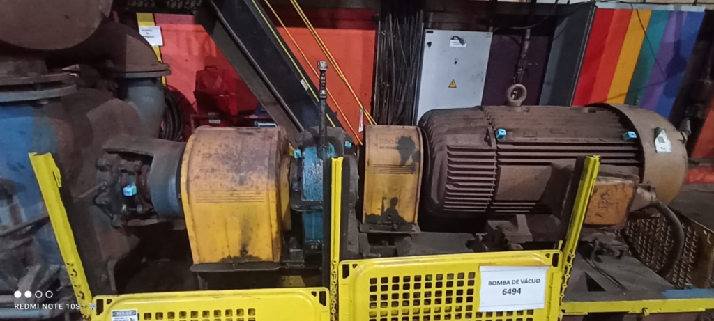
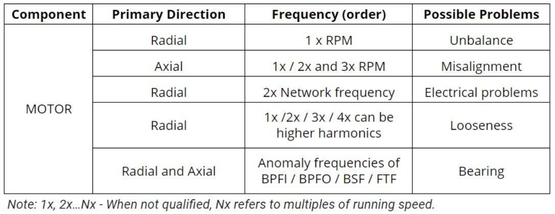
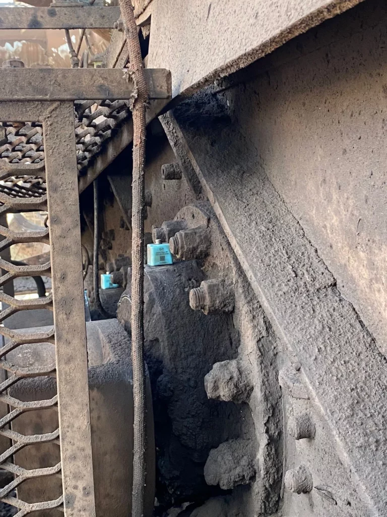
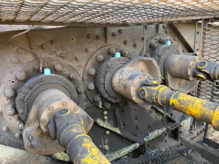
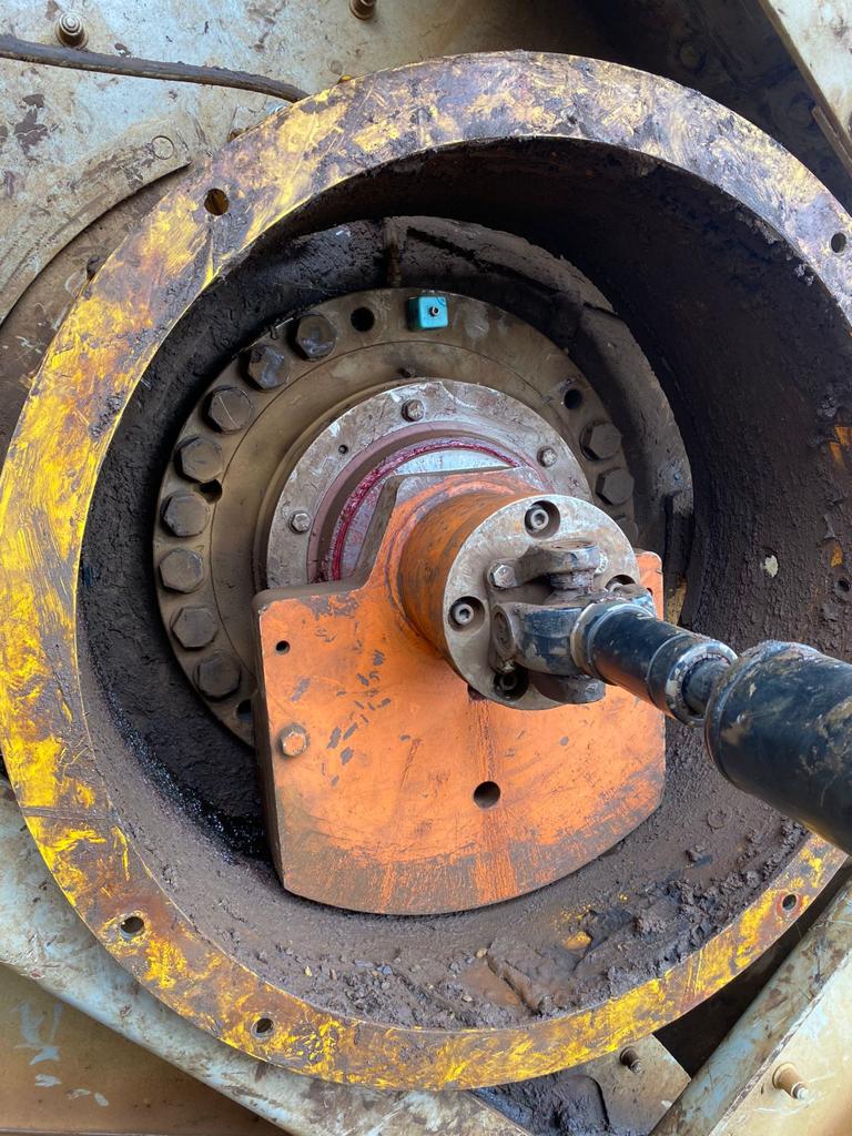
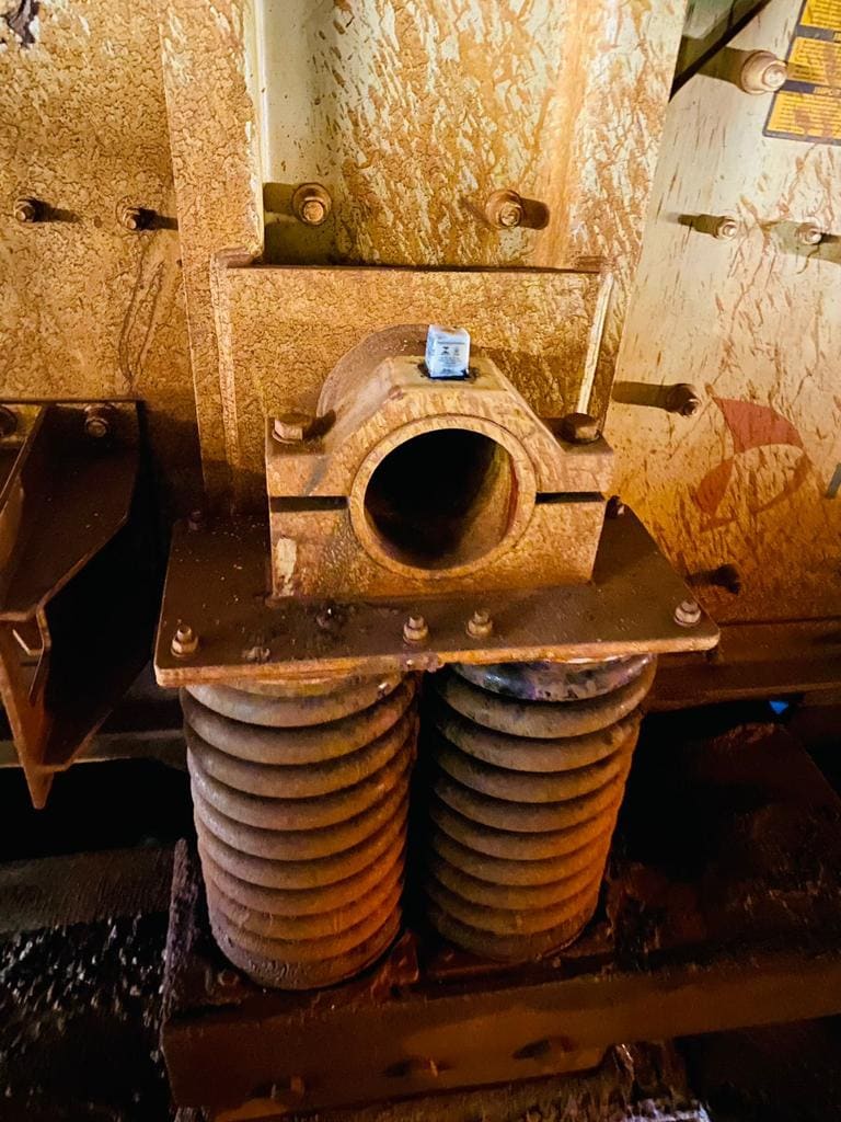
Circular exciter cells, exciters and bearing housings
In circular exciter cells, due to the casing, it is often not possible to mount the sensor directly on the component, so it is mounted as close as possible to the casing.
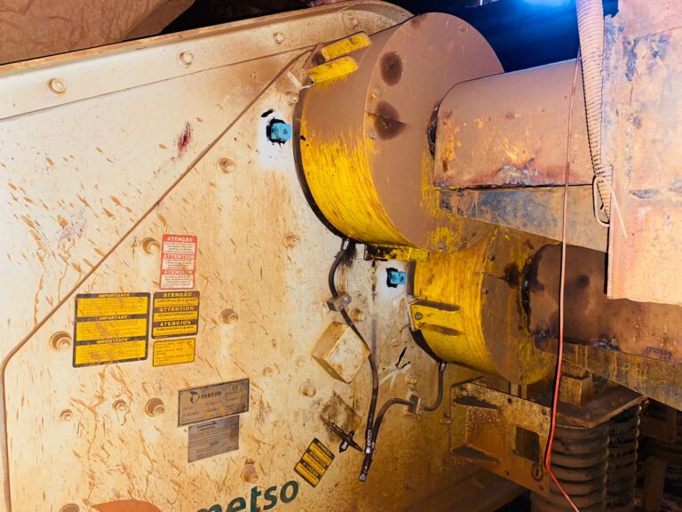
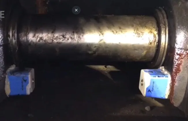
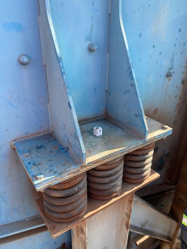
Spring bases
For the springs, it is recommended to install TcAs or HF+ sensors. Each of the spring bases should have a sensor installed in order to monitor the movement of the screen and compare the right and left sides, as well as the loading and unloading parts, in addition to the diagonal direction.
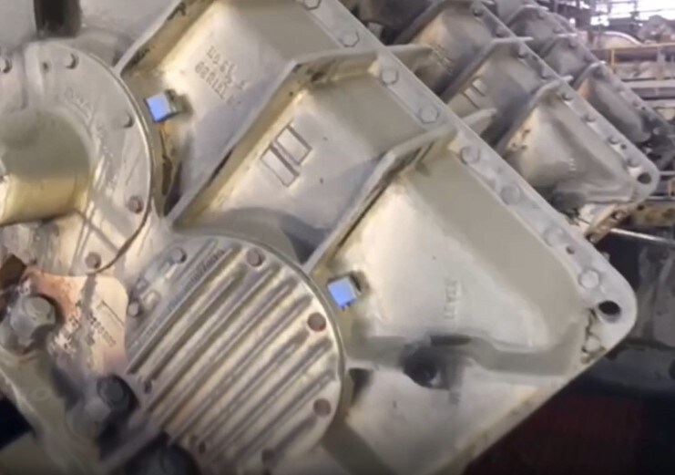
Field photos of sensors mounted at these locations:
It is worth mentioning that Dynamox’s sensors are IP 66 and IP 68 certified, guaranteeing sufficient robustness to be applied in environments with large amounts of particulates, high temperature and humidity, without compromising the quality of the data generated and without the need for maintenance or human intervention in collection.