Do the DynaLoggers have a warranty?
Yes, for a period of 1 year. Find out more here.
Yes, for a period of 1 year. Find out more here.
We suggest that you always have the updated version of the app. To do this, access the Google Play Store (Android) or App Store (iOS) and download the latest version.
The Web Platform is updated automatically, so no action is required.
No. The DynaLogger should be fixed on the machine to be monitored and configured to obtain measurements from that specific machine, thus generating a reliable history of data. In addition, many machines may need more than one point to be monitored, according to the need and degree of monitoring desired by your company. To find out more about installation and mounting of sensors, see “Mounting“.
Yes. In Brazil, the DynaLogger is ANATEL approved and INMETRO certified for Explosive Atmospheres/IP Code.
Outside of Brazil, the DynaLogger has the following certifications: FCC (United States), CE RED (Europe), IC (Canada) and RCM (Australia).
For more information, get in touch with our support team (support@dynamox.net)
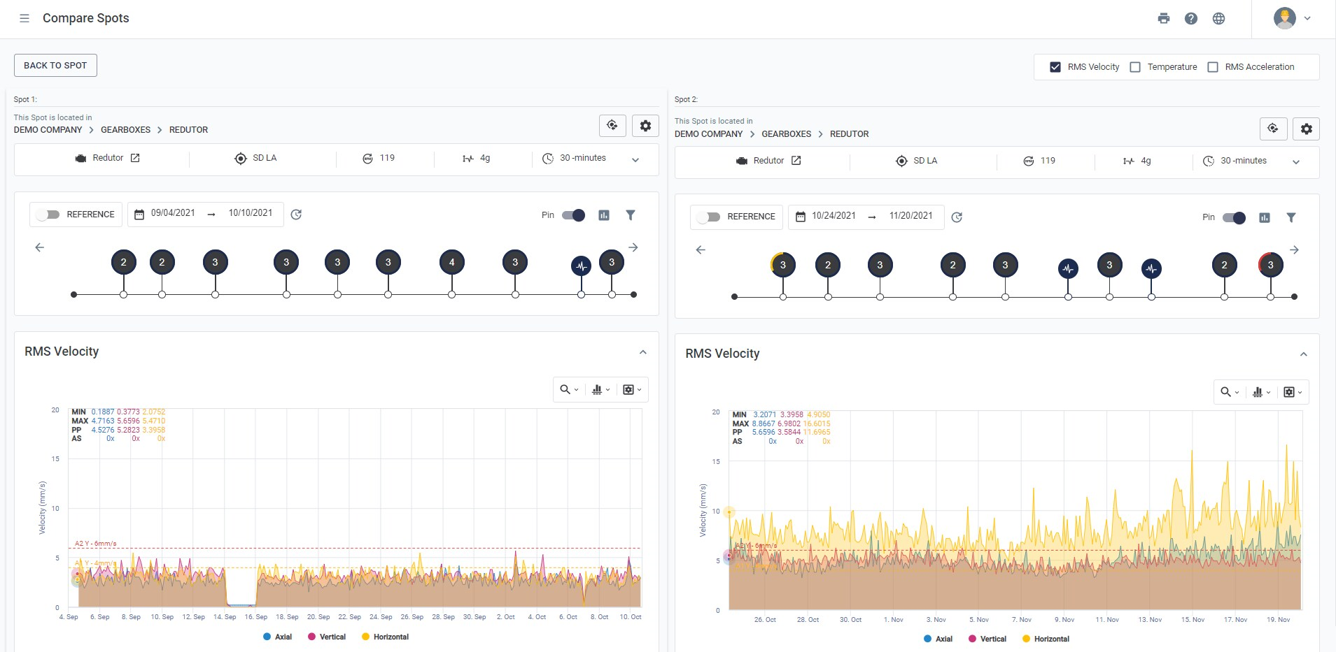
The Compare tool allows to compare continuous data from different time periods side by side.
The option is available in the upper right corner of the Spot Viewer screen.
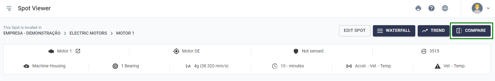
After selecting the desired Spot, the data will appear side by side. You can change the desired period on each side.
The mounting method is one of the most critical factors for measuring vibration. A rigid attachment is essential for avoiding false readings and data.
Depending on the type of machine and position, different mounting methods could be used. To get the best results from the DynaPredict solution, screw mounting is recommended. To do this, the installation surface must be prepared first, as described below.
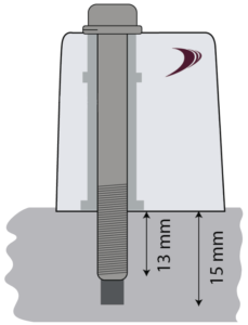
Before choosing this mounting method, check that the installation point on the equipment is thick enough for drilling. If so, follow the step-by-step procedure below
Drill a threaded hole with an M6x1 threaded tap (supplied in kits with 21 DynaLoggers) at the point of measurement, at least 15mm deep.
Using a wire brush or fine sandpaper, clean any solid particles and scale on the surface of the measurement point.
After surface preparation, the DynaLogger attachment process should begin.
Position the DynaLogger at the measurement point so that the base of the device is completely supported by the installation surface. Once this is done, tighten the screw and spring washer* supplied with the product, applying a tightening torque of 11Nm.
* Use of the spring washer is critical to achieving reliable results.
Preparation of the Adhesive
The most suitable adhesives for this type of fixation, according to tests conducted by Dynamox, are the Scotch Weld DP-8810 or DP-8405 structural adhesives from 3M. Follow the preparation instructions described in the manual of the adhesive itself.
Dynalogger Attachment
Apply the glue so that it covers the DynaLogger’s entire bottom surface, completely filling the center hole. Apply the glue from the middle to the edges.

DynaLogger installation with glue fixation
Press the DynaLogger on the measuring point, orienting the axes (drawn on the product label) in the most appropriate way.
Wait for the curing time indicated in the manual of the glue manufacturer itself, in order to guarantee the good fixation of the DynaLogger.
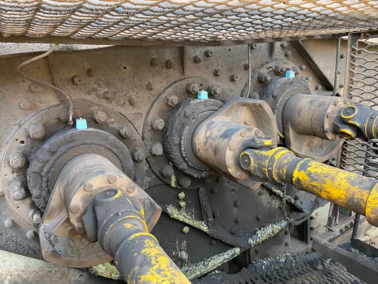
Vibrating screens are used to separate materials according to their size and are especially important in mining processes. This machine basically consists of a motor, exciter mechanisms, bearings, screen mesh and vibration attenuators. It works by means of a precise vibratory movement with a suitable inclination angle, which provides benefits such as saving energy and reducing costs in the screening process.
Various components of a vibrating screen can fail, leading to repairs, downtime and various costs. The implementation of a continuous monitoring system for failure detection and other predictive maintenance strategies are fundamental for increasing the safety and reliability of this type of machinery.
Although the entire system has several vibration loads, which are inherent to the process or its components, it is still possible to relate these loads to specific parts of the equipment or the process that the equipment goes through. For example, harmonic loads are related to the vibrational isolation present in vibrating screens, or even transient vibrations can arise due to a loading impact/impulse on the screen.
In order to assertively monitor vibrational behavior, the installation of vibration sensors can become an important ally. However, when wired systems are installed in this type of machinery, they often result in high maintenance costs for cables and infrastructure. Thus, there are huge advantages to using wireless sensors, such as little or no maintenance costs, easy installation, automated and continuous monitoring (with the help of a gateway), among others.
To obtain good results with wireless vibration sensors, certain precautions must be taken, such as choosing a suitable sensor, mounting it correctly on the components to be monitored and setting an appropriate operating configuration.
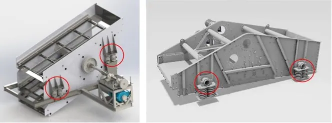
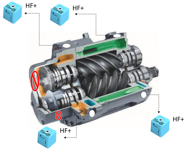
As a practical example, for a screen like the one in the figure below, driven by exciter boxes, we recommend installing HF+ sensors, measuring up to 13kHz (blue DynaLogger), for motors, bearing housings and exciters. For the spring bases, it is recommended to install TcAs sensors of up to 2.5kHz (green sensor).
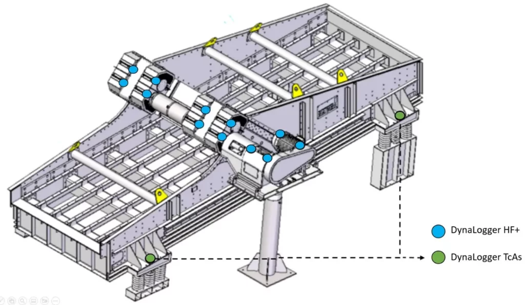
Figure: Indication of sensor mounting on vibrating screens
| Location on the screen | Number of DynaLoggers | DynaLogger |
| Motor | 2 | HF+ |
| Bearing housings | 2 | HF+ |
| Exciter 1 | 2 | HF+ |
| Exciter 2 | 2 | HF+ |
| Spring basis | 4 | HF+ or TcAs |
| TOTAL | 12 |
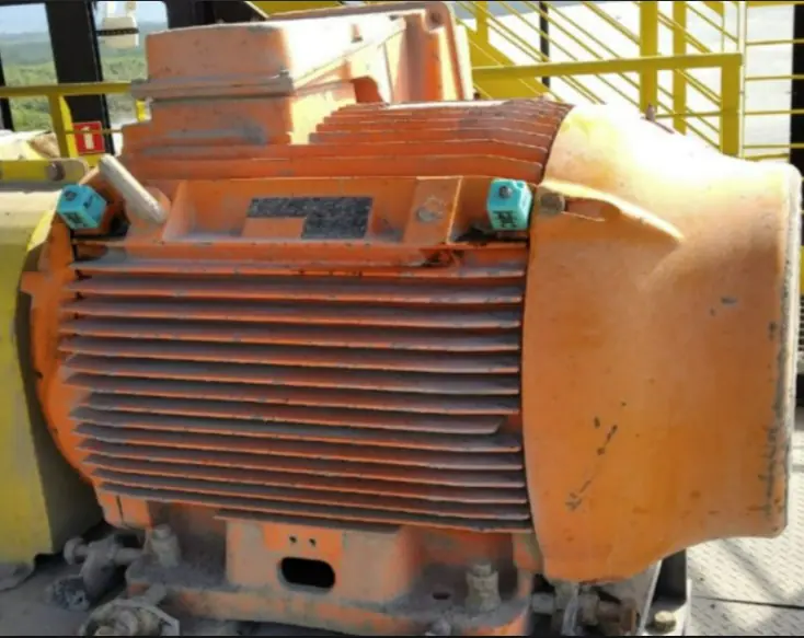
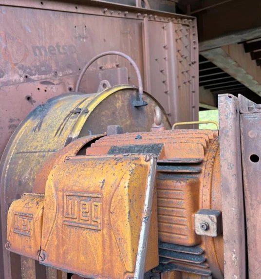
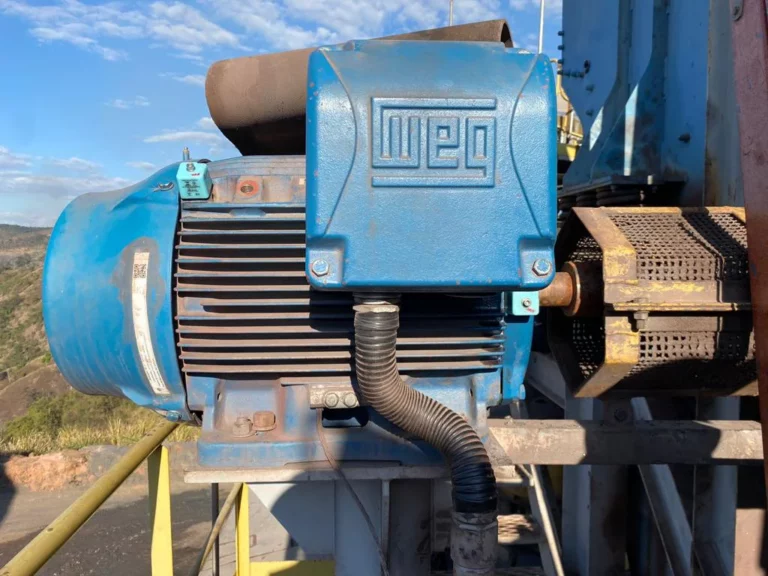
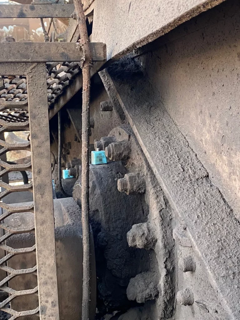
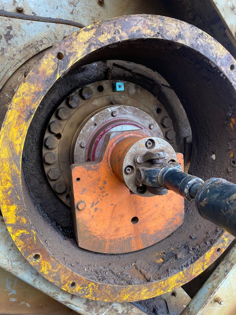
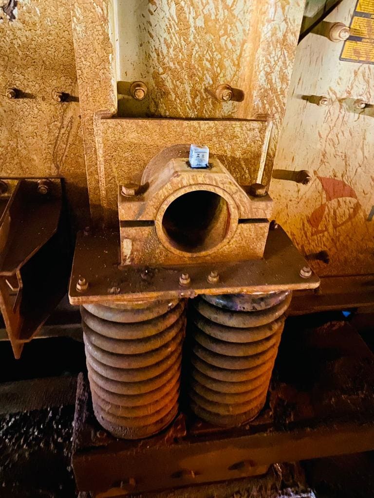
In general, when monitoring motors, we recommend using two sensors, one for the drive end (DE) and one for the non-drive end (NDE). For the exciter mechanisms, we recommend using a sensor for each bearing housing. A DynaLogger HF+ is recommended per exciter cell. In the case of external bearings, HF+ sensors are also used for each bearing housing. Below are some photos of the installation on these components.
In circular exciter cells, due to the casing, it is often not possible to mount the sensor directly on the component, so it is mounted as close as possible to the casing.
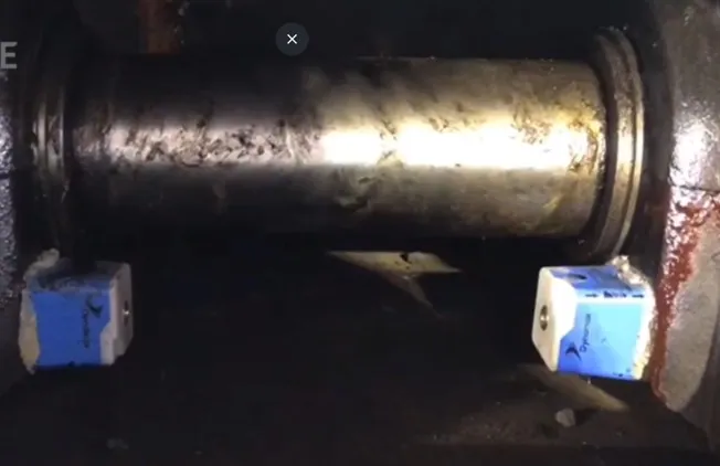
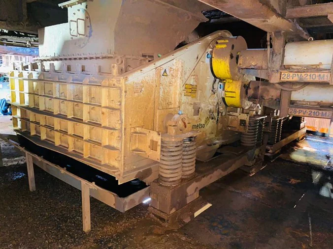
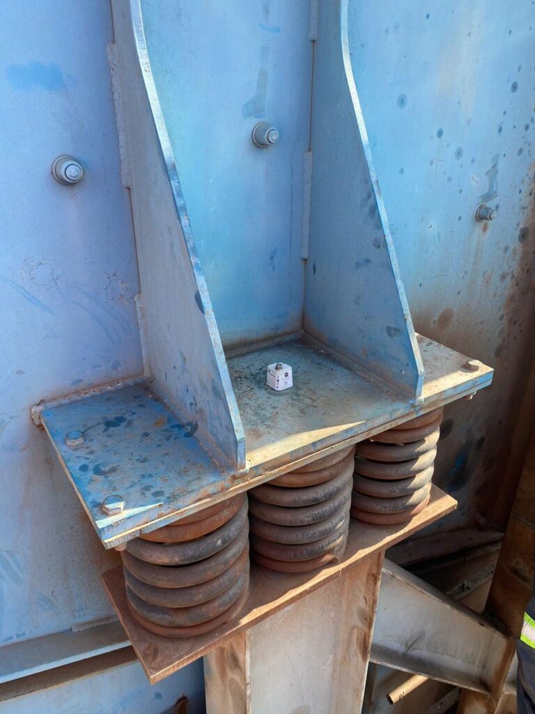
For the springs, it is recommended to install TcAs or HF+ sensors. Each of the spring bases should have a sensor installed in order to monitor the movement of the screen and compare the right and left sides, as well as the loading and unloading parts, in addition to the diagonal direction.
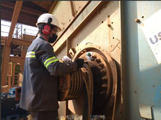
Field photos of sensors mounted at these locations:
It is worth mentioning that Dynamox’s sensors are IP 66 and IP 68 certified, guaranteeing sufficient robustness to be applied in environments with large amounts of particulates, high temperature and humidity, without compromising the quality of the data generated and without the need for maintenance or human intervention in collection.
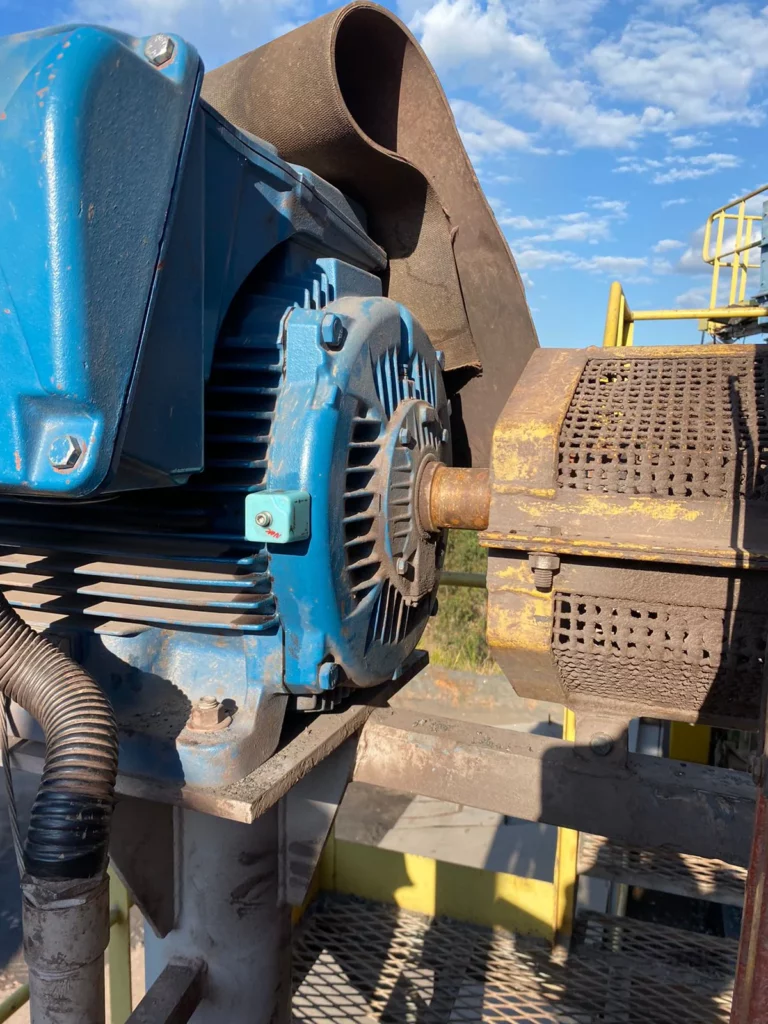
Conveyor belts are widely used in the transportation and material movement in diverse production processes. Generally, the equipment has a constant flow, moving materials from one point to another of the production process. The equipment is basically composed of motors, gearboxes, pulleys and their respective bearing casings.
The motor is responsible for activating the machinery that, due to its low operation speed and high loads, requires a coupled gearbox. Motors and gearboxes have already been specifically addressed before, so we will give more attention to the conveyor belt pulleys in this article.
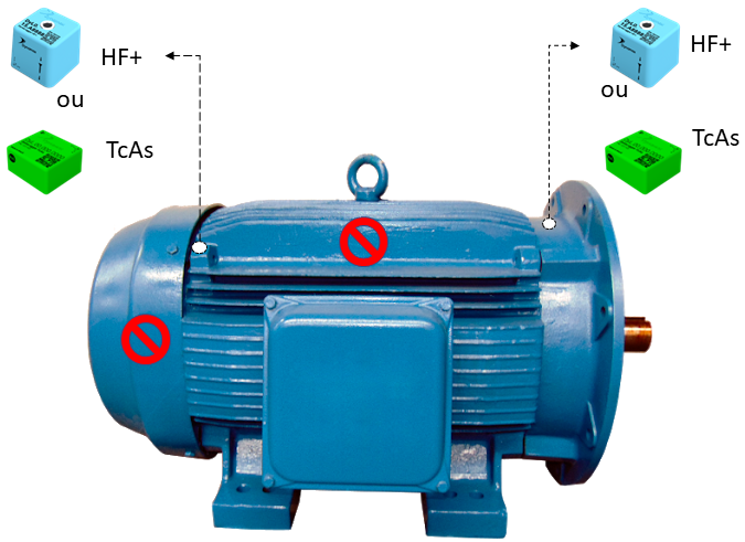
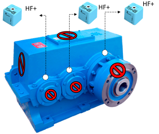
Figure 1: Positioning and sensor model indication for motors and gearboxes
The pulleys are responsible for activation, return, stretching and belt back, depending on their position on the equipment. All pulleys are fixed to the equipment structure by means of bearing housings. The bearing housings, in turn, consist basically of bearings, bushings and nuts, and can be manufactured with a variable number of rolling elements, sizes, formats, etc.
Keeping bearing casings in good operating condition is an essential task for safety and good performance of the production process. The most common bearing failure modes are linked to the following causes:
These faults can generate defects in the cage, balls or rollers, inner and outer races.
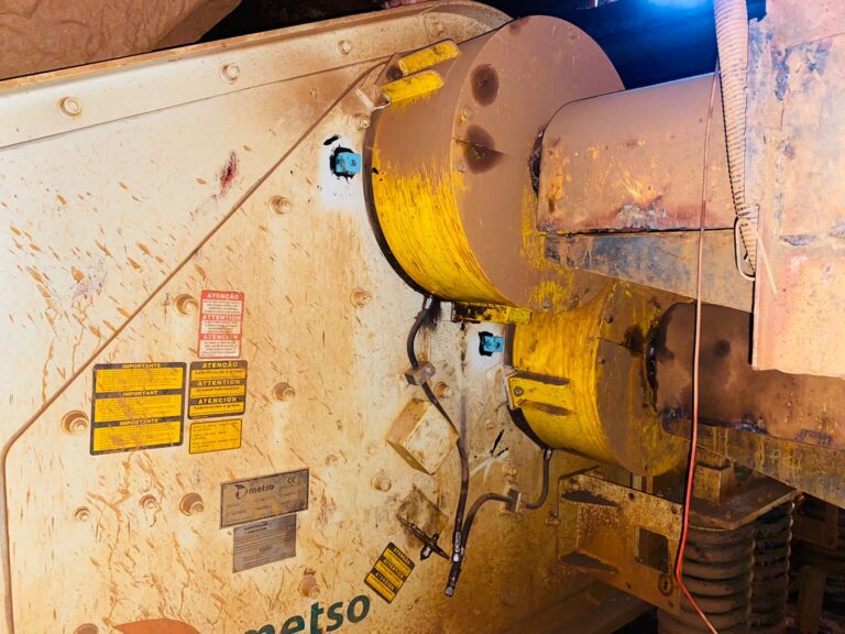
These defects are identified through predictive maintenance, using vibration analysis. Two sensor models can be used to successfully monitor pulley bearings: 1) DynaLogger TcA+ with maximum frequency of 1KHz and 2) DynaLogger HF with maximum freq. of 6.4 KHz. Both models are IP66 and IP68 certified, being impermeable to dust and resistant to liquids, making it possible to install near the belt. The sensor must be placed parallel to the rotation axis, and avoiding flexible bases and covers.
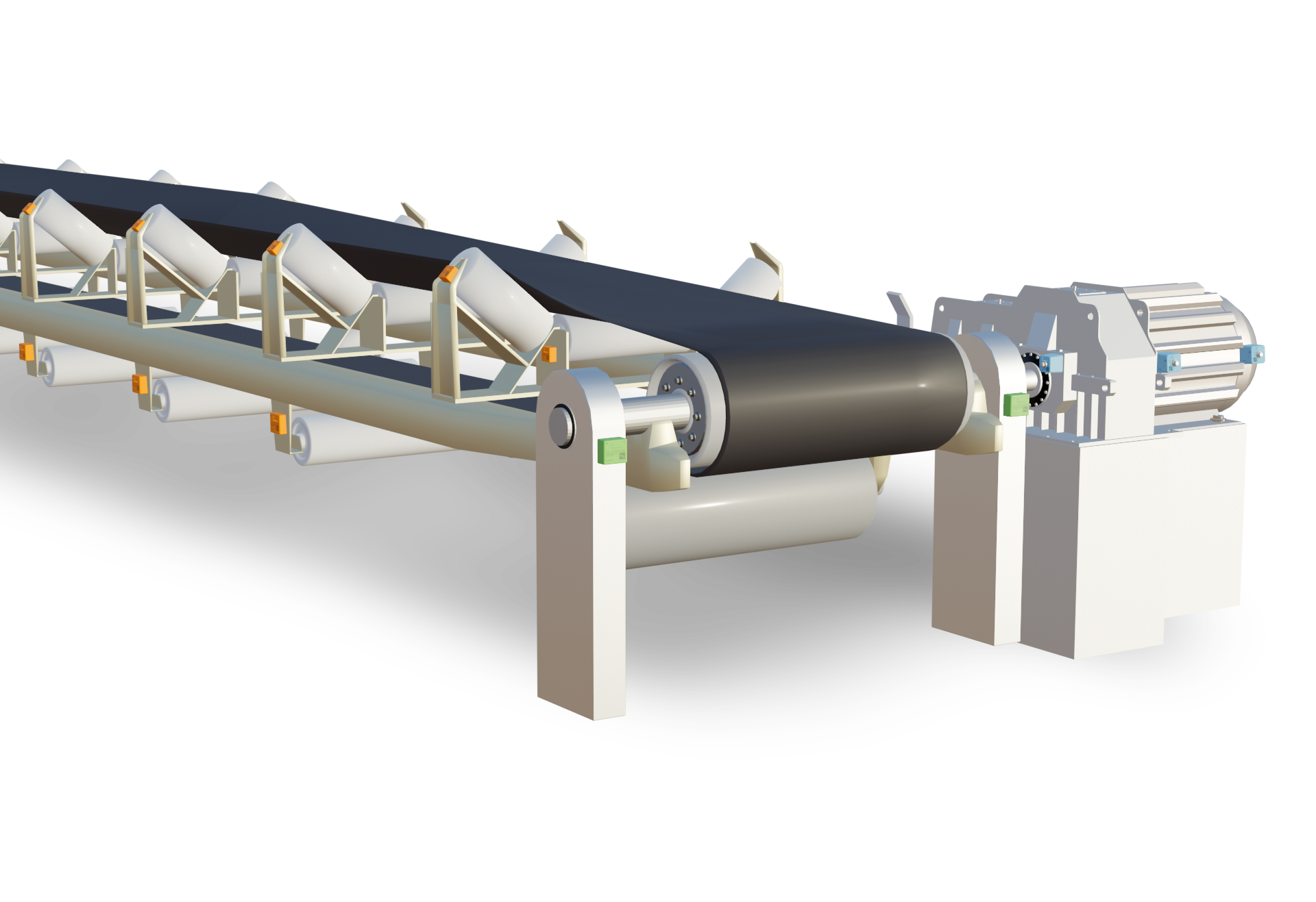
Figure 2: Conveyor belt and bearing housing of the drive pulley in detail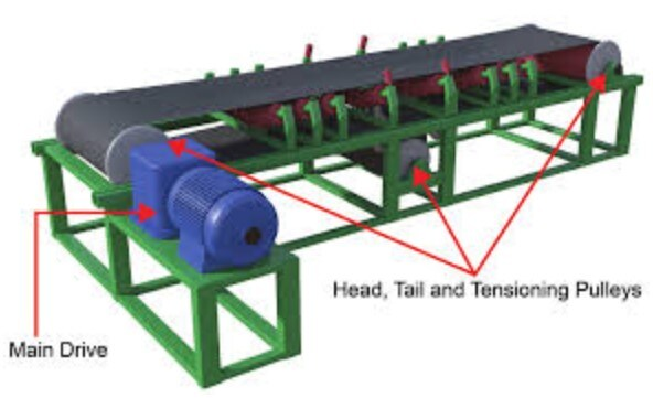
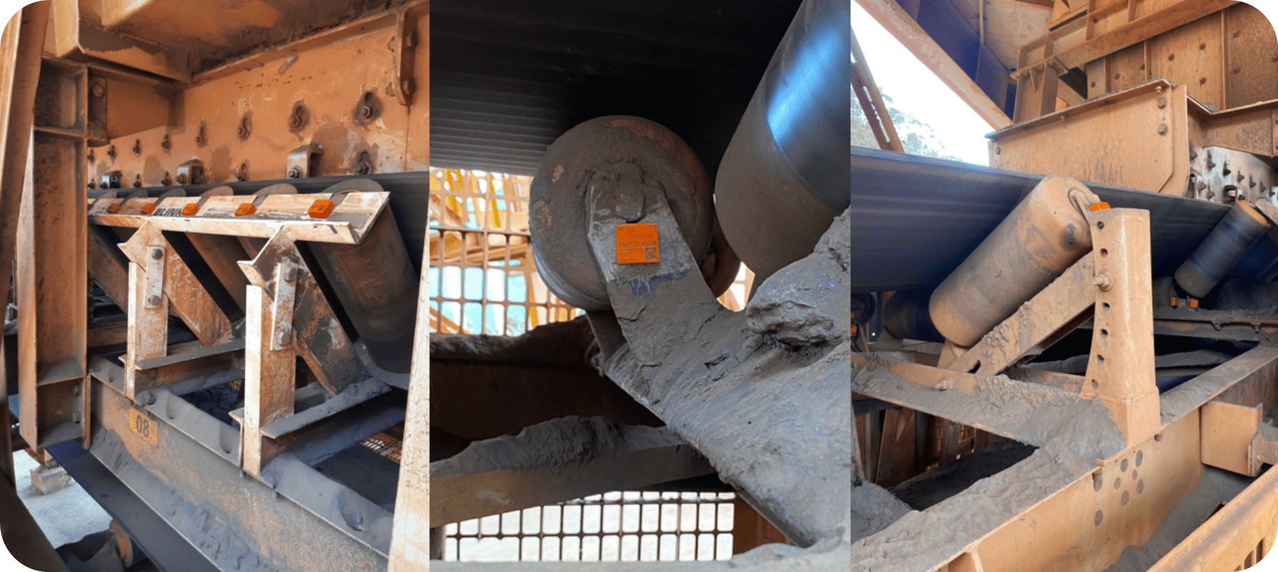
Figure 3: Conveyor schematic with application of DynaLoggers HF sensors in pulley bearing housing
In order to demonstrate the good use of sensors in conveyor belt pulleys let’s take a brief example.
Example: Fault monitoring appearing in the frequency of the outer race (highlighted in the green lines) of the 23152 CCK/W33 bearing with 84 RPM.
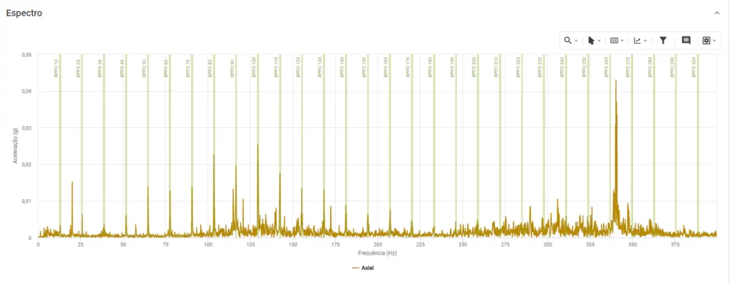
Figure 4: Fault spectra on bearing outer race
Compressors are widely used in industrial processes to compress air and other types of gases. These machines have a wide range of applications in industries, going from compressed air supply for general applications to very specific ones, such as cooling of cold rooms in food processing industries. As equipment that generally work with high speeds and small clearances between its components, constant monitoring of this type of machine is recommended and can assist in anticipating potential faults.
One of the predictive techniques that can be used for compressor monitoring is vibration analysis. Manufacturers commonly inform the monitoring spots on this type of machine. In general, the monitoring spots are indicated on the compressor input shaft (as close as possible to the gears and bearings), as shown in the figure below. DynaLoggers HF sensors are the most recommended for this task, since the compressors generally operate at high speed and their faults usually appear at higher frequencies. If vertical mounting is not possible, horizontal spots can be chosen.
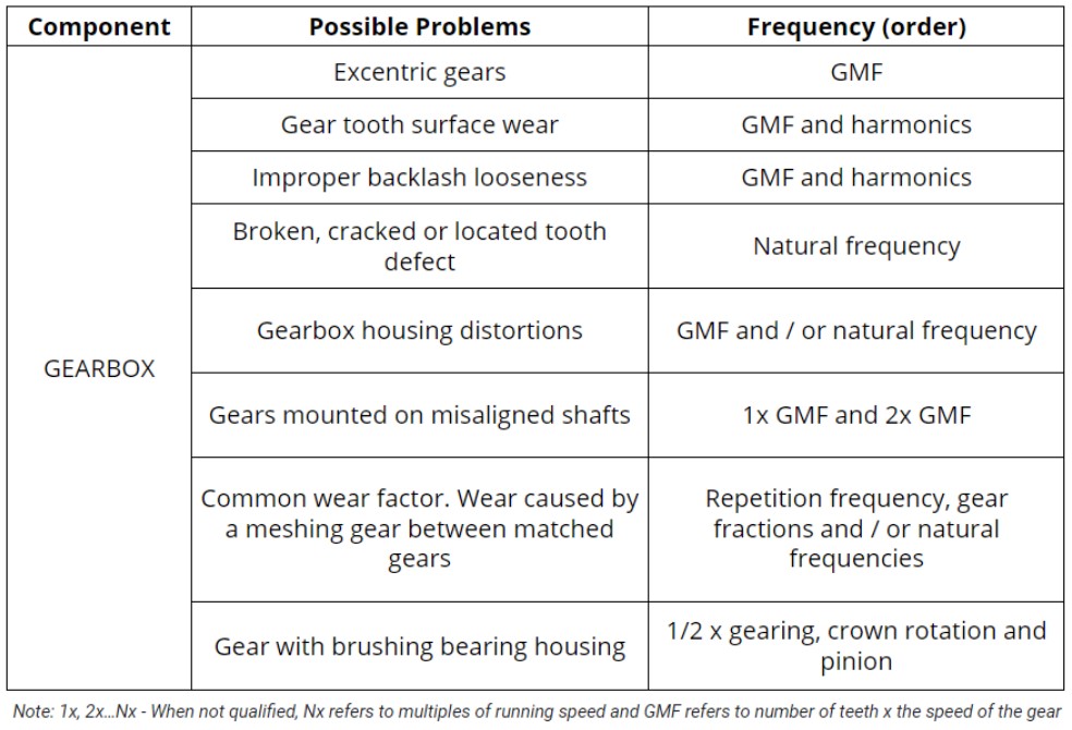
Gearboxes are used to increase or decrease the speed of a drive system or simply change the direction of rotation. A variety of problems in this type of system can be detected by vibration analysis, such as:
One of the main frequencies of interest when evaluating the integrity of the gears will be the gear meshing frequency (GMF = number of teeth X RPM), mainly monitoring the frequency amplitude increase and the relationship with its harmonics. However, it is important to note that the GMF, by itself, is not a fault or defect frequency. All gears generate frequencies of a certain amplitude. In addition, all gearing frequencies have sidebands of some amplitude. Thus, the analysis must be based on prior knowledge of the breadth of healthy machinery and must be carefully analyzed by vibration analysts.
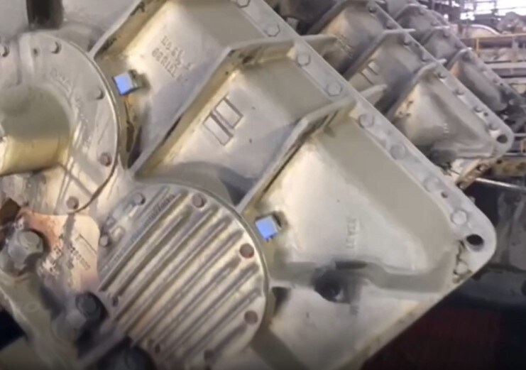
More specifically, a reduction set is composed of 4 main components
It is common for analysts and maintenance managers to be concerned with checking vibration data only for the set of gear meshes and often end up ignoring the bearings. However, in the event that one of the bearings fails, the entire system will be compromised, possibly even causing damage to the gear set.
With the implementation of the Dynapredict Solution, it is possible to continuously monitor the amplitude evolution in the frequencies connected to the GMF , as well as bearing defects. In order to have greater precision and reliability of the acquired data, it is recommended to install the DynaLogger HF sensor model in each bearing present in the gearbox. Still with regard to sensor mounting, it is indicated to avoid sensor positioning on screwed covers and preferably choose rigid spots at the housing, always as close as possible to the element to be monitored.

(Sensors shall be mounted on both sides of the equipment)
Table 1 – Typical fault frequency and its causes