Web: June/2 | 2026
Hello,
We’ve prepared this email to keep you up to date with the improvements and features we’ve just released on the Dynamox Platform.
Check out what’s new and make the most of the updates!
Shall we get started?
__________________________________________
1. New Asset list: Everything in a single view
Less time searching, more time analyzing. We transformed the old Machines screen into the new Asset List, designed to offer maximum visibility and speed when searching for information.
Unified View: Now, Machines, Subsets, and Components appear in a single list, eliminating the need to navigate deep into the tree to find what you need.
Visual Context: We added 3D models representing the type of each asset and new columns such as “Location” and “Configured at”.
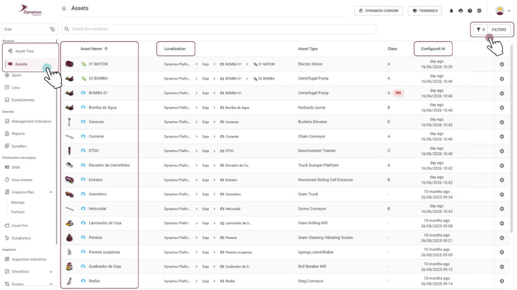
Advanced Filters and Infinite Table: Find assets instantly with new filters and fluid navigation, without switching pages.

The real benefit: Gain operational speed and total control over your asset park, in addition to quickly identifying configuration gaps.
___________________________
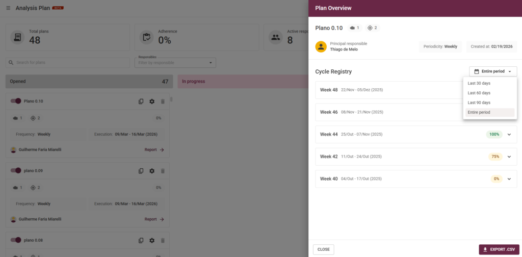
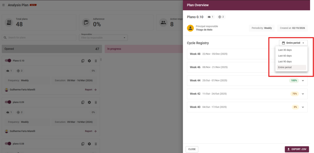
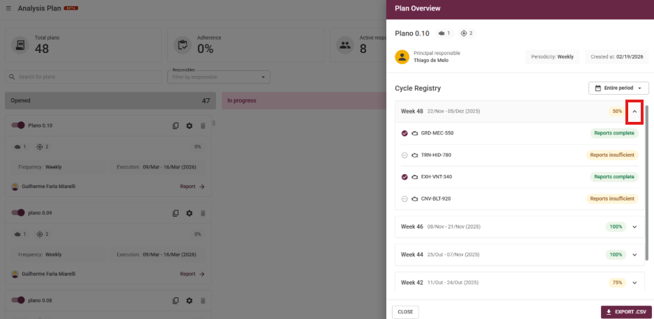
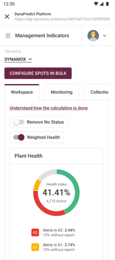
2. Analysis Plans: More visibility and realistic deadlines
We improved the experience for those who execute and manage analysis plans, combining quick visual information with time management that respects your planning.
Evolution of the Report Indicator: The status icon in the execution tree is now smarter. Instead of showing just the current cycle, it reflects the condition of the last report performed on the spot (within a 90-day window). If the report is older, the icon remains empty, but simply hovering the mouse will show how many days ago the last analysis was registered.

Deadlines that match your pace: The time to complete the analyses is now exactly equal to the plan’s periodicity. If the plan is biweekly, you have 14 days; if it’s monthly, you have the entire month. This ensures that the adherence rate is calculated in a much fairer and more realistic way.
Smart Status and Transition: With this change, plans that previously appeared as “Coming soon” may now appear as “Open” or “In progress” right at the beginning of the cycle, since the execution period now covers the entire interval.
Direct Shortcut: See a point of attention (yellow or red icon)? Click directly on the icon to open the report and understand what is happening, without having to navigate through other menus.
The real benefit: You gain a fluid workflow, where you can visually identify priorities and have deadlines consistent with the reality of your operation.
Remember: closing the cycle remains manual after reaching 100% of the analyses, ensuring you have the final control over the closure.
______________________________
These enhancements are designed to make your monitoring more intuitive and efficient, driving a more agile and streamlined daily operation.
Have questions or want to learn more about these updates?
Reach out to our team!
Until next time!
The Dynamox Team