The Web Platform is the tool used to analyze the data collected by DynaLoggers, which is why we are constantly upgrading it to facilitate the user experience.
Read below to discover some of the improvements made this year (click the link to find out more).
E-mail notifications for spots with an alert;
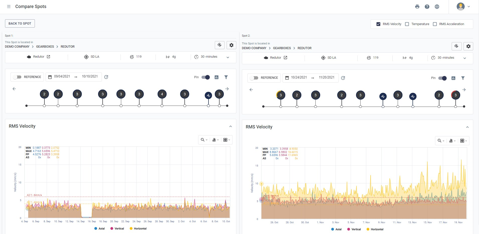
Comparison between spots: compare overall values between two spots, side-by-side;
Addition of more than one alert per spot;
Waveform period cursor;
Record of edited spots with info such as name, date and the change that was made;
Asset tree: Creation of machines and spots on the Web Platform and the possibility of deleting machines and empty folders;
‘Business risk’ on the DMA;
Spectral analysis with logarithmic scale;
Integrated Dashboard in list format;
Visual improvements:
– Spot path on the Spot Viewer
– Spots not collected for more than one month highlighted on the DMA;
– Battery level for each sensor on the DMA;
– Overall RMS acceleration value for each spectrum;
Comments: chat between users in any timeline event;
Help when configuring gateway collection;
Associating spots to gateways;
Option to request the inclusion of a bearing.
ALERT NOTIFICATIONS VIA E-MAIL
E-mail notifications for software alerts are now available. To start receiving them, the first step is to simply register the user to the workspace – click the “MANAGE” button on the asset tree (image below) and choose the desired sub-area.

On the “Users” tab, it is possible to add the permission “Subscriber” to the user that you want to receive the notifications.

Every data collection that generates an event with an A2 (critical) alert, will automatically send an e-mail to the users registered as a “Subscriber”, containing information about the spot and the period of the alert. From the e-mail report, it is possible to go directly to the spot in question on the Web Platform by clicking “Go to Spot”.

It is worth noting that users who are “Subscribers” do not need to be subscribers to the plant as a whole, but to sectors within the plant, in order to choose exactly which assets are most critical for the generation of the automatic e-mails.
We are developing further improvements for management, where it will be possible to choose the frequency of the notifications and manage the subscribed users.
COMPARISION BETWEEN SPOTS: COMPARE OVERALL VALUES BETWEEN TWO SPOTS, SIDE-BY-SIDE
The Web Platform now has a tool for making an easy comparison between two spots. The comparison can be made between each of the parameters: RMS velocity, temperature and RMS acceleration.
The comparison is made via the Spot Viewer, by clicking on the button ‘COMPARE’ on the top-right part of the screen.

By clicking this button, a window will open with all of the available spots for comparison. It is possible to search by spot name, machine or DYID to find the right spot. To select the spot, simply click on the “+” icon located on the right side of the window, in line with the spot.

After selecting the spot, both spots will appear together on the screen, with all of the spot viewer analysis tools available.

SEPARATE SOFTWARE AND HARDWARE ALERTS
Besides the established LED alert on the DynaLogger, configurable on the app, it is now also possible to independently configure alerts on the Web Platform. These alerts work in a similar way to the hardware alerts (LED): determine intervals of vibration or temperature that will produce an alert for a spot with levels A1 and A2.
To configure alerts on the Web Platform, access the ‘edit spot’ page and proceed to the tab “Alerts” where it will be possible to set two independent alerts between:
- Alert Option A
- Alert Option B

In practice, these alert options (A and B) allow the user to be alerted by more than one type of measurement. In other words, it is possible to define up to 2 software alert conditions independently and fully configurable on the Web Platform! These alerts can be defined per axis (Uniaxial), applied to the three axes (Triaxial) and even the temperature. It’s also possible to determine the number of measurements above the limit that will trigger the alarm for the spot, i.e. how many consecutive measurements of vibration or temperature above the A1 or A2 thresholds will be necessary for the system alarm to trigger.
Note: Web Platform alerts are displayed on the Dashboard and do not indicate on the LED of the device.

WAVEFORM PERIOD CURSOR
A new tool available on the Web Platform is the cursor for indicating the waveform period. This can be used to measure the time interval between two points, in order to determine a pattern in the data collected by the DynaLogger. To access the tool, simply click on the cursor symbol located in the top right corner of the waveform graph, as shown below. Clicking on “period” will activate the tool and the user can select any two points on the graph, which will be marked in red.

If the cursor is used to measure the difference between two peaks or troughs of a dominant waveform signal, the frequency calculated based on the period will be related to the vibration spectrum, as is the case in this example.

As such, with this new functionality, a vibration analyst can extract information directly from the waveform. The tool can be especially important in the analysis of non-deterministic signals, such as impulsive signals generated by defective gears, among others.
RECORD OF EDITED SPOTS WITH INFO SUCH AS NAME, DATE AND THE CHANGE THAT WAS MADE
Every modification to the configurations of a spot will generate a parameterization event on the timeline, highlighted by the orange icon (image below).

By clicking on the icon, information such as which user was responsible for the edit, what change was made and on what date. This allows greater control for monitoring assets.
Beside this, comments can also be made, so whenever a user is making a change for whatever reason, it can be justified.

CREATION OF MACHINES AND SPOTS ON THE WEB PLATFORMA AND THE POSSIBILITY OF DELETING MACHINES AND EMPTY FOLDERS
It is now possible for users with “administrator” permission to create machines and spots not just via the app, but also via the Web Platform. This allows prior creation, i.e. before the installation of the sensors, and prevents the need for creation at the last minute in an unorganized way.
The option to delete empty machines or sub-areas (folders) is also available, but they must not have any spots or machines associated respectively.
To do this, just access the “Asset tree” on the side menu and by clicking on the option “MANAGE”, a gear symbol will appear, allowing the item to be edited or deleted, as shown below:


‘BUSINESS RISK’ ON THE DMA
When a machine is created on the Web Platform, the criticality level of the machine can be classified by selecting from the “Class” field. One of these classifications is “Business risk”. If selected, the machine with this classification will be considered critical for the operation of the company. This is why we have now made available the option to filter the DMA for spots with this criticality level.
To apply the filter, click on the button at the top of the screen:

SPECTRAL ANALYSIS WITH A LOGARITHMIC SCALE
Vibration spectra can now be viewed in a logarithmic form, which increases the detection efficiency of defects in machines with low rotation.
To do this, in the spectral analysis area, just open a spectrum and select the last icon from the options panel.

INTEGRATED DASHBOARD IN LIST FORMAT
The integrated dashboard is shown in the form of pie charts by default. Now, the user has the option to change the visualization to show in the form of a list, where there will be access to more information related to the health index. On the top-right side of the screen there is a button for alternating between the list format and pie chart format.


The list is sorted by health as standard and shows the quantity of spots (predictive) and routes (sensitive) with active A1 and A2 alerts, as well as delayed and unaccomplished routes (sensitive)
VISUAL IMPROVEMENTS
When the spot viewer is opened for any spot, the ‘path’ of the spot will be displayed at the top of the screen. The path shows the different levels of the asset tree for which the spot is located. This update will help users to verify that the spot that was accessed is correct, in case there are various spots with the same name, for example.

Spots that have not been collected for at least one month are now highlighted in red on the “last sync” column, with the aim of drawing attention to spots that are not being collected frequently.

In addition, there is now an indication of the battery life of the sensors associated to the spots. The new DynaLogger models generate this indication on the DMA, thus giving visibility to the remaining battery life.

Another improvement is the addition of the overall RMS acceleration values for each axis, which is now visible on the spectral analysis menu. We are also developing trend graphics for these values, which will be released soon.

IMPROVED COMMENTS
The way of communicating between users on the Web Platform is upgrading. On the timeline of the Spot Viewer, it was already possible for users to leave a comment on an event (collection, spectrum, parameterization). Now, various users can leave multiple comments on the same event, in the form of a “chat”.
Each comment has details such as the time and date, and it is also possible for users to edit or delete their own comments.
Events that contain comments appear on the timeline highlighted with a red circle, as shown in the example below.


SUGGEST IDEAL COLLECTION INTERVAL FOR GATEWAYS
To help users configure gateways and optimize their performance, the Web Platform generates a tip in yellow (image below) when the configured collection interval for a gateway is less than ideal.

ASSOCIATING SPOTS TO GATEWAYS
When adding a spot to a gateway, the screen ‘Select Spot’ now shows the complete list of spots. A search bar has also been added to facilitate the selection of the desired spot. It is possible to add more than one spot at the same time by clicking on the “+” button to the side of the spots and clicking “ASSOCIATE”. Spots that appear with the cloud icon instead of “+” are already associated to a gateway.

REQUEST THE INCLUSION OF A BEARING
In case the model of a desired bearing doesn’t exist in the bearing database, it’s possible to click on the option “Did not find? Contact us” and request the inclusion of a specific bearing.


