11.1) Health Indicators

The Health Indicators, within the Integrated Dashboard, display the health indices of different plants or work areas of the company. Each is represented by a pie chart indicating the health of the assets in the area, based on the number of Spots and inspection routes that triggered A1 or A2 alerts.


Picture: Health indices by sectors or plants


In this same screen, you can click on the side arrows in each pie chart so that, within the organization of the asset tree, a new Dashboard is generated with the sublevels and machines related to the selected one. In this way, it is possible to perform an integrated and specific visualization of all areas and sub-areas of the plant.
The purpose of this screen is to show which areas need more attention from the maintenance or reliability team, i.e., which of them are theoretically in more compromised health and are impacting the overall health levels.


10) Creation of reports (predictive analyses)

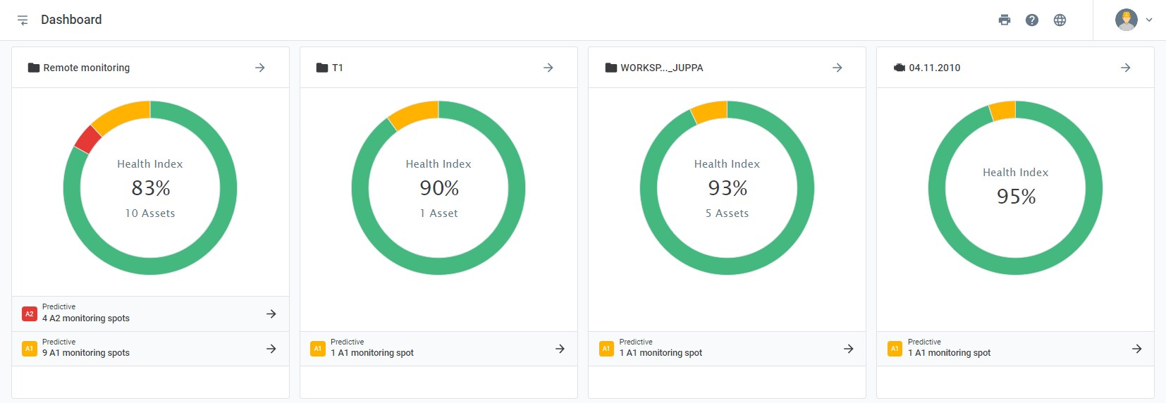
The analysis of the data collected by DynaLoggers can be done in several ways through the Web Platform. The Predictive Analysis tab has as main goal to enable the elaboration of technical reports about failures, alerts or recommendations regarding the health of the monitored asset. The Predictive Analysis section is found at the end of the “Spot Viewer” and “Machine Viewer” pages.


Performing Predictive Analysis

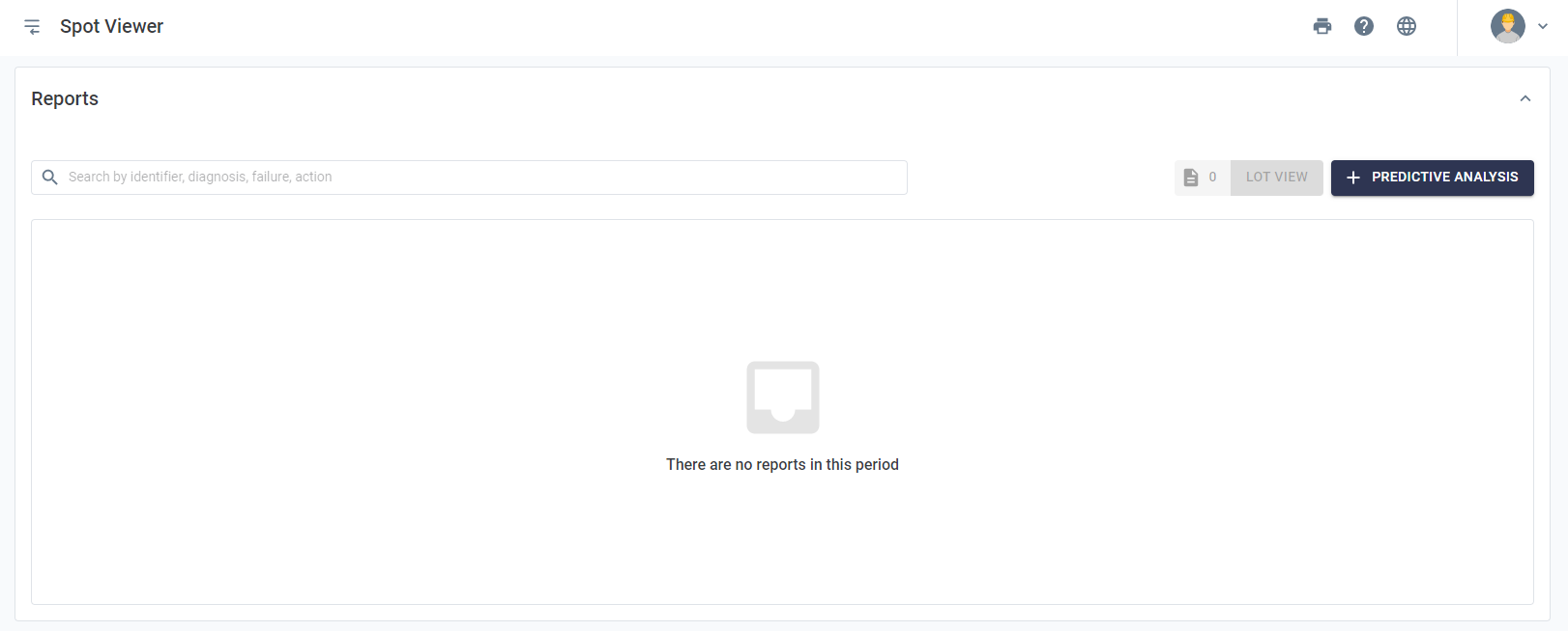
To make a technical report of a Spot, just access the section through the Spot Viewer (at the bottom of the page) and select the “” option.


Picture: Creating Predictive Analysis


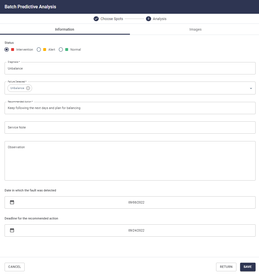
A new screen will be shown, requesting Spot analysis information:
 

Picture: Filling in the predictive report

The information tab has the following fields:

  • Status: selection of the current asset condition. Three options are available to inform the severity of the report;
  • Diagnosis: brief description of the problem encountered by the analyst;
  • Detected failure: selection of the failure found at the point among a series of categories;
  • Recommended action: indication of which actions should be taken based on the analysis performed;
  • Note: addition of infos that have not yet been cited;
  • Date on which the failure was detected: optional info to register from which moment the failure could be identified; 
  • Deadline for Action: add deadline for action based on the “recommended action”.

The Spot Viewer tab, on the other hand, brings the graphs referring to the history of the analyzed spot data, with the objective of providing background for the analyst when making his report. It is possible to add temperature, acceleration, and speed graphics with customized time periods. It is also possible to add an explanatory comment below the graph.


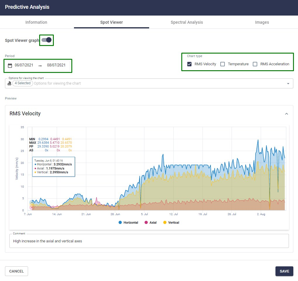
Picture: Data history tab available when creating a predictive analysis

The “Spectral Analysis” tab allows the addition of spectra that prove the detected failure. The selected spectra will be part of the report.


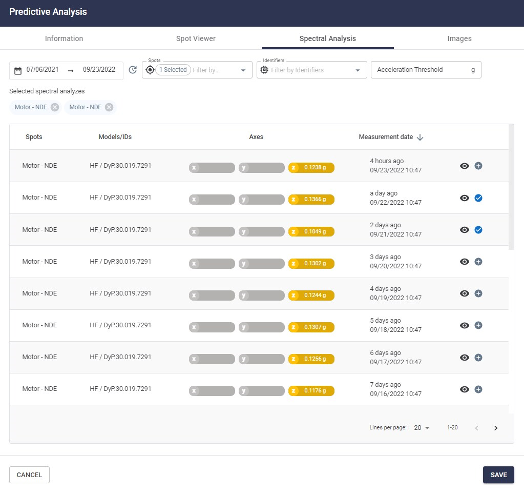
Picture: Adding spectra where failures are identifiable


Finally, the “Images” tab allows the user to add pictures to the report. By selecting the “Add Image” option, files saved on the user’s computer can be added and will become part of the report.


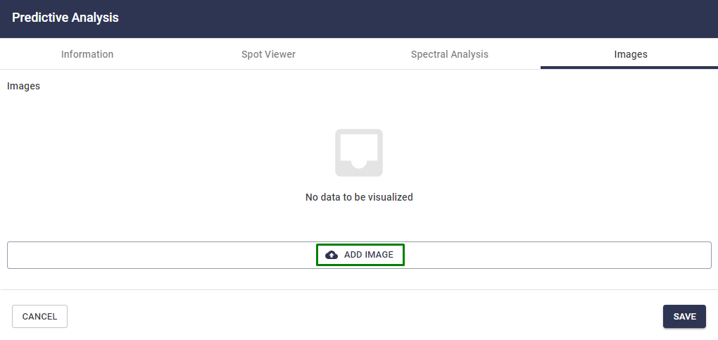
Picture: Adding images to the predictive report


Predictive Analysis Visualization

The predictive analysis performed are available for viewing and access in several ways, as presented below. To access the full version of the report, click on the report icons in any of the options listed below.

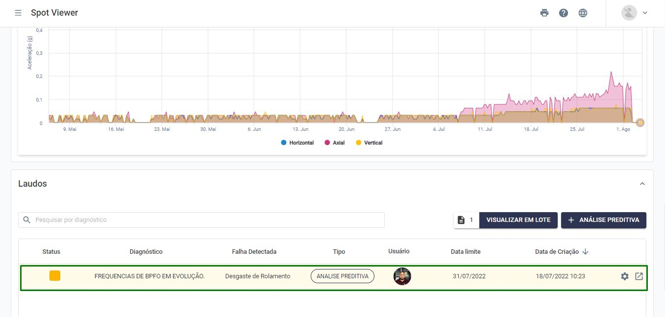
1. In the Spot viewer screen (data history): at the bottom of the screen, below the RMS acceleration graph.
 

Picture: Predictive Analysis in the Spot Viewer
 

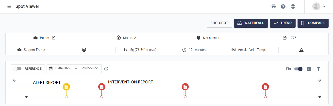
2. In the timeline of the Spot Viewer screen: to access the complete report, simply click on the icon in the timeline.
 

Picture: Reports shown on the timeline of the data history screen

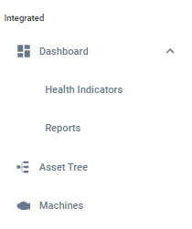
3. Through the Integrated Dashboard’s Reports screen 

On this screen you have all the reports history for all the Spots for which this type of report has already been generated. More details can be found in the “Viewing Reports” section below.

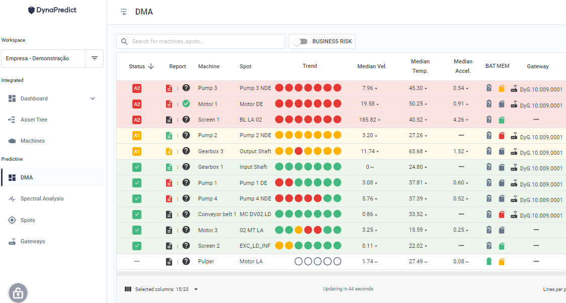
4. Through the DMA Dashboard, in the “Report” column. In the case of visualization of the analyses through the DMA dashboard, the last report performed and the criticality assigned is shown.
 

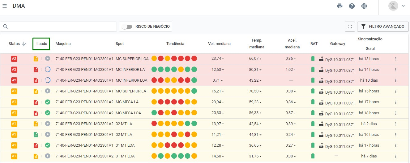
Picture: Column for viewing reports from the DMA

Predictive Analysis for multiple monitoring points

In the Machine Viewer screen, it is possible to perform technical reports for more than one monitoring point simultaneously. At the bottom of the page, you will find the option ““.
 

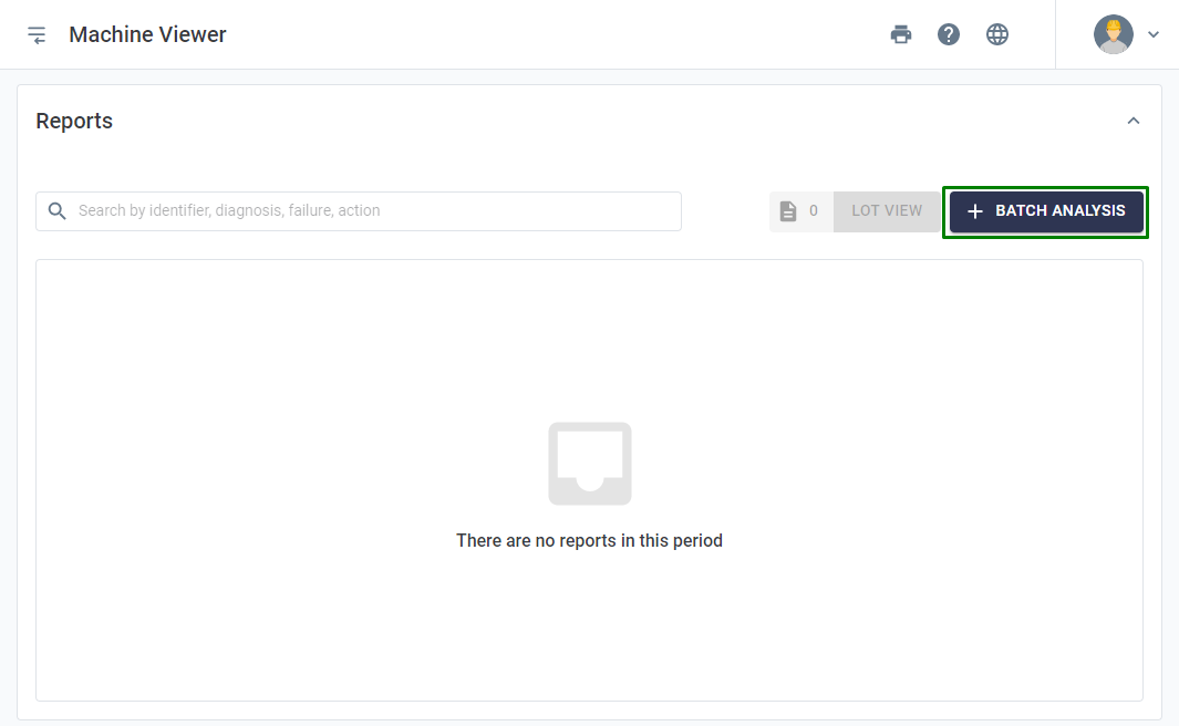
Picture: Option to issue report by machine 
 
Clicking on this option will result in the opening of a window similar to the one discussed in the previous section. The difference, in this case, is the need to include which Spots the user wants to add to the report.
 

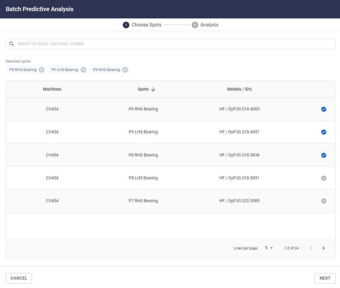
Picture: Predictive Analysis for Multiple Spots
 

When the list of Spots for the machine appears, simply select, in the rightmost column, which ones will be added to the analysis using the “” button. Going forward, the diagnostics, the appointed failure, status, and recommended action options will be the same as those already present in the Predictive Analysis for just one monitoring point, detailed in the previous section.
When performing a batch predictive analysis, as in this case, the selected Spots will inherit the report, which will be available through the options listed in this section.


1) Platform Access

The access to the Web Platform is performed through the URL: https://dyp.dynamox.solutions.

Initially, the login screen will be displayed and the user must enter their access credentials to enter the Platform.

If you do not have access credentials, you can contact Dynamox directly, through the e-mail support@dynamox.net. If the user forgets his/her password, it is possible to reset it through the option “Forgot your password?” generating a link that will be sent to the registered e-mail.


Picture: User Authentication
 

After logging into the Web Platform, you must choose the workspace you want to access, based on the permissions assigned to the user.


Picture: Workspace Selection

 
After selecting the workspace, the user will have access to the Web Platform and all its functionalities.


1.1) Home Screen and Main Menu

Immediately after logging in, at the top of all screens you will be able to view/hide the side menu, as well as the print commands, help, and language.


Picture: Available Options in all screens.
 

Currently, the Web Platform is available in Portuguese, English, Spanish, French and Korean.

When logging in, the first screen to be shown is the DMA Dashboard , which will be discussed in detail in the following sections.


Picture: Platform Home Screen – DMA Dashboard
 
The side menu, shown in the picture above, can be accessed at any time after the user login. 
 

Picture: Side Menu
 
From there, you can access the Integrated, Predictive, and Sensitive sections (available to customers who have purchased this module).

Integrated

In the Integrated section, an overview of the data and assets that composes the workspace is presented, through the functions:

1. Dashboard: section that centralizes data obtained from predictive and sensitive data. It is divided into two parts:
 

Figure: Integrated section in the side menu
 
  • Health Indicators: presents the health of the assets by sectors, taking into account the predictive and sensitive modules (in case the company has acquired it).
  • Reports: presents all the predictive and sensitive analyses performed by users in the client company.

2. Asset tree: enables the hierarchy of the company’s units, sectors and machines, facilitating the organization and management of the available assets.

3. Machines: presents a view per machine, considering the predictive and sensitive module. By selecting a machine to visualize, it presents a grouped view of all Spots located on this specific machine, as well as anomalies detected by sensitive inspectors through the sensitive module.

Predictive

The Predictive section presents the main functions that support predictive monitoring, based on information from Dynamox’s vibration and temperature sensors, the DynaLoggers. Among them are:
  • DMA Dashboard: decision support panel, which displays an indication of the assets’ health, through the information of the sensed Spots and alarms configured for each point.
  • Spectral Analysis: list with all the spectral analyses performed by Spot and machine.
  • Spots: list with all the monitoring points (Spots) created, their respective machines and DynaLoggers.
  • Gateways: lists all registered Gateways (automated data collectors for Dynamox sensors) and their respective settings.

Sensitive (Optional)

In the Sensitive section, functions that support the creation and management of sensitive inspection routes are available:

  • Dashboard: six dashboards are available to assist decision making, regarding sensitive inspection routes and anomalies reported by field inspectors.
  • Adherence Groups: a panel that provide the list with the grouped user groups for route adherence accounting.
  • Route Management: a list with all the inspection routes and their respective information, as well as the option to create and manage new or existing routes.
  • Checklist Models: a list of all checklists created, and option to create new checklist templates.

More information regarding the use of these features is described in the Sensitive Inspection Manual.