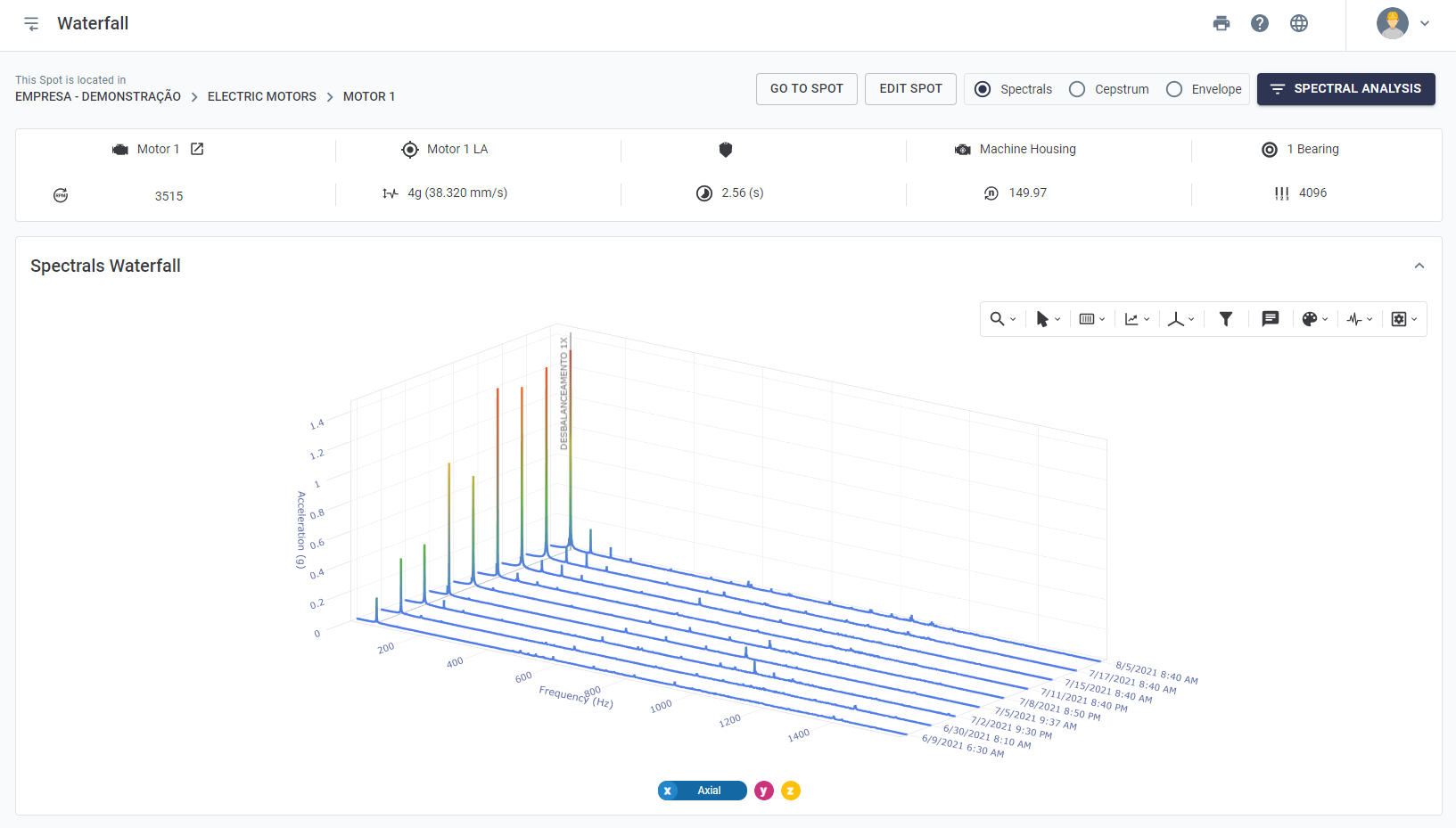
9.2) Vibration Spectrum Analysis

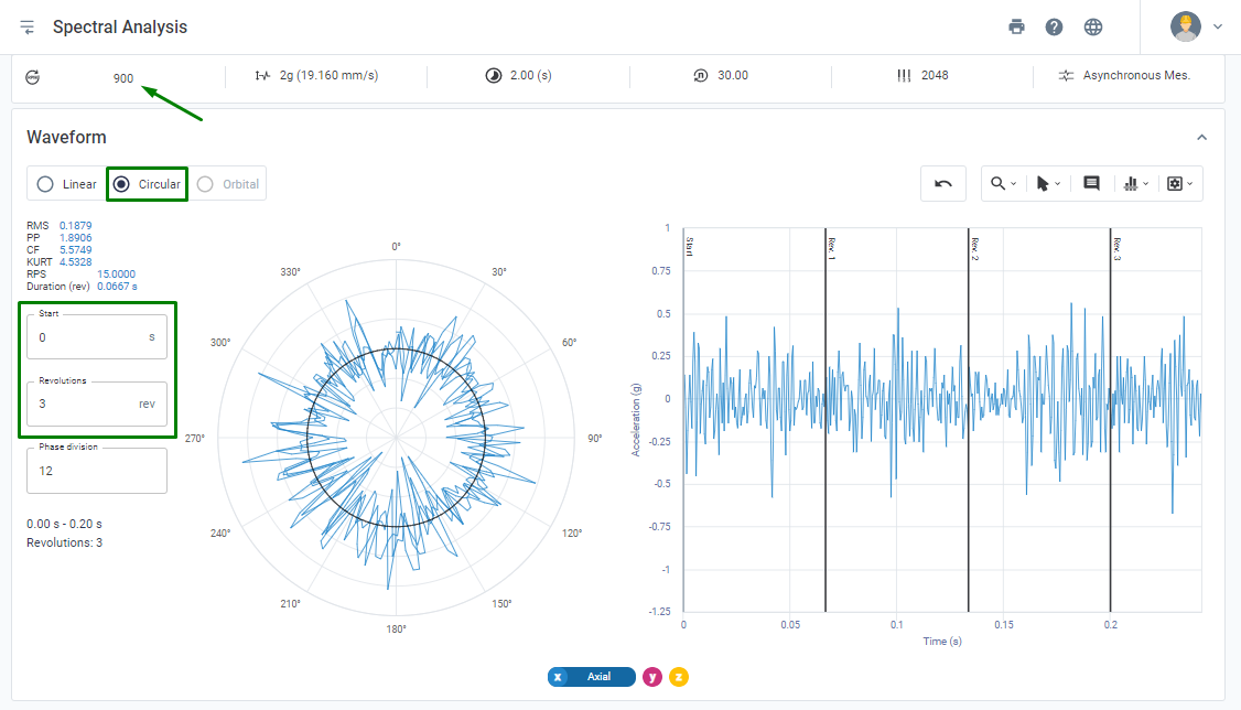
When accessing a spectrum in the Web Platform, first the spectral in the frequency domain is displayed for the active, accelerating axes. Information is also available for the velocity and displacement quantities (see Metrics section).


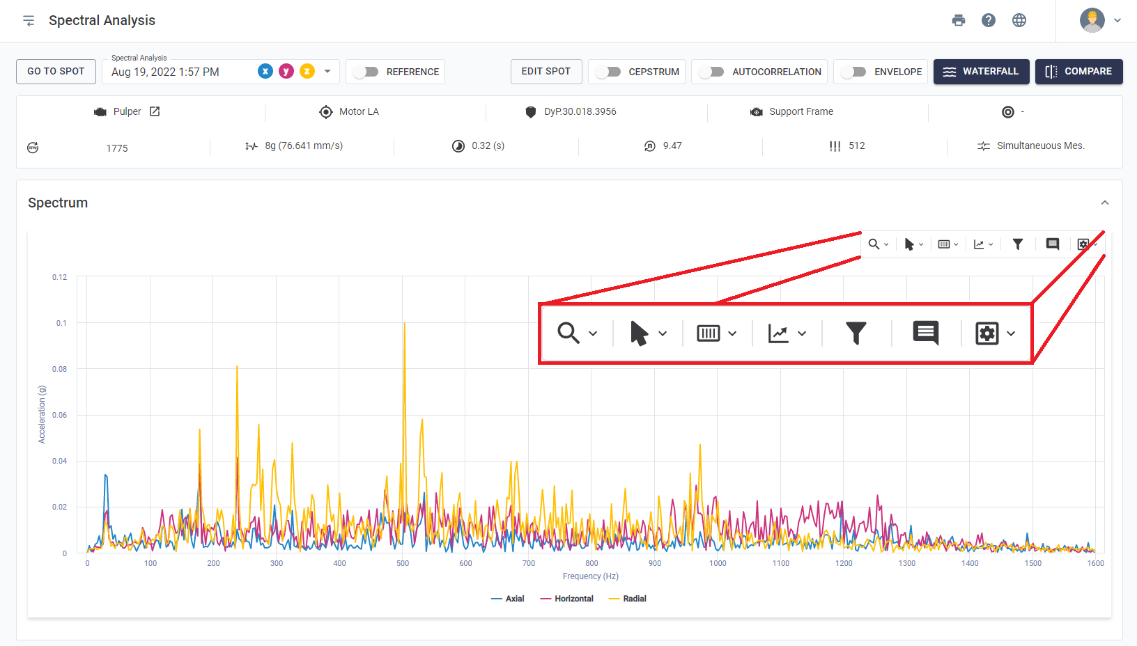
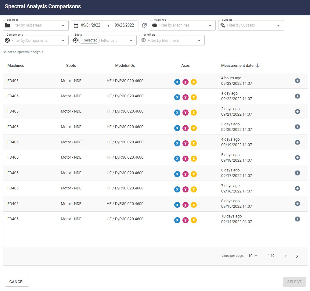
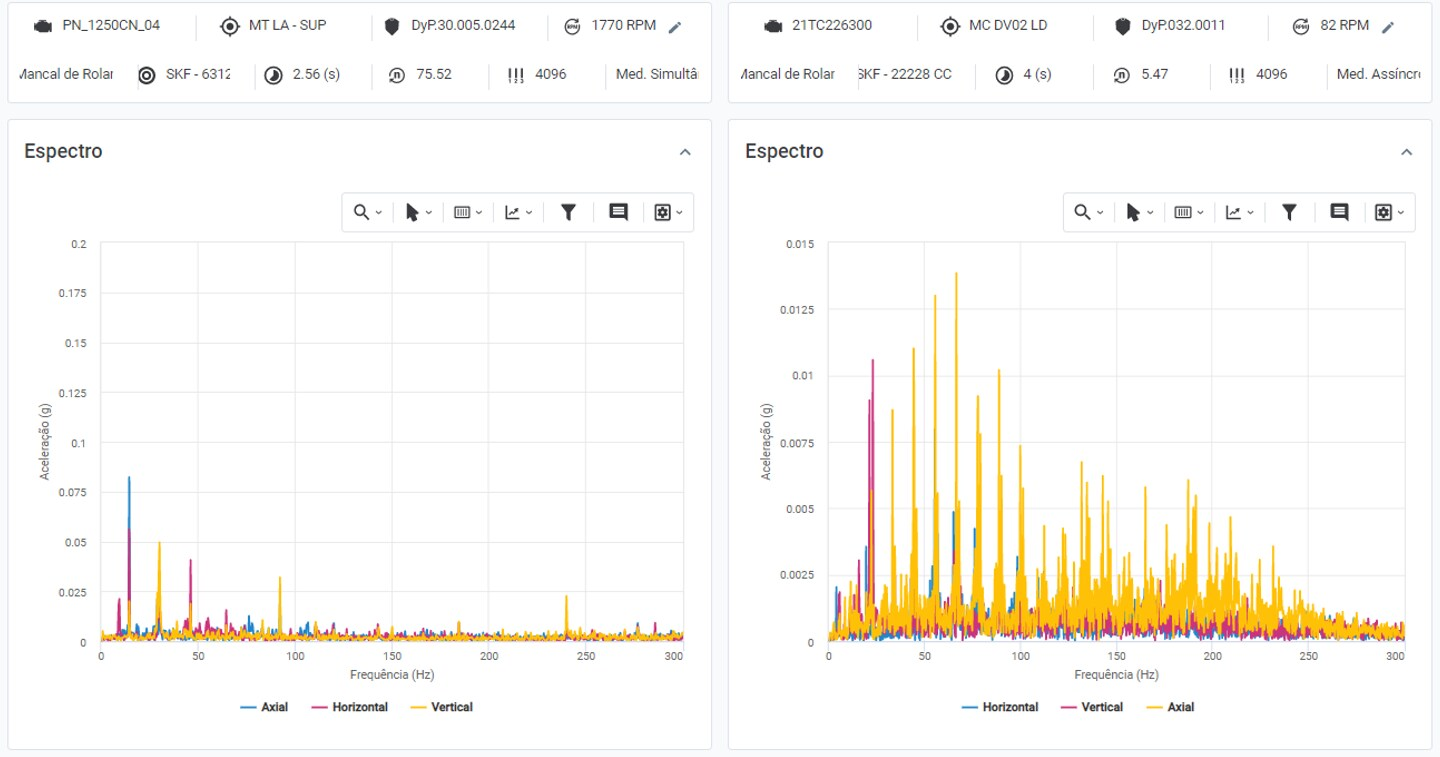
Figure: Spectral analysis and available tools


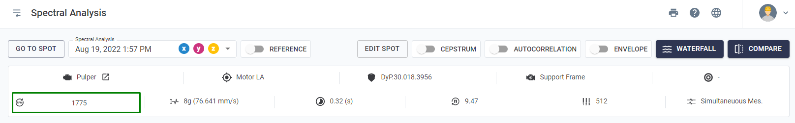
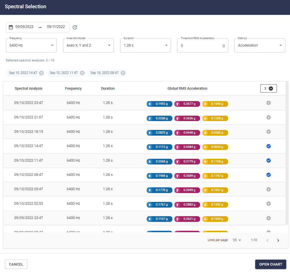
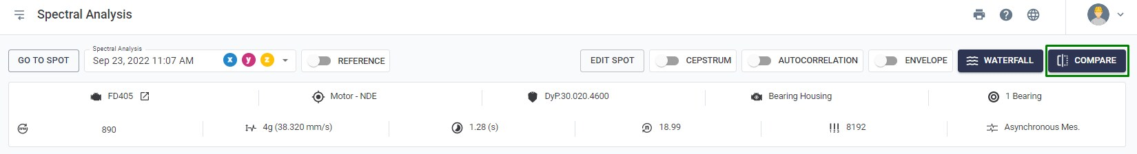
At the top of the page, information is displayed about which time period the viewed spectral refers to and which axes were collected. By clicking on the rectangle with the date, you can also browse spectra in nearby time periods for a quick visualization.


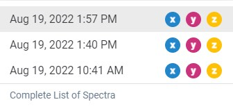
Figure: Spectral Analysis Selection


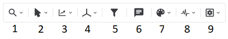
The following section explains each of the tools in the role upper toolbar:

Zoom Tools

Several functionalities are analogous to the zoom tool of the Spot Viewer, detailed in previous sections. On the other hand, the Spectral Analysis zoom tools have differentiating features, such as keyboard shortcuts, with the objective of boost the way the user relates to the Platform.
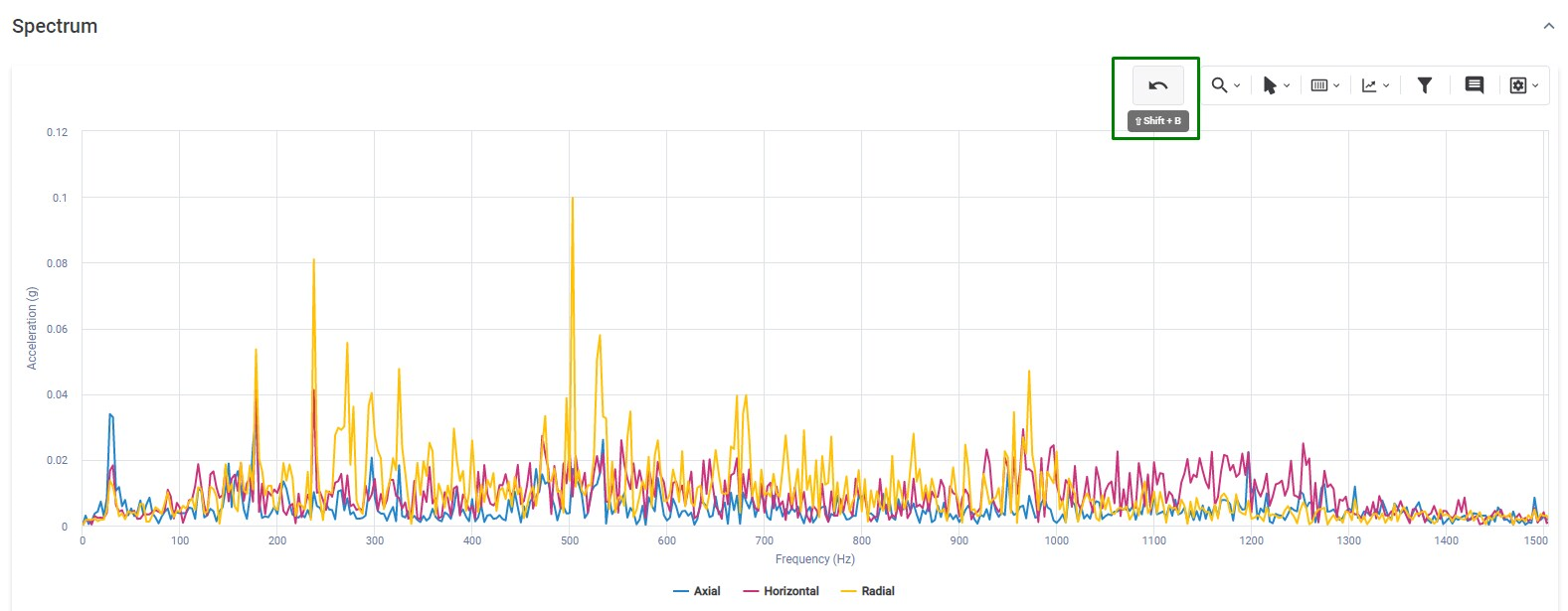
In addition, when zooming in on the graph a return zoom button appears, as it can be seen in the picture below, allowing the user to undo the last zoom command.
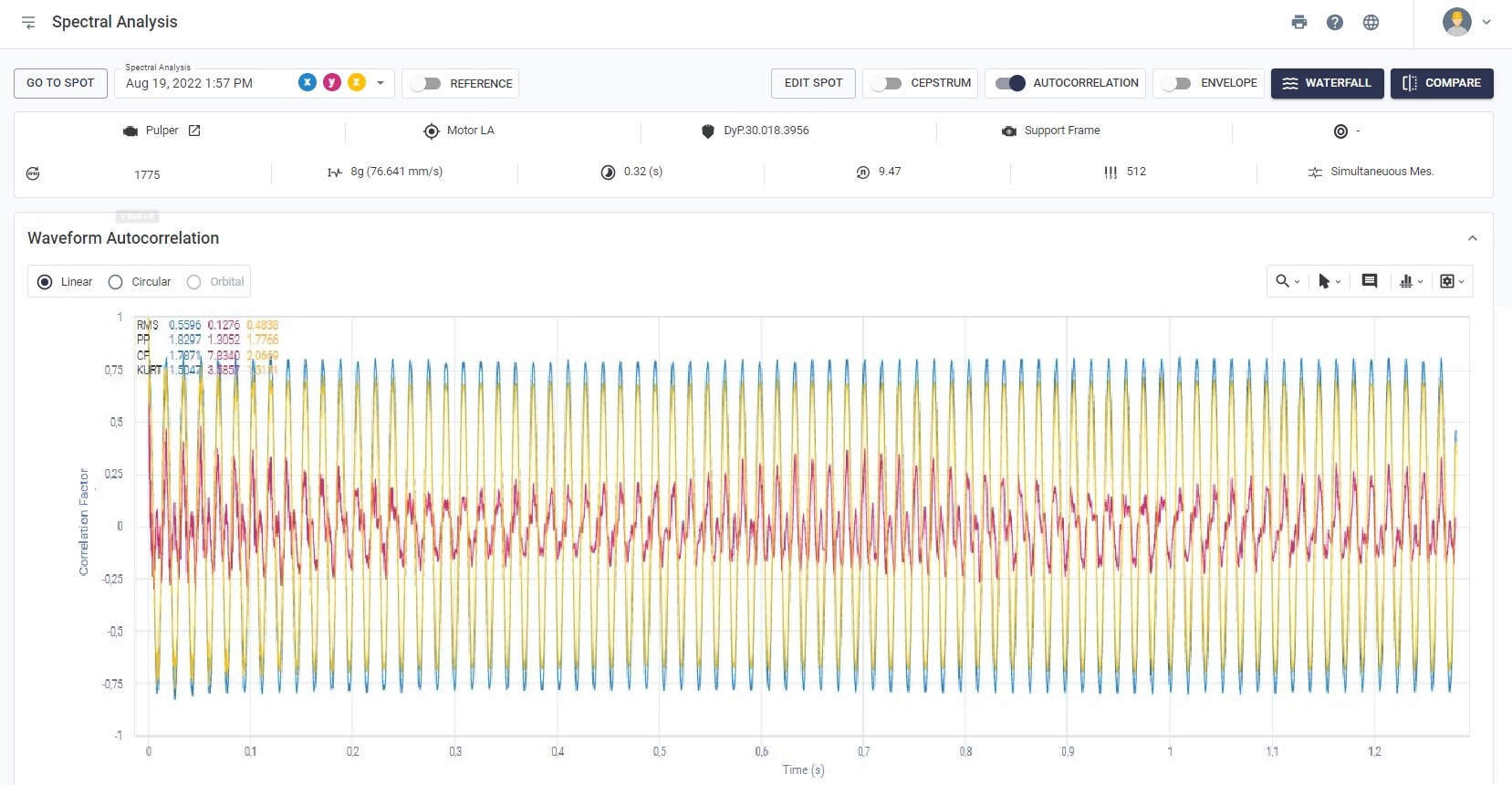

Figure: Zoom return button


Cursor Tools

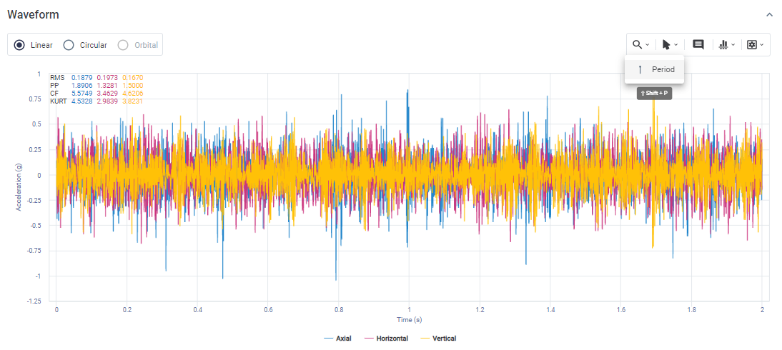
It is possible to highlight specific frequencies, their harmonics and their sidebands on the graphs. To highlight a specific frequency, simply select the cursor type, place the mouse on the graph and mark. The points corresponding to the selected frequencies will be displayed on the graph, as well as a window with their amplitudes. The cursors are important to analyze, in detail, the frequencies that are being excited in the spectrum, as well as their sources.
The single cursor, as its name suggests, will mark a specific frequency in the spectrum. The harmonic cursor will mark multiples of the chosen frequency. Finally, the sidebands cursor will mark a central and side frequencies, as chosen by the user.
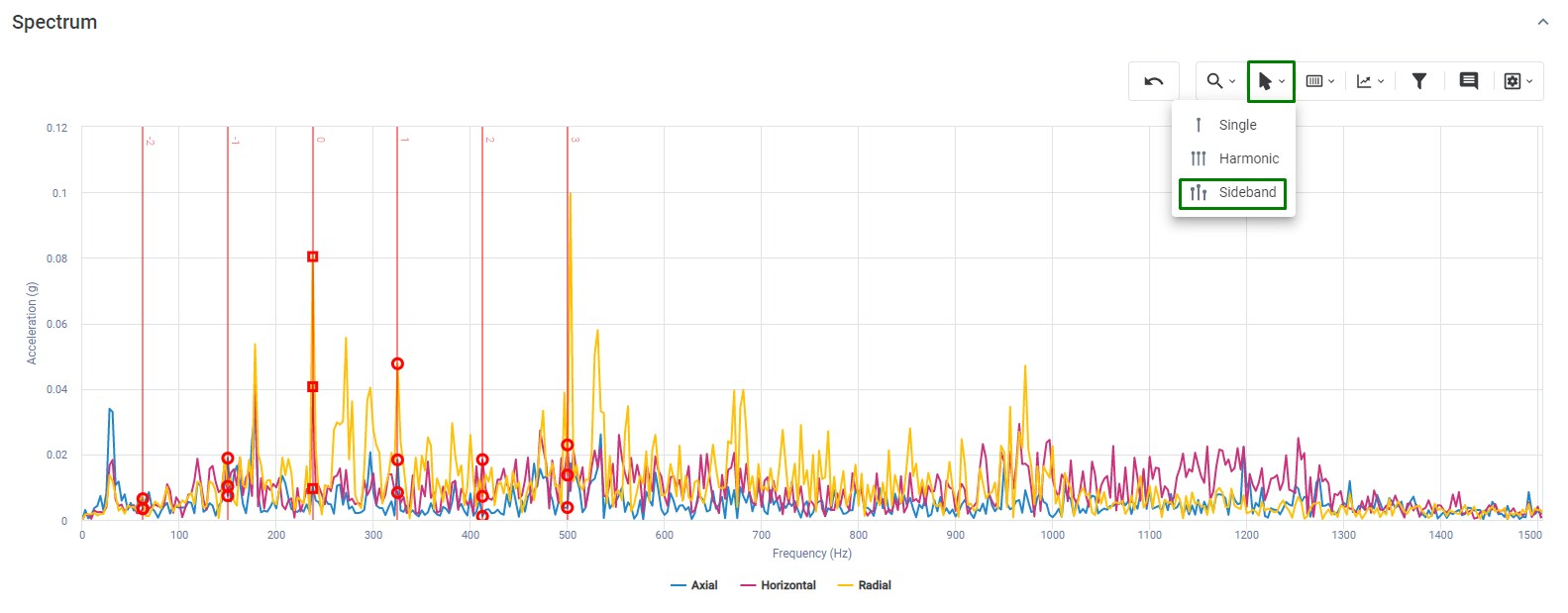


Figure: Cursor Tool
 
Similar to the Zoom tools, there are shortcuts for creating cursors quickly, which are also detailed in the Spectral graphs shortcuts section.
In the Waveform graph the periodic cursor type is available. Finally, to remove a cursor, simply double click on the text box that provides amplitude and frequency values at the highlighted points on the graph.
All cursors have a subtitle indicating the vibration values in each axis at the instant they are positioned. The values are displayed at the bottom of each graph.


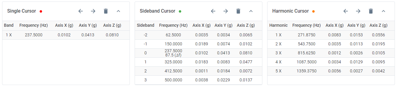
Figure: Point-to-point values of the cursors at the bottom of the graph

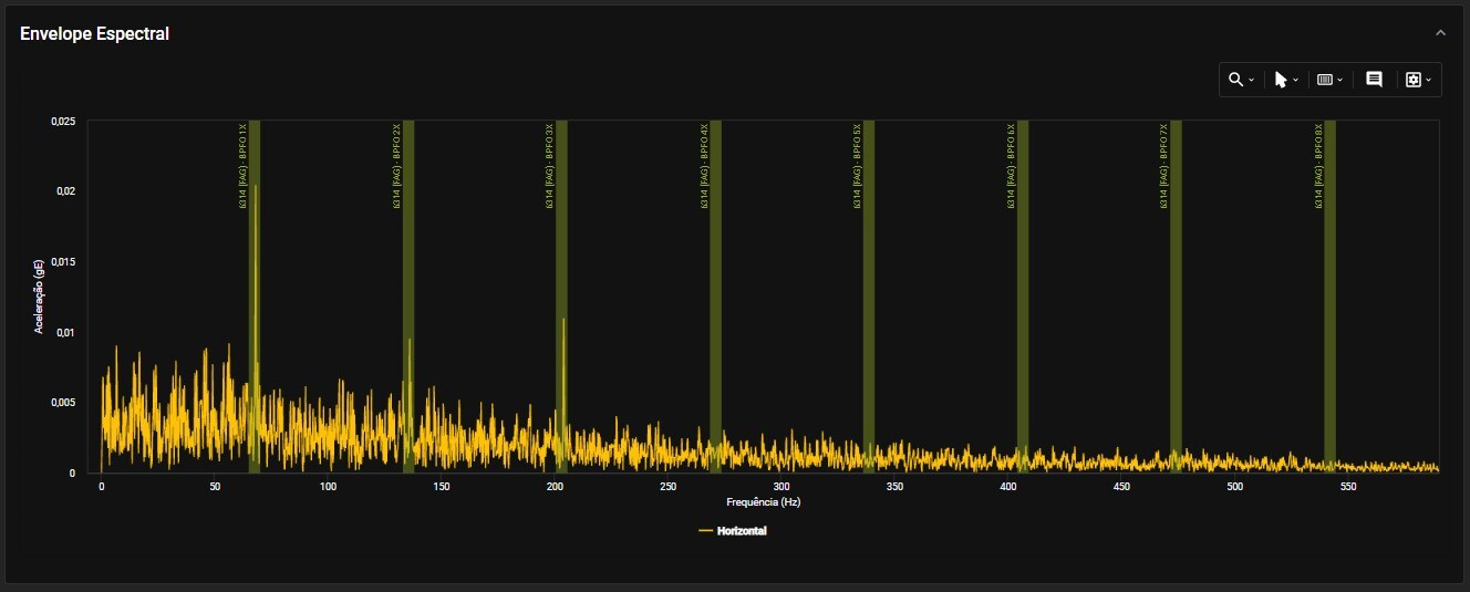
Automatic Frequency Markers 

It is possible to highlight the rotational frequency of the machine, in addition to the characteristic failure frequencies of the bearing for cases where it has been registered in the bearing bank. The process of bearing inclusion is detailed in the Spot Creation section. The available options for automatic cursors on the Platform are:
  • RPM: Machine rotation frequency;
  • BPFI: Passing frequency of the rolling elements on the innner race;
  • BPFO: Passing frequency of the rolling elements on the outer race;
  • BSF: Rotation frequency of the rolling elements;
  • FTF: Rotation frequency of the cage.


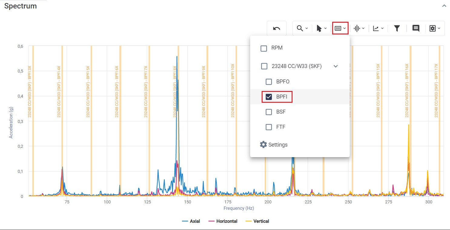
Figure: Tools highlighting rotational frequencies and bearing failures

Customized Frequency Markers

This tool allows the insertion of frequency markers for visualization on spectral graphs. In this way, it will be possible to register the different frequencies present in the machines (blade pass frequency, gearing frequency, electrical failure characteristic frequencies, among others). The process of setting up a custom marker is detailed in the Spot Creation section, on the “Frequencies” tab.
 

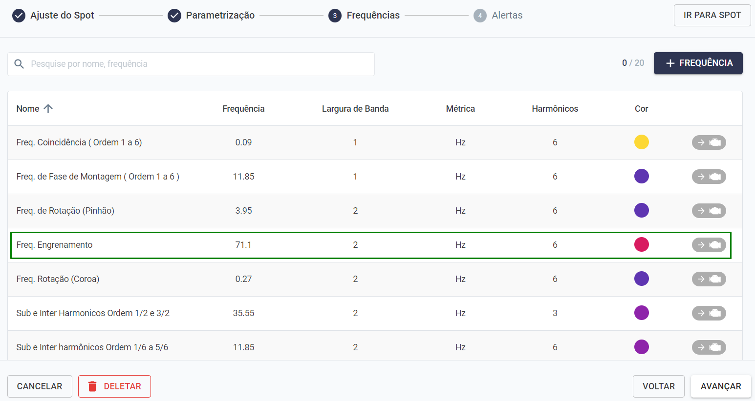
Figure: Customized Frequency Markers 

When analyzing a spectral, the marker will be available next to the other tools, via the wave symbol.


Figure: Accessing the custom marker tool
 
When the marker is activated, indicative lines will appear on the spectrum, as previously configured (color pattern, value on axis, origin).
 

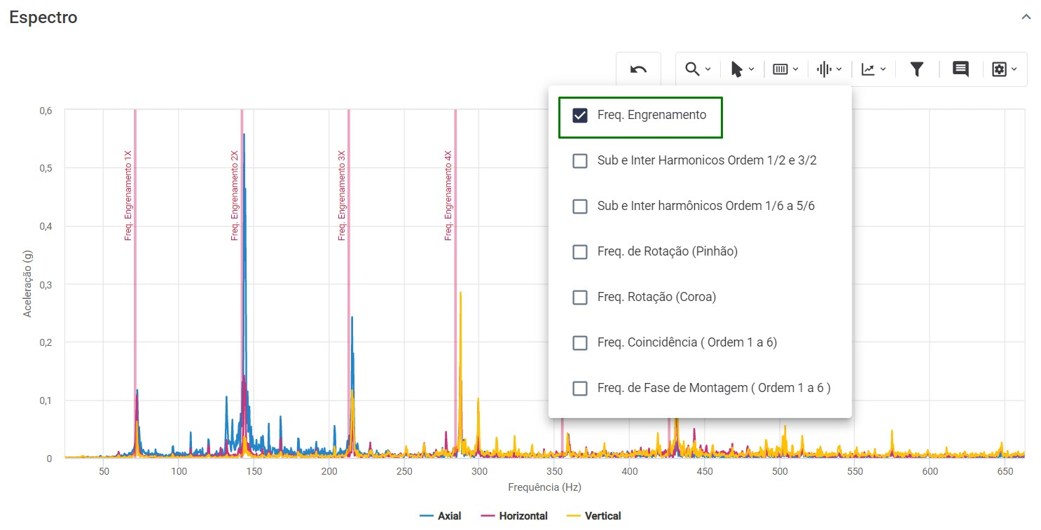
Figure: Cursor tool with customized frequency values
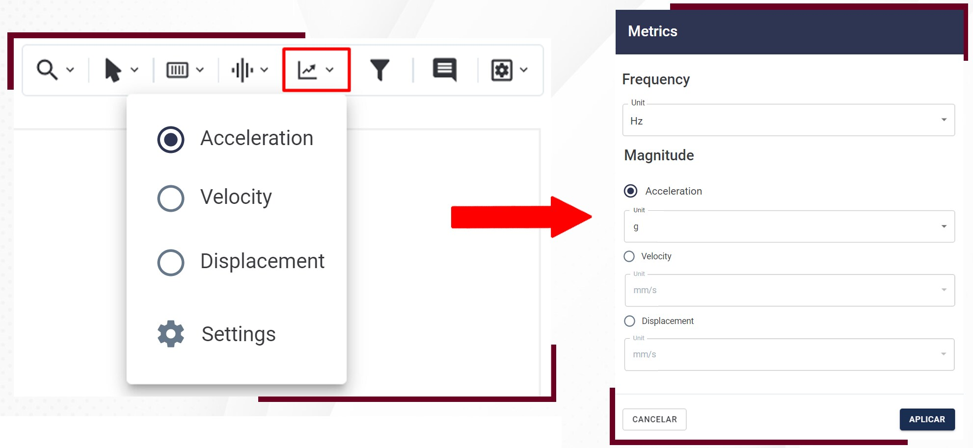
 
This tool helps the user to visually identify the frequency of interest and its harmonics, aiming to identify patterns to detect known failure modes.

Metrics

Allows you to change the spectral magnitude (acceleration, velocity, or displacement) and their respective units. It can be accessed through the toolbar above the spectral graphs shown.


Filter Tools

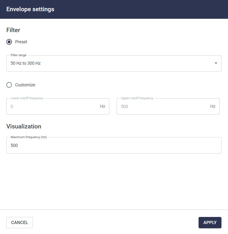
It is possible to apply filters that help eliminate noise and highlight characteristics of the signal. When you select the option, a new window will open where you can choose the desired filter type and cutoff frequencies.


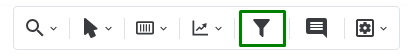
Figure: Accessing the filter tool

The options are: ‘High Pass’, ‘Low Pass’, ‘Band-Pass’, ‘Center Frequency’ filters.
The objective of the DMA Dashboard is to support maintenance decision making and interventions by providing an overview of the Spots condition, based on previous measurements and user-defined alarms (A1 and A2).
 

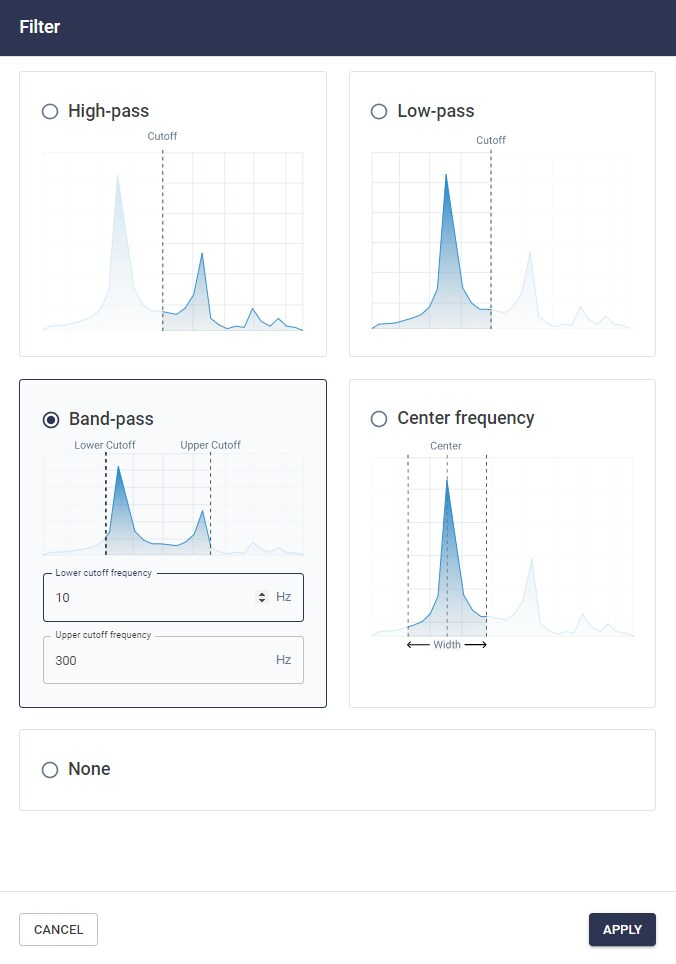
Figure: Filters tool

The shortcut for using filters on graphics is ( Shift + F ).

Notes 

It is possible to add notes to custom frequencies. The annotations serve to assist the analyst in viewing the spectral analysis graph more clearly and objectively.


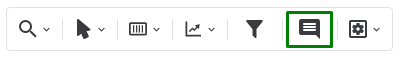
Picture: Accessing the note tool


When you select the icon in the top toolbar of the spectral analysis graphs, a window will appear asking for two fields of information: at what frequency the user wants to insert the note, and a subtitle box that will appear over the cursor on the graph.


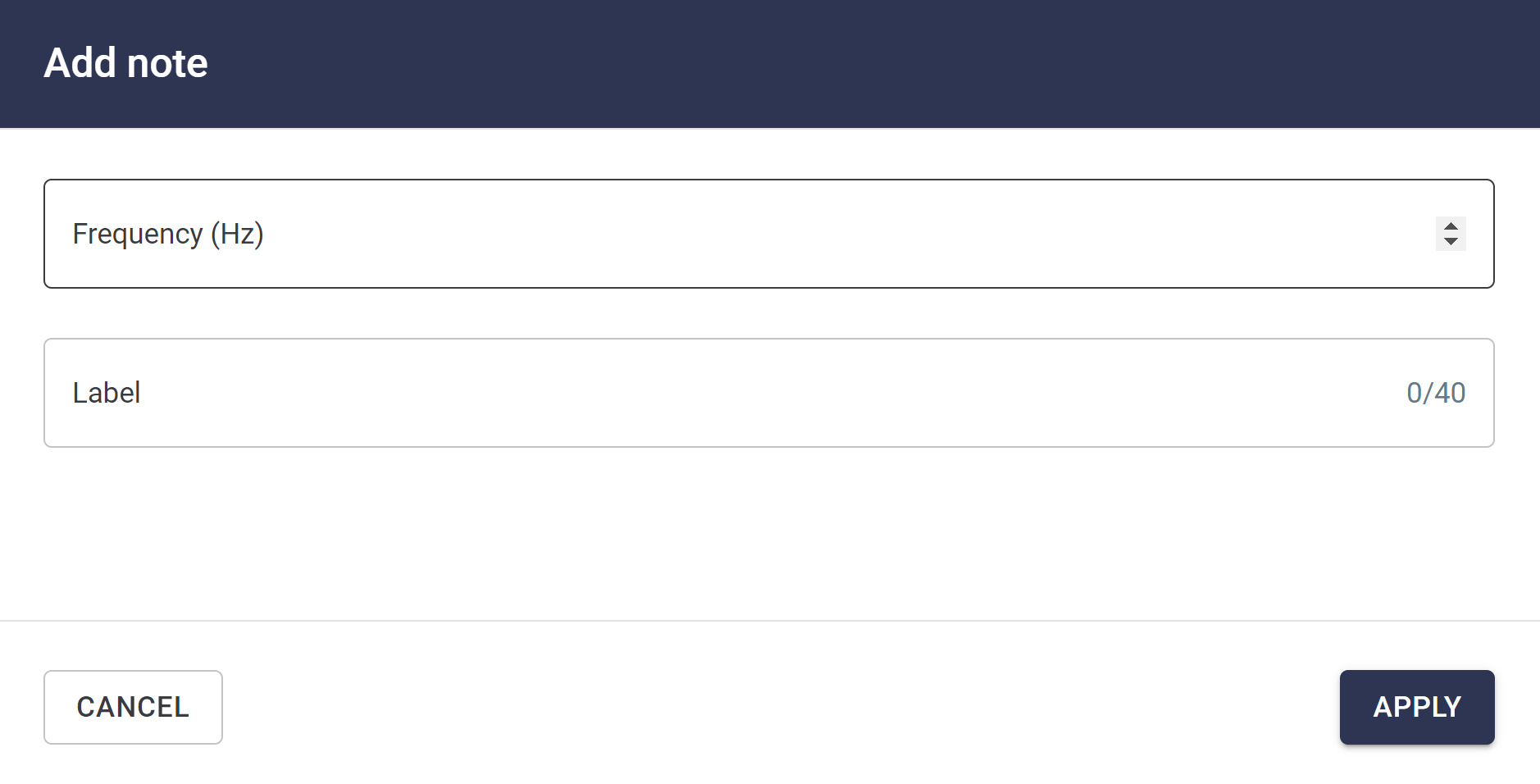
Figure: Add notes on specific frequency


The keyboard shortcut for using the notes on the graph is ( Shift + N ).

Visualization Options

The series of visualization options, which can be accessed from the top right menu, encompasses a number of functionalities, including: plotting grid lines, viewing the graph in logarithmic scale, which can fault defect detection on slow rotating machines, or displaying the text boxes of cursors added via the “Cursor tooltip” option.


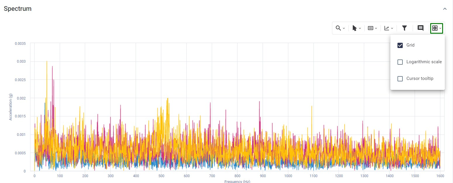
Figure: Visualization Options

Spectral Chart Shortcuts

Aiming at the dynamic use of the Platform, the Spectral Charts have several shortcuts that encompass the main tools for analyzing vibration spectra. The shortcuts are arranged as shown in the table.


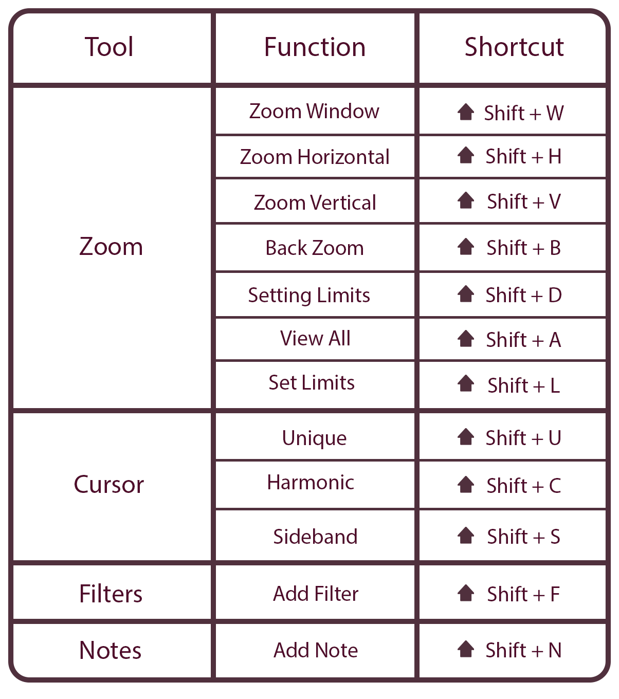
Figure: Spectral chart shortcuts


9.3) Waveform (linear and circular)

The waveform is the arrangement of the data coming from the DynaLoggers in graphical form in the time domain. It represents all possible variations in the set of values obtained in acceleration from the point where the sensor is installed, for the time the data set was acquired (by App or Gateway).
The waveform can be important for visualizing repeating patterns in the signal, such as beating or impacts, as well as modulations. The data can also be converted from acceleration to velocity and displacement.
To get to this screen see the section “Accessing the Vibration Spectral Screen”, which shows the various ways to view the waveform and spectra for each Spot. Below there is an example of a triaxial waveform obtained from a conveyor belt bearing.
 

Figure: Viewing the waveform and period cursors

In the same graph, instantaneous values, per axis, of: RMS, peak-to-peak, crest factor and kurtosis are available in the upper left corner. In addition, using the period cursors you can see the time difference between two distinct peaks, as well as the resulting frequency in Hz.

Circular waveform

The circular waveform is another way to analyze the same data, but plotted in polar coordinates.
To activate this form of visualization, simply, on the desired waveform, activate the “CIRCULAR” option at the top right of the screen.
One must also define the starting instant and the number of revolutions displayed on the graph.


Figure: Viewing the circular waveform

For satisfactory results, it is recommended that the RPM of the location closest to the monitored point is correctly scaled. This can be changed momentarily at the top of the page for a real-time update of the waveform.


Figure: Timely edition of RPM


9.4) Spectral Envelope

Vibration analysts can use several tools for fault analysis within the Web Platform. One of the main ones is the Spectral Envelope, useful for identifying high frequency faults through signal demodulation.

When accessing a spectrum in the Web Platform, the screen includes a button in the upper right corner of the screen to request an envelope (demodulation) of the signal.


Figure: Spectral Envelope Selection Button


By clicking the button ““, a window will be displayed asking for the frequency range in which you want to apply the envelope. The Web Platform has predefined envelope values, parameterized by the most common frequency ranges in vibration analysis. However, it is also possible to define a custom envelope in the same window. Simply select the “Customizable” option and define the desired frequency range.


Figure: Customizable envelope configuration


After selecting the frequency range, the envelopes (spectral and waveform) will be available at the top of the page. Both have the same functionalities as the spectral analysis.


Figure: Spectral envelope with filter from 3500 to 4300 Hz, pointing BPFO bearing failure (dark mode of the Web Platform activated, for better contrast)


9.5) Waveform autocorrelation

Autocorrelation is an analysis in the time domain that correlates waveforms with themselves to calculate a correlation factor at each time instant. It can be useful in helping the vibration analyst identify periodic frequencies, improving visualization and also, analogous to the previous section, allowing it to be displayed in its circular form.
To activate the waveform autocorrelation plot, simply, in the desired spectral screen, activate the option “” located in the upper part of the screen.


Figure: Activation of autocorrelation


The graph will be displayed just above the spectrum. The same tools available for the standart waveform are also available.
 

Figure: Waveform Autocorrelation


9.6) Spectral Waterfall

The waterfall is a three-dimensional graph where up to 10 spectra of a monitoring point are displayed, helping the analyst to identify fault trends from the growth of vibration amplitudes. 
It can be accessed via the Cascade button present at the top of the “Spot Viewer” and “Spectral” pages.
 

Figure: Spectral Cascade selection button


In the window that will be displayed, you must select which spectra will be used to form the cascade. The available filters are: date of spectra, settings (it is necessary that all spectra have the same frequency settings, monitored axes and duration) and acceleration threshold. The acceleration threshold filters spectra whose RMS acceleration is below a user-defined value, in order to only use graphs generated while the machine is running.
With the filters set, simply select the spectra to be used by clicking on the “” ssymbol to the right of each spectrum listed at the bottom of the window and then clicking ““.


Figure: Selection of Spectra to build the waterfall

The “Spectra Cascade” screen, which will open next, shows at the top some general information about the monitoring point and the spectra, such as machine, RPM, duration and number of lines.
Below, the waterfall chart and the available tools are displayed. The time period appears on one of the axes, in an increasing manner for a comparison of possible failure evolution.
 

To facilitate the visualization of the graph, it can be moved to the most suitable position for analysis. The following are the available forms of movement:
  • CTRL + Click + mouse movement: lateral movement;
  • Click + mouse movement: rotation;
  • Scroll mouse button: zoom in or out (graphic).
In addition, the “” button allows you to change the spectra used to generate the graph.
Picture: Metric options for cascading

Waterfall is also available for envelope and cepstro view, as shown above. Enabling either of these options will update the chart to reflect these types of metrics.
In the right corner of the chart some analysis tools are available  that can be applied to the waterfall, such as:

Figure: Spectral cascade visualization tools


1. Zoom tools, which allow you to analyze a specific frequency range of the spectra.

2. Cursor tools, which allow you to add single, harmonic or sideband cursors at specific frequencies.

3. Defining the metric on which the graphs will be displayed below (acceleration, velocity or displacement) and their respective units.

4. Definition of the analyzed axis (X, Y or Z). In the case of triaxial spectra, the user must define which axis will be analyzed each time.

5. Filter tool. High-pass, low-pass and band-pass filters are available for each spectrum of the waterfall.

6.Notes. Tool that allows you to add comments on a specific graph and frequency.

7. Color visualization tool. Definition of the colors of the graphics in a way that facilitates visualization, available in 4 modes.

     7.1 Global maximum amplitude: color gradient that takes all spectra into account. Peaks of higher amplitude will be displayed in warm colors.

     7.2 Local maximum amplitude: color gradient for each spectrum. Higher amplitude peaks will be displayed in warm colors.

     7.3 Pattern per axis: solid color, same for all spectra;

     7.4 Individual pattern: solid color, individual for each spectrum.

Picture: patterns of the Spectral Cascade
 
8. Show/Hide spectra. Allows the user to view only a portion of the spectra defined when generating the cascade;

9. Option to hide/display grid at the bottom of the graph and view the waterfall in logarithmic scale.


9.7) Side-by-Side Spectral Comparions

In addition to spectral comparison using a reference spectrum, it is also possible to view two vibration spectra side by side, making it easy to compare vibration spectra collected some time ago at the same spot, and even between different spots.

This option is available to the user on the spectral screen, using the “” button on the upper right of the screen.
 

Figure: Spectral screen with side-by-side comparison option


Clicking on this button will display a window showing the spectra available for side-by-side comparison.


To select a spectral window, click on the “” button, displayed right next to the window and confirm the selection by clicking on ““. To find the desired spectrum more easily, you can search by machine name, Spot, or sensor number.


Figure: Filter to choose spectral of comparison
 
This tool can be useful in fault diagnosis. The analyst can, for example, compare side by side spectra or vibration waveforms of the same spot, on different collection dates, making clear the evolution of vibration amplitude or even the appearance of new failure frequencies at the spot.
 

Figure: Waveform spectral comparison 
 
In addition, after viewing the spectra, you can access all the tools to do a more detailed analysis on each of the viewed spectra.


12) Gateways

The DynaGateway is the automated data collector for the Dyna-Predict and its purpose is to interact with the DynaLoggers within its bluetooth range, collecting measurements and requesting spectra according to user-defined time intervals. The collected data is sent directly to the Web Platform via Wi-Fi, Ethernet and Mobile Networks (according to the model chosen).

In the Web Platform, the user has the possibility to manage the Gateways, associated to the Desktop, through the Gateways screen. To access this screen, use the predictive section, from the side menu, and select the “Gateways” option.


Picture: Information tab of the Gateways of the selected workarea.

Accessing this screen you will find a list of all the Gateways that have been associated as well as information about their operation.
For more information about the prerequisites for operating the device, as well as the system configuration and management screens, refer to the Gateway User Manual.


11) Integrated Dashboard

The integrated Dashboard, available in the side menu of the Platform (figure bellow) takes into account both the predictive module (vibration and temperature monitoring) and the sensitive module (DynaSens) that has checklists and inspection routes.

This part of the Web Platform is divided into two sections:
▪ Health indicators
▪ Reports


Figure: Integrated Dashboard


11.3) Machine Viewer

The Machine Viewer is a tool for viewing information about the company’s machines, joining information from the sensitive and predictive modules. There are two ways to access the functionality: through the side menu, in the “Machines” option, or by clicking on the desired machine through the asset tree. This screen encompasses all information relating to a particular machine in the plant, grouping Subassemblies, Components and Spots common to it.

Applicable information and filters

The top of the Machine Viewer shows the path within the asset tree where this machine is located, a table with machine information, and filters for Subsets and Components. If any of these filters are applied, the information shown in the rest of the screen will refer only to the filtered items. In addition, you must define the starting instant and the number of revolutions displayed in the graph.
 

Figure: Machine information and applicable filters.

Timeline

Just below the filter options, a timeline is displayed with the events of all the monitoring points registered on the machine, such as Spots creation/deletion, Spots parameterization, spectral analysis, A2 alerts triggered, checklists performed, and reports issued. By default the events of the last seven days will be shown, but this interval can be changed through the calendar in the upper left corner.
 

Picture: Machine’s timeline.

It is worth noting that the events presented in the machine timeline are for the time period selected above. In the same way presented in the Spot Viewer, one can comment on each event individually, generating a history of conversation between users

Monitoring Points

Below the timeline, in the Machine Viewer, a reduced version of the DMA is shown, with only the Spots referring to that machine (or subsets/components, if a filter is applied). The information follows the same pattern as that displayed in the traditional DMA.
 

Figure: Reduced version of the DMA Dashboard on the machine screen

Anomalies – Sensitive Module

The “Anomalies” field lists all the anomalies reported by users in the  checklists’s answers filled out during the sensitive module routes, for the customers who have purchased it. Listed in this section are: the anomalies, observations, user responsible, subset/component, and date/time. By clicking on one of these anomalies, the user is redirected to the checklist report.
 

Picture: Anomalies – Sensitive Module

As in the other features on this screen of the Platform, the information displayed follows the pattern according to the time period chosen on the machine timeline.

Manual Measurements

Also belonging to the sensitive module, below the “Anomalies” field, a graph is displayed with the results of the manual measurements performed on the routes of the sensitive module. To select which magnitudes will be displayed in the graph, simply click on the “” option and select the desired magnitude.
 

Picture: Manual Measurement Graphs – Sensitive Module

The Sensitive Module is a tool in the DynaPredict solution for managing inspection routes on field. For more information about the usability of the solution, please see the Sensitive Inspection Manual.

Predictive Analysis

At the bottom of the page is the “Predictive Analysis” section, referring to the performance of technical reports from multiple monitoring points on the machine. All reports performed in the period are presented.
 

Figure: Predictive Analyses performed on the machine, per monitoring point

To make new reports, the user simply selects the icon “” and selects which Spots will be analyzed.


11.2) Viewing Reports (Predictive Analysis Reports)

The “Reports” division, present in the Integrated Dashboard, presents all the reports (predictive and sensitive) issued by the system users.
 

Picture: Sensitive and predictive reports

Regarding the columns shown:

  • Status: shows how critical the report performed by the user is.
    • Red: intervention required;
    • Yellow: alert condition;
    • Green: no problems found.

▪ Resolution: presents information about the treatment given to the report.

  • Open: the report was issued, but no corrective action was registered for the report;
  • In progress: a corrective action for the reported problem is in progress;
  • Resolved: the reported problem was corrected through some action / action of the team. By clicking on the line of the generated report, you can check what action was taken, if the user who changed the status has filled in details of the action.

▪ Location in the asset tree: points to where the Spot or machine belongs within the company’s hierarchical structure.

▪ Diagnosis: informs the diagnosis filled in by the user for the failure found.

▪ Detected Failure: informs which failure category was filled in by the user who created the report.

▪ Type: This screen shows predictive and sensitive reports. The “type” option indicates the origin of each report.

▪ User: information about which user filled out each report. Hovering the mouse shows the user’s name and e-mail.

▪ Deadline: filled in by the user in the report itself, represents the deadline for the action recommended by the report creator.

▪ Creation date: date on which the report was created.

In addition, if any of the reports have undergone changes, the “” symbol (placed on the far right of the line of the modified report) will allow you to check which information has changed and by which users. By clicking on this symbol, a new tab will be displayed showing the changes.


Picture: Historical changes in performed report