4) Spot Edition

After creating a Spot, it may be necessary to do some parameter editing.
In the case of Web Platform editing, there are different paths that lead to the same editing screen.

1) Through the “Spots” option in the Side Menu (image below):  this screen shows all the Spots already created within the Web Platform for the chosen workspace level.
At the top of the screen you can search for a specific Spot and access its editing screen through the gear icon highlighted in red on the picture.
 

Figure: Editing Spots via the side menu, “Spots” tab


2) Through the DMA Dashboard: in the row of each registered Spot, there is a gear symbol that allows access to the editing screen of the spot in question.


Figure: Editing Spots via the DMA Dashboard


3) From the Spot Viewer (data history) screen of each Spot: the option is available at the top of the screen “Edit Spot”.


Figure: Editing a Spot using the “Spot Viewer” screen


4) Through the Asset Tree: after accessing the “” mode, the user simply clicks on the gear symbol “” of the Spot that he wishes to edit.


Figure: Spot Editing via the Asset Tree.


The 4 options listed above will allow the same edits to be made to the Spots. These edits are essentially the same as those that were previously registered in the Spot setup, described in the previous  “Creating Spots” sections.


5) Spot List

The Spots screen, accessed through the side menu, brings information regarding all the monitoring points registered below or at the level accessed by the user, respecting the hierarchy of the asset tree. It also brings information about which machine the spot belongs to, if there is (or not) a DynaLogger associated, its model and serial number.
 

Figure: Spot List


Using the gear symbol, the Web Platform allows users (editors and administrators) to make changes to the spots they want. After clicking on it, the “Spots Creation / Configuration” screen will be displayed.


6) Dashboard DMA

The goal of the DMA Dashboard is to support maintenance decision making and interventions by providing an overview of the Spots condition, based on previous measurements and user-defined alerts (A1 and A2).


Figure: DMA Dashboard


The Dashboard consists of the following columns:

Status:  shows the current state of the spot, informing whether it has exceeded the A1 and A2 alert limits, of continuous level or by band, defined in the spot’s registration. The status is updated at each new collection performed by the application or by the Gateway.


Report: status of the last “predictive analysis” performed, as well as the status of progress (open, in progress, resolved). By clicking on any of the report icons, the respective predictive report previously performed by the analyst will be opened.

Machine: Name of the machine to which the Spot is registered.

Subset: subdivision of a machine, according to the asset tree. 

Component: subdivision of a subarea, according to the asset tree.

Spot: name of the monitoring point.

Trend: analyzes the Spot’s variation over time. Each circle represents the worst alert level (A1 and A2) exceeded for each of the last seven days prior to the last collection date. By hovering the cursor over the circles, it is possible to view the date, the alert violated, and the estimated time that this Spot was on alert.

Median Velocity: median value of the RMS velocity on the day of collections. The arrow next to the value indicates the variation from the day before the last collection.

Median Temperature: median value of the temperature, in ºC, on the day of collections. The arrow next to the value indicates the variation in relation to the day before the last collection.

Median Acceleration: median value of the RMS acceleration on the day of collections. The arrow next to the value indicates the variation in relation to the day before the last collection.

Vel % of A2: Displays the percentage difference between the median value in RMS velocity and the A2 alarm level, in relation to the last day of collections. To learn how to configurate these levels, please refer to  “Spots Creation / Configuration”. This indicator considers the configuration of “Spot operating levels” in order to disregard downtime values.

Temp % of A2: resents the percentage difference between the median value in temperature and the A2 alarm level, in relation to the last day of collections. This indicator considers the configuration of “Spot operating levels” in order to disregard downtime values.

Accel % of A2: presents the percentage difference between the median value in RMS acceleration and the A2 alarm level, in relation to the last day of collections. This indicator takes into account the configuration of “Spot operating levels” in order to disregard downtime values.

BAT: Estimation of the remaining battery of the DynaLogger associated to the Spot.

MEM: indicates the remaining storage capacity of the DynaLogger memory. The memory length depends on the sampling interval, i.e. how often the DynaLogger collects and stores data. This interval can be queried by hovering the mouse over the memory card icon of the desired spot. They are divided into 4 colors:

 More than 40% free memory.

Between 20% and 40% free memory.
 Less than 20% free memory;

Memory full. When this happens, the DynaLogger stops collecting data, keeping the already collected data.

Note: Whenever data from a DynaLogger is collected, either by the Application or by the Gateway, the internal memory of the device gets cleared.

Gateway: if the Spot is associated with a gateway, for automated collection, the gateway’s serial number will be shown. If the user wants to access information about a specific gateway, just click on the serial number.

Last General Synchronization: Shows the date of the last synchronization, that is, the date of the last measurement collected for this Spot.

Last Continuous Synchronization: Shows the date of the last continuous synchronization, that is, the date of the last continuous data collection collected for this Spot.

Last Spectral Synchronization: shows the date of the last spectral synchronization, that is, date of the last spectrum for that spot.


Filter Columns in Tables: through the “” option located in the lower left corner of the DMA screen, a window opens listing all columns that can be displayed/hidden. This allows the user to determine which columns will be shown in the tables, in order to display only the relevant  items to the analysis at the time.


Figure: Selectable columns in the DMA


In addition, in the upper left corner of the page there is a search bar and an advanced filter, which allows you to search by various options, such as by a machine, Spot, or serial number of a specific DynaLogger.


Figure: Advanced filters and search bar

In addition, by selecting the “” option at the end of each of the Dashboard lines, quick shortcuts are shown so that the user can continue navigating the Platform and obtain specific informations from the spots.


Figure: Navigation shortcuts 


7) Alert visualization in the Asset Tree

Another possible page for viewing alerts, in addition to the DMA screen, is the asset tree screen.
Before getting into the detail of the alerts, at the top of the page is the search field to search by subwork areas, machines, subsets, components and Spots.
Note: If the search is for a component, subset or Spot, it is necessary to expand the machine where these are located so that the Platform can search the items within it.
 

Figure: Asset Tree and Search Bar


Next to the name of each workspace, folder and machine is a circle indicating the number of monitored points that have or have not triggered one of the alerts (A1/A2). The arrangement of the alert icons is as follows:
Alert A2: When you hover the mouse over the red icon, the number of A2 and A1 alerts that have been triggered will be displayed. By priority, the number in the center of the circle refers only to A2 (red) alerts.
Alert A1: When you hover the mouse over the yellow icon, the number of triggered A1 alerts will be displayed. The number in the center of the circle refers only to alerts of type A1 (yellow).
No alerts: The condition of the selected level is within the normal range defined by alerts in the platform, with no alerts triggered. This icon will also be displayed in cases where no alert has been registered.
Note: If the selected level is a folder, machine, subset or component, i.e, that can have more than one Spot associated, when you hover the mouse over the alerts icon in the asset tree, the number of each of the aforementioned status types will be displayed, as follows:


Figure: Alerts tab


8) Spot Viewer – RMS Velocity, Temperature and RMS Acceleration History

The telemetry data (continuous data) of vibration and temperature are obtained based on the sample interval configured for each sensor within its respective spot. This interval is configurable in “Spots Creation / Configuration” and is visible in the vibration and temperature data history screen, called the Spot Viewer.
Note: the most common way to access this screen is via the “Dashboard DMA”.
 

Figure: Spot Viewer screen with selected sample interval information


Based on this interval, vibration graphs (RMS velocity and/or RMS acceleration) and contact temperature will be presented, where each measurement was obtained precisely according to the time set in the interval.
As will be shown below, this type of chart allows for basic monitoring of a machine’s operating levels, quickly pointing out any deviation from the expected standard.
 

RMS Velocity


Just below the header shown in the image above, the first vibration graph is displayed: the RMS velocity graph, presented in triaxial form, i.e. in the three axes. In the footer, by clicking on the name of each axis, you can activate or deactivate the displayed axes by clicking on it.


Figure: Graph of RMS velocity chart over time per axis


Note: the yellow and red dotted lines correspond to the alerts configured for this point. For more details, see the link.
 

Temperature


Below the RMS velocity chart the temperature graph is exhibited with values also measured based on the sample interval.


Figure: Temperature graph over time

RMS Acceleration


Finally, at the bottom of the page, the RMS acceleration graph is displayed. This is another way to track the vibration levels of the monitored asset.


Figure: Graph of RMS acceleration chart over time per axis

Note: once again, the alert levels configured in the yellow and red dotted worksheets can be seen. Note that in this case, the monitored machine presents a strong evolution of vibration levels, even passing the configured alarm levels.

Using the function box, present in the upper right corner of the chart, you can access the following tools:

     1) Zoom Tools 


Picture: Zoom Tools

The zoom tools can be used to view a specific part of the graph. Zooming can be done directly on the axis (horizontal X/Vertical Y) or both at the same time (XY window). The default zoom is set to ‘horizontal’. To set axis limits for zooming, select ‘Set Limits’. To return to the original view, select ‘View All’.

     2) Analysis Tools


Picture: Analysis Tools

The analysis tools have four functionalities:
  • Alerts – Plots alert levels A1 and A2 on the chart. This option will only be available in Spots that have previously defined alerts.
  • Statistics – Displays the maximum, minimum, and peak-to-peak RMS velocity values for the selected period; 
  • Moving Average – Used to smooth out short fluctuations and highlight long-term trends. Below is an example of an RMS velocity graph with moving average enabled for the axial axis.
Figure: RMS speed graph with moving average enabled
 
  • Acceleration Threshold – allows you to plot the minimum and maximum acceleration thresholds configured in Spot creation, to check the instants when the machine is operating under stress or moments of stopped machinery.

     3) Viewing Options

 
Picture: Viewing Options

The viewing options have two features:
  • Grid – Plots the grid lines at significant intervals on the graph;
  • Area – Adds or removes the color filling below each line of the graph.


8.1) Web: Timeline in the Spot Viewer

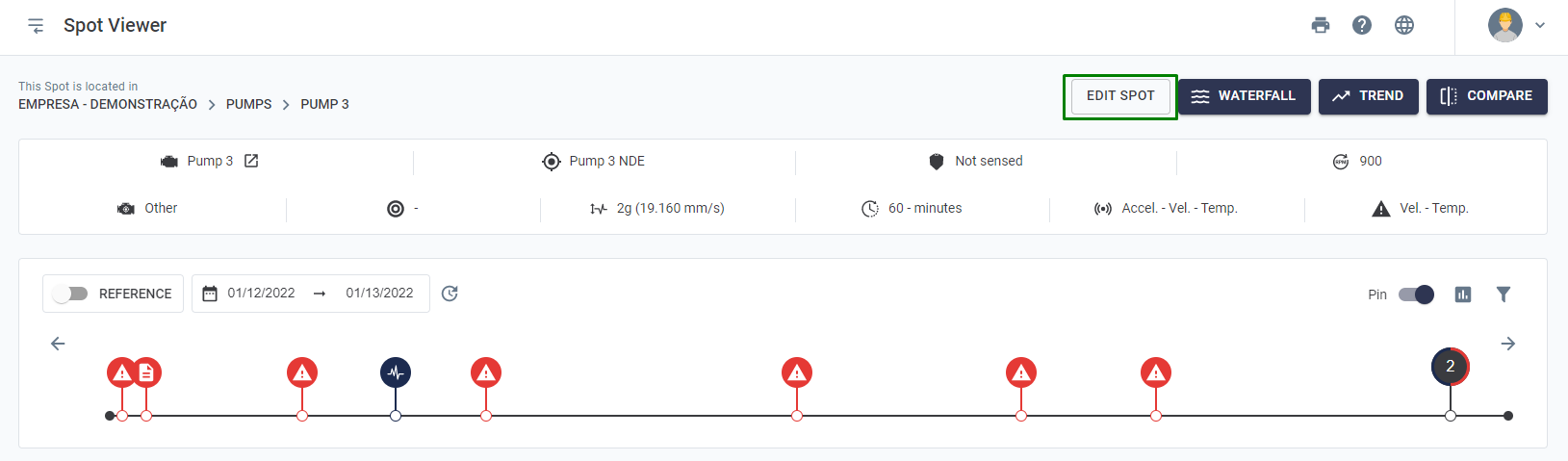
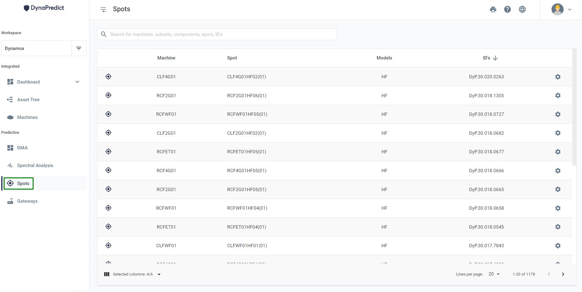
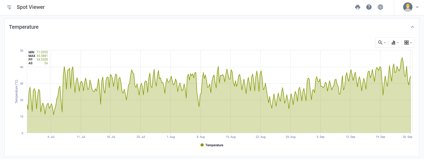
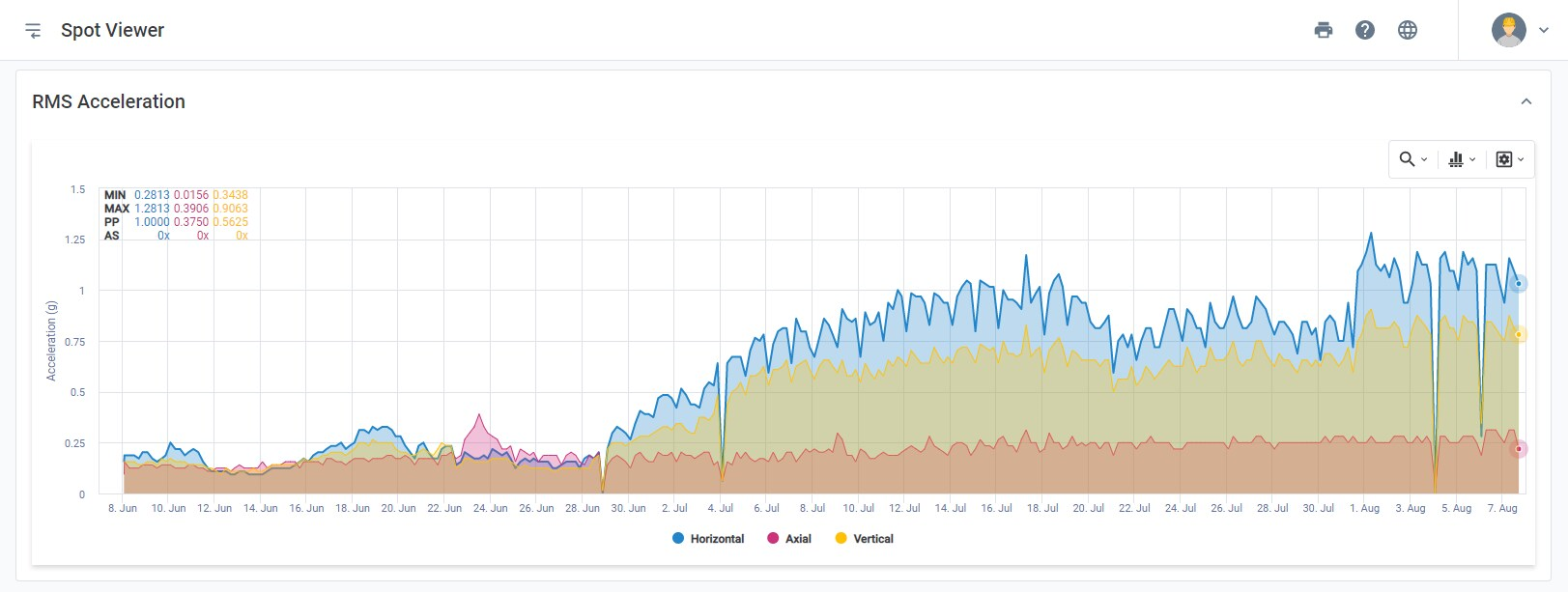
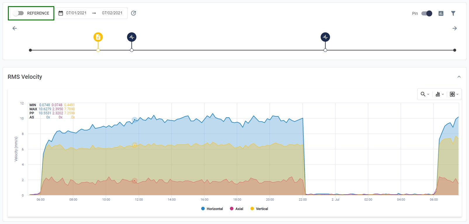
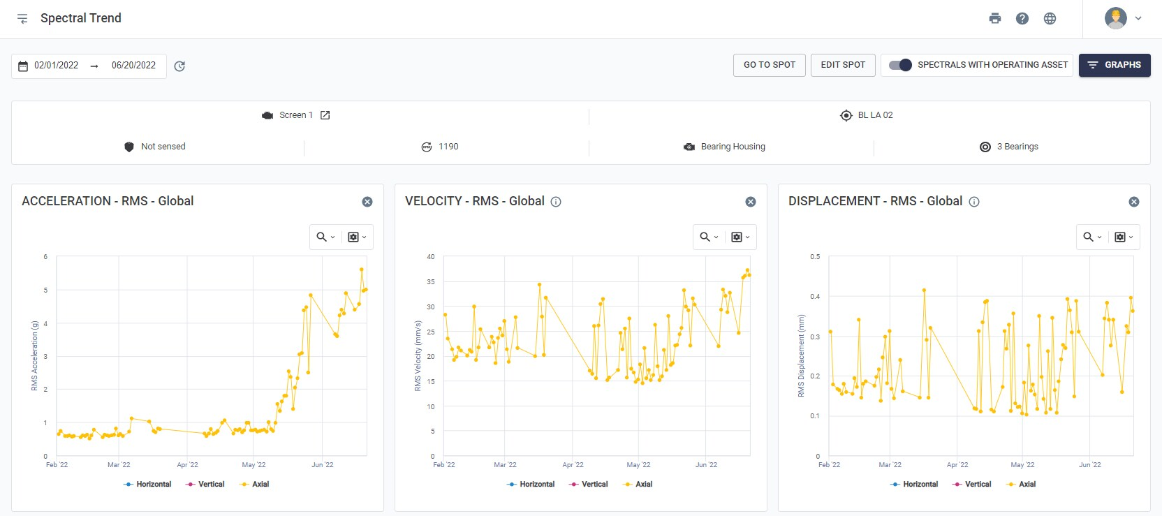
After the Spot’s header registration, the Timeline is displayed, which chronologically presents the events that occurred in the Spot during the selected period.
To navigate through the calendar, you can click on it, just above the timeline, to set the start and end of the displayed data.
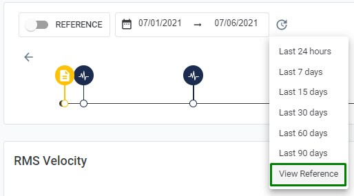
By default, the Platform shows the period referring to the last 7 days. For a better usability of the user, by clicking on the “” icon, to the right of the calendar, it is possible to select pre-selected periods, among them: last 24 hours, last 7, 15, 30, 60, or 90 days.


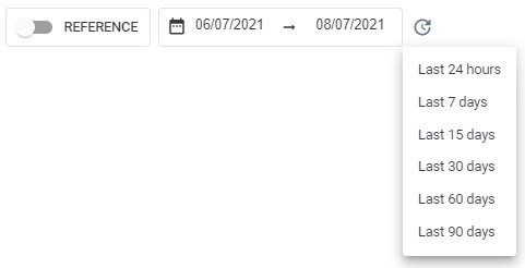
Figure: Calendar of the spot viewer screen


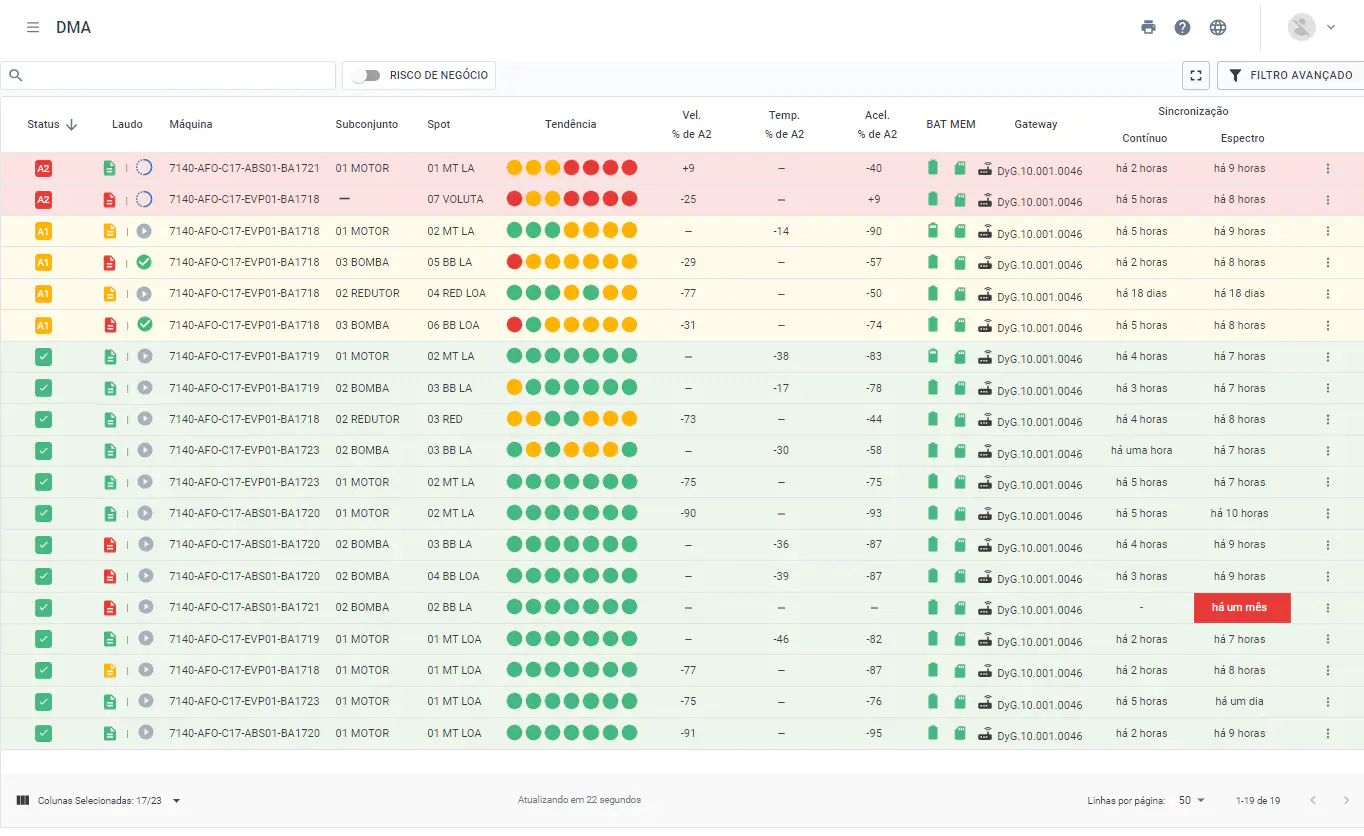
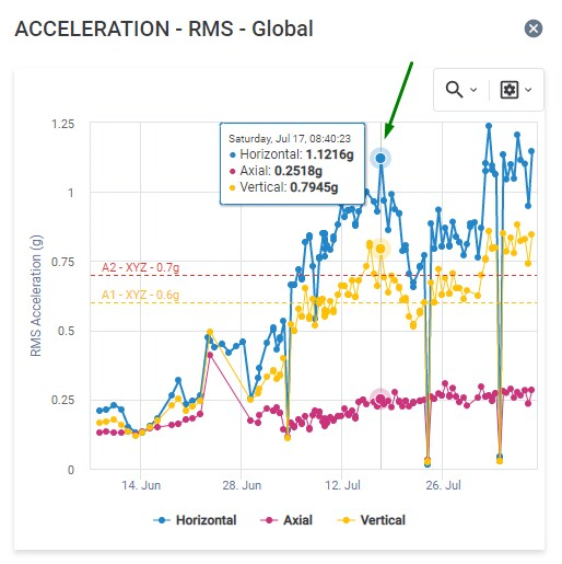
Currently there are several types of events: continuous data collection, spectral analysis collection, report emission (predictive analysis), Spot parameterization, Spot created/deleted, A2 Alert, and commented events only.


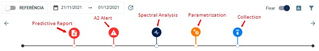
Figure: Timeline and events related to the Spot


The interactive icons displayed on the timeline follow the pattern below:

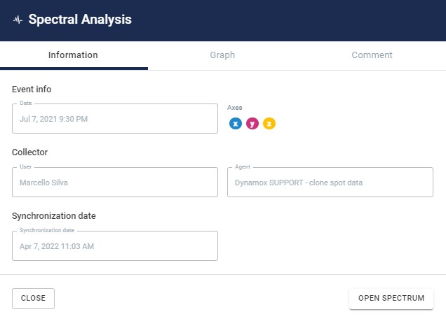
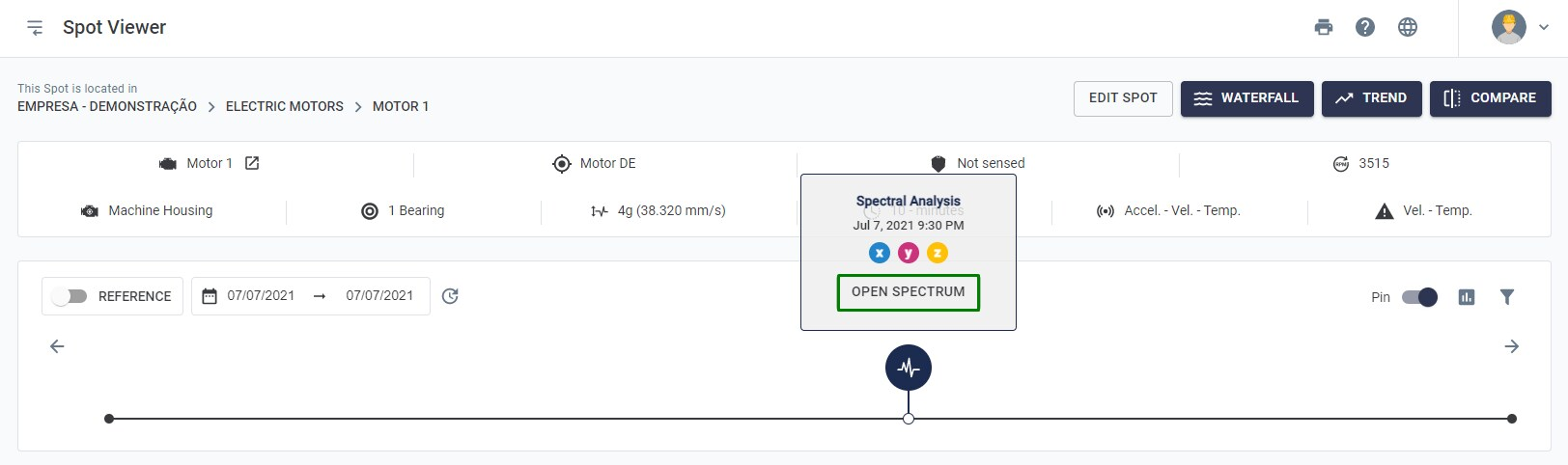
Spectral Analysis: through this icon the user can access a spectral analysis performed in Spot. After clicking on the icon, a tab will be displayed with information such as creation date, selected axes, the person responsible and the event agent, the synchronization date, preview of the graph for user viewing, among others.

Collection: Collection available data from the sensor memory based on the sample interval chosen for the Spot. This event, as well as the Spectral Analysis, can be generated by Gateway or by an inspector collecting on field via mobile application. By clicking on the icon it is possible to know the source of the collection as well as its time information.

Parameterization Event: editing event performed by a user. By clicking on the event it is possible to see which changes were made, who was responsible for it and at what moment (on the timeline).
Predictive Report: issuing predictive analysis report, based on data from vibration and temperature sensors. By clicking on the icon, the information of the user who performed the analysis and the shortcut for the report will be displayed. This icon has color interactivity, that is, its color is displayed according to the criticality assigned by the analyst when making the report. By default, there are: green, yellow and red, which relate, respectively, to normal, alert and intervention levels.

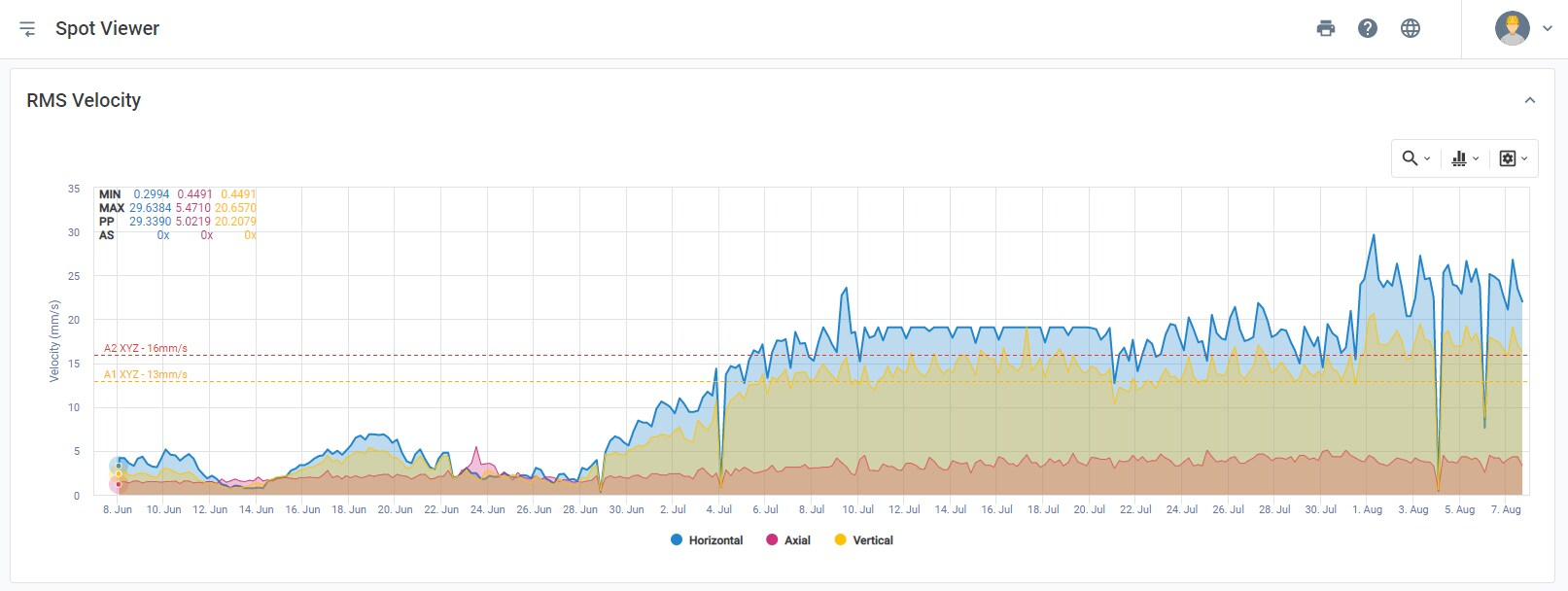
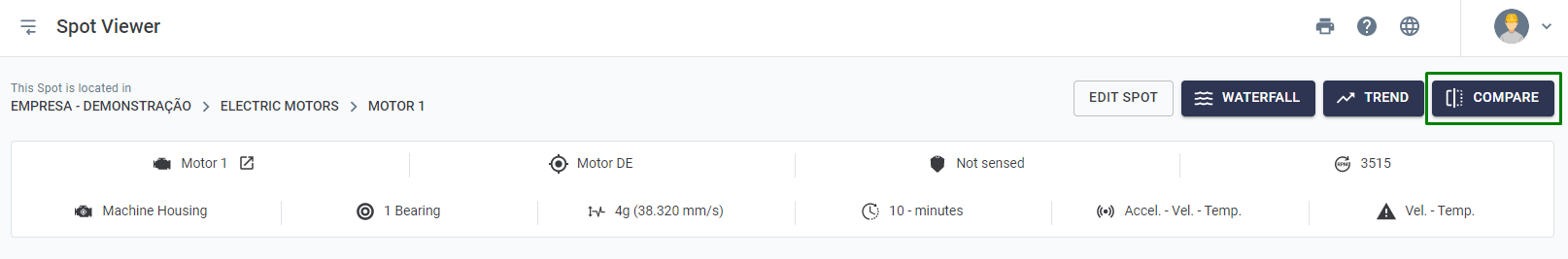
A2 Alert: Alert type A2 triggered on the Spot. Clicking on the icon will display information such as: agent (Gateway or application collection), metric (velocity, acceleration, or temperature), time that the Spot was above specified levels and the configured value of alerts across all metrics.

Spot Created/Deleted: Spot creation event visualized. Clicking on the icon will display information about the user who created the spot, the settings made and through which device (application or platform) the monitoring point was created. In the case of a Spot deletion event, the icon will appear in gray.

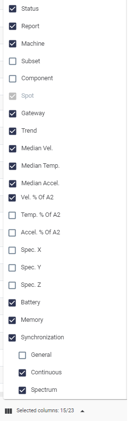
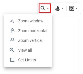
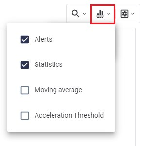
All icons can be accessed by selecting their respective functionality in the alternatives menu of the event filter.


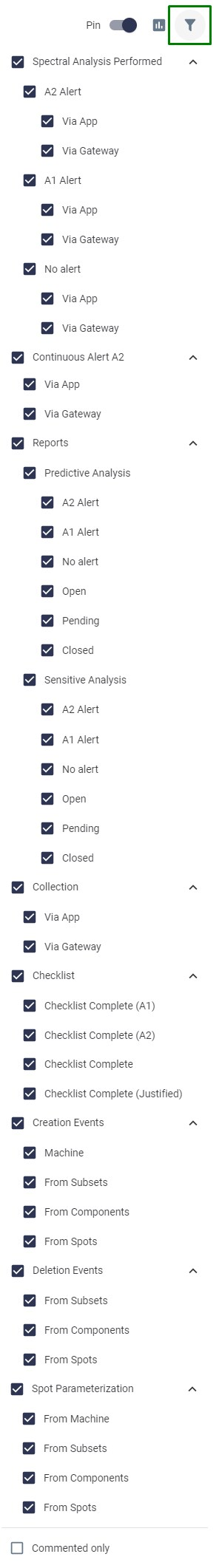
Figure: Timeline events filter


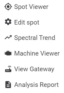
There is also the option to pin or unpin the timeline from the top of the page, using ““. Next to this is the “” icon, which takes the user to a tabular view of the spot timeline, entitled Event Report. This type of data visualization follows the same pattern of icons used in the timeline described above. Similarly, information about the user who performed the action and which Spot was involved in the event is displayed.
Users are also able to leave comments on a timeline event (collection, spectral, parameterization) that can be answered by other colleagues in the form of a “conversation”. Each comment has date/time information and it will be possible for users to edit or delete their own comments. Events that have comments appear on the timeline highlighted with a red circle, shown in the example below:


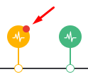
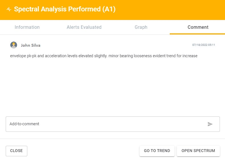
Figure: Comment tab for an event that occurred on the Spot timeline


8.2) Temporal Reference

One of the features available in the Spot Viewer screen is to select a continuous collection period as a reference for future analysis.
For example, after implementing a maintenance action and knowing that the asset is functioning properly, the post-implementation period can be used as a time reference. This way, at any time in the future, the reference can be accessed to make a comparison with the current vibration and temperature data.
To configure the reference period, just click on the “”  option, paying attention to choose the correct period through the start and end dates.
 

Figure: Enable period as reference in the “Spot Viewer”


In any future analysis, to view the chosen reference, simply click on the clock button, which is next to the date options, and select “View Reference”.


Figure: Viewing the selected reference


8.3) Compare Tool

The Compare tool allows to compare continuous data from different time periods side by side.
The option is available in the upper right corner of the Spot Viewer screen.
 

Picture: Compare tool


After selecting the desired Spot, the data will appear side by side. You can change the desired period on each side.


Figure: Comparison of continuous data from a conveyor belt bearing.
Left side: post-maintenance levels. Right side: high levels, intervention report already issued.


This tool can be relevant for adding comparison images to the reports / predictive analyses, thus making the reports more complete and visual.
Note: It is possible to compare two different Spots in different time periods. The customization and choice is under the user’s control. It is worth mentioning that all analysis tools, markers and the tools alike are also available in the comparison view.


9) Accessing the Vibration Spectral Screen

Vibration Spectra is useful for failure mode analysis in industrial machinery. Through them, it is possible to identify what type of defect is evolving or appearing in the asset, in order to schedule maintenance and avoid corrective stops in the production line.
Access to the spectral analysis screen occurs in several ways within the Web Platform. Below are presented the main ones:


1) Through the timeline of each Spot or machine

The spectra are accessible via the spectral analysis icon “” on the timeline in the data history screen, avaiable in the Machine Viewer and Spot Viewer screens. When you select the icon, a summary window with details of the spectra will be displayed. In the summary window you can access general information, a simplified version of the graph, and insert or view any comments entered by users.


Figure: Event Report – Spectral Analysis

The complete chart, with all the tools, can be accessed by clicking on the “Open Graph” button on the screen above or directly on the icon, as shown below:


Figure: Spectra access via timeline

2) Access via spectral trend

This is done by clicking on the Spectral Trend graph point. As discussed in this link, each point of the spectral trend represents a spectrum, with its respective date and time of acquisition. When selecting one of the points on the graph, the respective spectrum is opened on a new screen.
 

Figure: Spectral Trend – accessing the spectral at a desired point
 

3) Through the “Spectral Analysis” screen in the side menu

The user can access a list of all spectra performed in the sector or site to which he is logged in through “Spectral Analysis” in the side menu.


Figure: Spectral Analysis option in the side menu


When accessing this screen, the user can filter by various items, such as machine, Spot, or serial number of a DynaLogger.


Figure: Spectral list with selectable filters

When using any of the three ways mentioned above, the spectral screen will open, displaying the spectrum in the frequency domain and the waveform in the time domain. The screens and functionality of the spectral analysis will be detailed in subsequent sections.


9.1) Spectral Trend Graphs

The user can follow the trend of the data from his spectral collections, i.e., graphs with the energy in each spectral collection performed. The tool is available via the “” button in the upper right corner of the Spot Viewer screen.
By clicking this button, the user will be taken to the “Spectral Trend” screen and will find by default the global RMS level trends for acceleration, velocity, and displacement. With this tool, it will be possible to view the spectral measurements history in a very visual way, thus highlighting possible evolutions in the vibration levels of the machinery.


Figure: Accessing the spectral trend screen via spot viewer


Figure: Standard spectral trend with plots of acceleration, velocity and displacement

Clicking on one of the graph points takes you to the spectral analysis screen for the time at which the spectrum was recorded. The arrangement of the graph data takes into account the time period selected in the header at the top of the screen.
This tool also allows the user to select metrics by frequency bands, highlighting evolutions in the vibration pattern of different machine components. For this, the Platform makes available more than 80 types of graphics, through the “” button in the upper right corner.
The available graphs provide global metrics by frequency range and several others. In addition, you can add multiple graphs side by side to compare data trends. Some chart options are described in the picture:


Figure: Selection of Spectral Trend Graph Types


After selecting the desired graphs and reloading the page, the new charts will be shown, as in an example below. In this case the RMS – Global displacement graph was removed and graphs per band were added, like the third one shown below, for “Velocity – RMS – 5 Hz to 50 Hz”.


Figure: Spectral trend graphs in different bands and metrics
 
The “GRAPHICS” option momentarily saves the visualization of the chosen graphics. To save permanently for the Spot in question, the user must save the graphics via the viewing preferences tool.